You can use the color settings in your block to set the text color, background color, link color, gradient options, and duotone filters for your content.?They are designed to make it as simple as possible to update your block’s colors.
The color settings are available when you use the?block editor. If you are new to the block editor,?this guide?will show you how to work with blocks. You can read more about the new block editor features and improvements?in this article.
The color settings available will vary based on the theme and the block in use.
How to access color settings
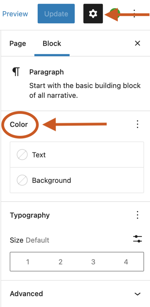
The color settings can be found on the Block Settings sidebar of a block under the section Color.
If you don’t see the Block Settings sidebar, select the block you want to customize, then click the settings icon (a cog) that is to the right of the Publish or Update buttons in the WordPress Editor.
In the Color section, click on the three-dot menu (also known as an ellipsis) to explore all the color settings that are not visible by default. Note that not every block supports all the color settings.

If you make customizations to these settings and want to revert back to the original settings quickly, you can do so by selecting the three-dot menu icon and clicking Reset All as shown in this article. This resets the settings and removes all of your changes.
Type of settings
Each supported block comes with different color settings.
Text and background colors
This option allows you to change the color of the text, and background on the block you are working on. A combination of these color settings can be used to call attention to your most important content.
You can pick a color from the color palette of your theme. You can also add a custom color from the color picker or enter the HEX, RGB, or HSL color values based on your brand. Click the two rectangle boxes next to the color slider to copy the HEX, RGB, or HSL color values.
Accessibility tests are built into the editor to warn you when the text may become hard to read against the background color choices as shown below.

Link colors
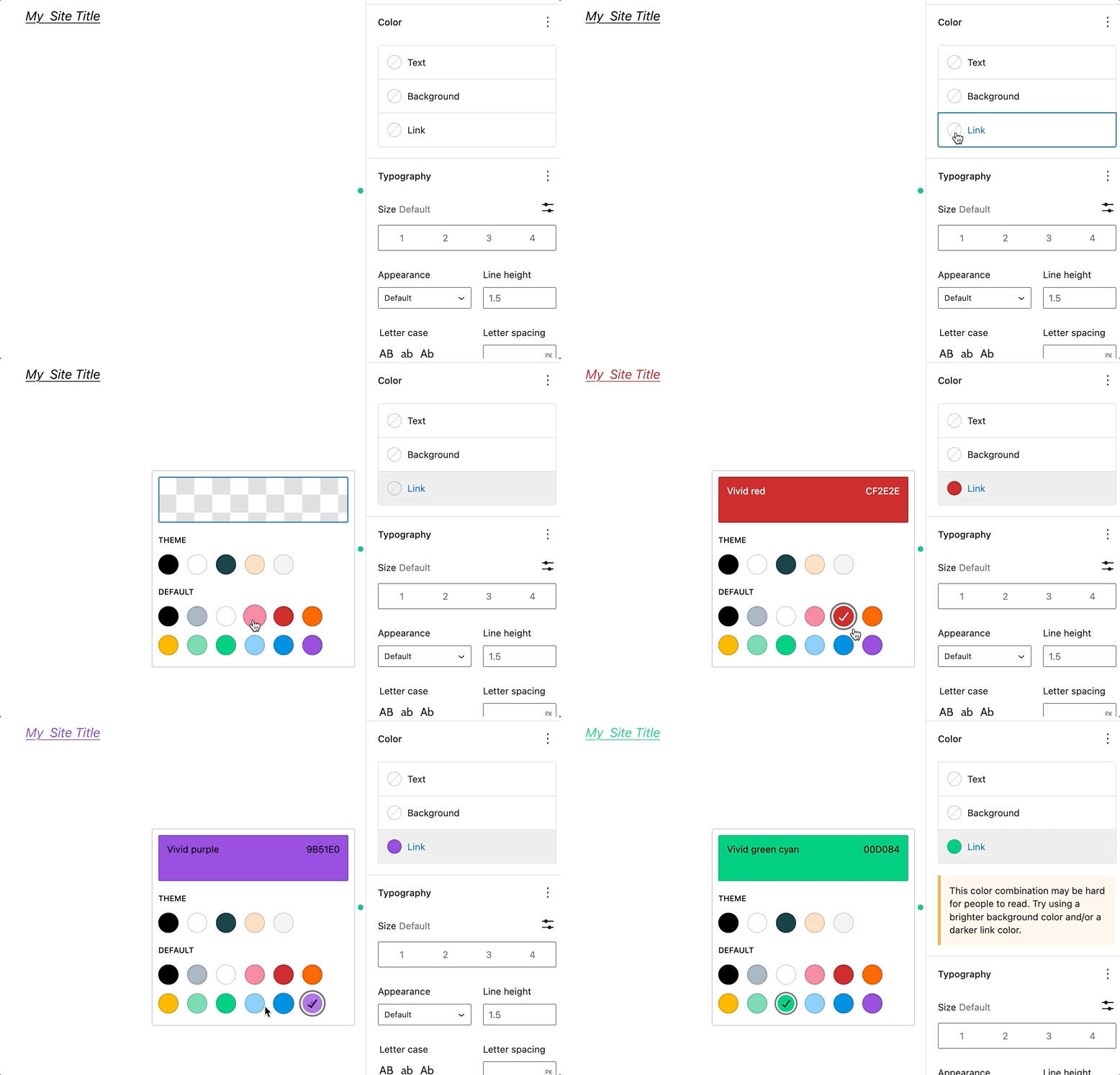
On some blocks, you will find the option to change the link color.

Gradient background colors
Some blocks such as the Heading block allow you to set either a solid color or a gradient as the background. A gradient is a mix of two or more colors, displayed using a certain pattern (from lighter to darker, or one color blending into the other).

A slider will appear that shows the two color points that make up the gradient.

You can click on any of the two color points to display the color picker for changing the color value. You can either choose a color from the color picker or enter the HEX, RGB, or HSL color values.
You can add additional color points if you like by clicking the?+?icon that appears when you hover over the gradient slider.

You can choose between the Linear or Radial gradient type. The angle control shifts the position of the gradient.
The Linear type creates a gradient between the two colors along a straight line, whereas the Radial type starts from the center and moves to the borders.

Duotone filter
You can create a two-tone color effect (called the duotone effect) on images without actually changing the original image
The duotone filter option allows you to add this filter color to your block content from the block toolbar. The filter can be black, white, or?any?other color combination of your choosing. The duotone effect works best on high-contrast images.?
To get started, select the Duotone filter icon in the block toolbar. You can pick the two colors for the effect from the list of duotone presets provided in the drop-down.?
You can also pick your own colors for the shadows and highlights by clicking on the Shadows /Highlights option which opens up the color picker and then selecting your custom color from the color palette.?
If you want to remove the duotone filter you can click the Clear button found at the bottom-right of the color palette.
Blocks that include color settings
- Social Links
- Gallery
- Calendar
- Table of Contents – not available in 6.1
- Social Links
- Button
- Avatar – Duotone only
- Code
- Column/Columns
- Comment Author Avatar – Background only
- Comment Author Name
- Comment Content
- Comment Date
- Comment Edit Link
- Comment Reply Link
- Comments
- Comments Pagination
- Comments Pagination Next
- Comments Pagination Previous
- Comments Title
- Cover – Duotone only
- Gallery – Background only
- Group
- Heading
- Image – Duotone only
- List
- Media & Text
- Navigation
- Paragraph
- Post Author
- Post Author Biography
- Post Author Name
- Post Comments Count
- Post Comments Form
- Post Comments Link
- Post Date
- Post Excerpt
- Post Featured Image – Duotone only
- Post Navigation Link
- Post Terms
- Post Title
- Preformatted
- Pullquote
- Query
- Query No Results
- Query Pagination
- Query Pagination Next
- Query Pagination Numbers
- Query Pagination Previous
- Query Title
- Quote
- Read More
- Search
- Separator
- Site Logo – Duotone only
- Site Tagline
- Site Title
- Social Links
- Table
- Table of Contents
- Term Description
- Verse
Demonstration
To illustrate the above settings, below is an example of how to add custom colors so that the social link icons will match the branding on your site:
Changelog
- Created 2022-11-01