You can use the dimension settings in blocks to help you better customize your layout and design. These settings impact the dimensions of blocks in various ways, including how groups of blocks are placed alongside one another.
The dimension settings are available when you use the block editor. If you are new to the block editor, this guide will show you how to work with blocks. You can read more about the new block editor features and improvements in this article.
How to access dimension settings
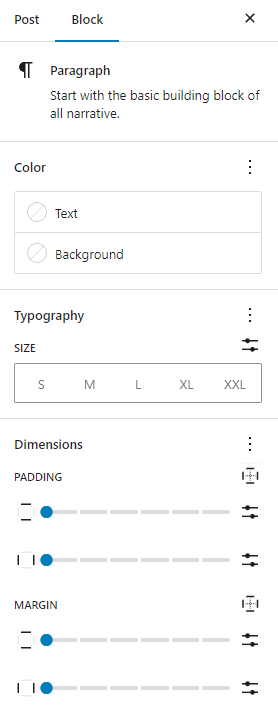
The dimension settings can be found in the Block Settings sidebar of a block under the section Dimension.
If you don’t see the Block Settings sidebar, select the block you want to customize, then click the settings icon (a cog) that is to the right of the Publish or Update buttons in the WordPress Editor.
Below are a few examples from different blocks:


In the?Dimension?section, click on the three-dot menu (also known as an ellipsis) to explore all the dimension settings that are not visible by default.
Note that the type of dimension settings you can see in your block depends on whether they have been supported by the block or not.
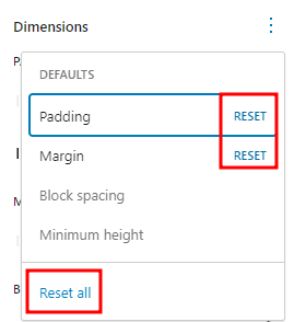
If you make customizations to these settings and want to revert back to the original settings quickly, you can do so by selecting the three-dot menu icon and clicking Reset All as shown in this article. This resets the settings and removes all of your changes. You can reset individual settings by clicking Reset on each setting. You can also reset all of them globally by clicking on the Reset All option.

Type of settings
Each block comes with different dimension settings.
Padding
This setting impacts the space between a block’s content and its border. You can either set horizontal and vertical paddings or set different padding values for each side. To set different padding for each side, follow the steps in the Unlink sides section.

Margin
This setting impacts the space around a block. You can either set horizontal and vertical margins or set different margin values for each side. To set different margins for each side, follow the steps in the Unlink sides section.

Preview margin and padding
When changing the margin or padding in a block, the editor will show the corresponding change, highlighted in a blue box around the block.
Block spacing
This setting impacts the space between nested blocks. This means that if you set block spacing for the entire block, you can change the spacing of the nested block within the parent block. You can find this setting in blocks like the Buttons block or Group block.
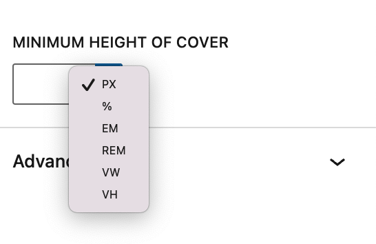
Within this setting, you can choose to set block spacing using different values: px, %, em, rem, vw, vh.

Minimum height
This setting enables you to set a minimum height for the block. You can find this option in the Cover block, Post Content block, Group block (including the Row and Stack variations). Within this setting, you can choose to set the height using different values: px, %, em, rem, vw, vh.
An example use case is to ensure that a Post Content area has a minimum height, forcing a footer area to render lower on the page, even if a page has very little content. Because of this, it can be quite useful to use viewport relative units when setting minimum height, e.g. 100vh for a block that takes up the entire height of the viewport.

Unlink sides
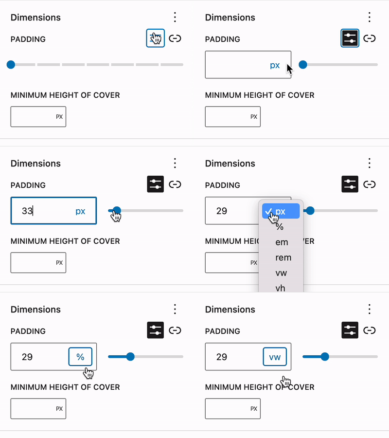
By default, the Padding and Margin settings will apply the same value for vertical and horizontal settings around the block. You can add a different value to each of the sides by clicking on the padding options or margin options icon on the right.
A drop-down menu will appear where you can select any of the side to modify. You can select a specific side (Top, Right, Bottom, and Left) to have a specific setting for the side, or select Custom to make individual setting for each side.


To return to adding the same value for all sides, just select the same icon again.
Set custom size & change units
You can add custom values for a block’s margin, padding, or spacing, and also change the units to one of the following: px, %, em, rem, vw, vh.

Blocks that have dimension settings
Various combinations of these options are available in the following blocks:
- Archives
- Audio
- Avatar
- Tag Cloud
- Table of contents – not available in 6.1
- Table
- Term Description
- Spacer
- Post Date
- Heading
- Paragraph
- Query Title
- Post Title
- Video
- List
- Media & Text
- Verse
- Categories
- Comment Edit Link
- Comment Date
- Comment Reply Link
- Site Logo
- Social Links
- Gallery
- Button/Buttons
- Code
- Column/Columns
- Comment Author Name
- Comment Content
- Comments Title
- Cover
- Group
- Heading
- Navigation
- Post Author
- Post Author Biography
- Post Author Name
- Post Content
- Post Excerpt
- Post Featured Image
- Read More
- Row
- Separator
- Site Tagline
- Site Title
- Stack
Demonstration
The following is a demonstration of various settings in action with the Post Featured Image, unlink the sides of the block, and use different units.
Changelog
- Updated 2023-08-24
- Updated screenshots for 6.3
- Updated unlink sides section to show the optimized and condensed spacing controls.
- Updated 2023-03-27:
- Added a new demonstration video.
- Updated the min height section.
- Updated blocks with support.
- Updated 2022-10-27:
- List block supporting dimensions options
- Update screenshots to match 6.1 interface
- Include custom size & custom units
- Add “Unlink Sides” as a separate section.
- Created 2022-01-17