The Group block allows you to group different blocks together and customize them to your liking, including setting custom background colors, spacing, and more.

Adding a Group block
To add a Group block, click on the Block Inserter icon.
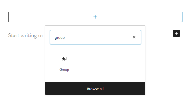
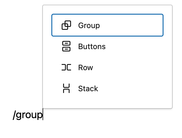
You can also type /group and hit enter in a new paragraph block to add one quickly. Row and Stack are also types of Group blocks, they just have a different layout style by default.
Block variations
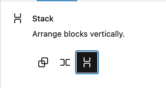
When the Group block is created, you will find different variations to choose from: Group, Row, and Stack

Converting multiple blocks to a Group block
You can also create a group by selecting multiple blocks. Multiple blocks can be selected by dragging your mouse. You can also select multiple blocks by holding down the “shift” key and using your navigation arrows or clicking on multiple blocks. Once one or more blocks have been selected, you will notice that the group icons will appear. You can click on these icons or use the “more options” button to convert them into a single group, as seen in the video below:
Detailed instructions on adding blocks
Block toolbar
Most blocks have their own block-specific controls that allow you to manipulate the block right in the editor. The Group block offers standard block options as well as full-width and wide-width options, if the theme supports these alignment styles.
The Group block shows three buttons in addition to the “Group” block icon.
- Moving handles
- Change alignment
- More options
Moving handles
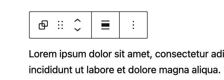
The up and down arrow icons can be used to shift a block up and down in your document.
Detailed instructions on moving a block within the editor can be found here.
Change alignment

None – Is the default width, the same as the main content.
Wide width – Increase the width of the post beyond the content size.
Full width – Extend the block to cover the full width of the screen, if supported by your site’s theme.
More options
These controls give you the option to copy, duplicate, and edit your block as HTML.
Read about these and other settings.
Editing the block
The nice thing about the Group block is that you can add any other blocks inside the group block and create a layout of your own. To add blocks to the Group block, click on the inserter icon inside the Group block.

Adding content
Inside the Group block, you can add a columns block, cover block or any other available block to create the layout of your choice.

The group block shown here has columns, heading, paragraph, image and button blocks.
Note that since the Group block has the ability to embed other blocks, if you click specifically on one of the blocks, the settings in the sidebar will change according to the block you added to the Group block. For example, if you added an image inside the Group block, when you click on the image the sidebar will display the options from the Image block settings.

Every block has specific options in the editor sidebar in addition to the options found in the block toolbar. If you do not see the sidebar, simply click the ‘Settings‘ icon next to the Publish/Update button. Within the Group block settings, you will see two tabs, one is for general settings and the other one is for styles.
Group block settings

Alignment
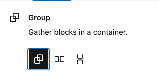
There are three alignment options for the Group block:
- Default
- Row (Horizontal)
- Stack (Vertical)

If you set a block to “Row”, you will see a number of new options to justify the items inside the row:

Items can be set to justify left, center, right or “space between items”. This last option will distribute the items inside the row to use all the available width. Additionally, by changing the “orientation” setting, you can have your items change from flowing horizontally to flowing vertically, as illustrated in the video below.
There is a second alignment option to specify how items should align vertically.
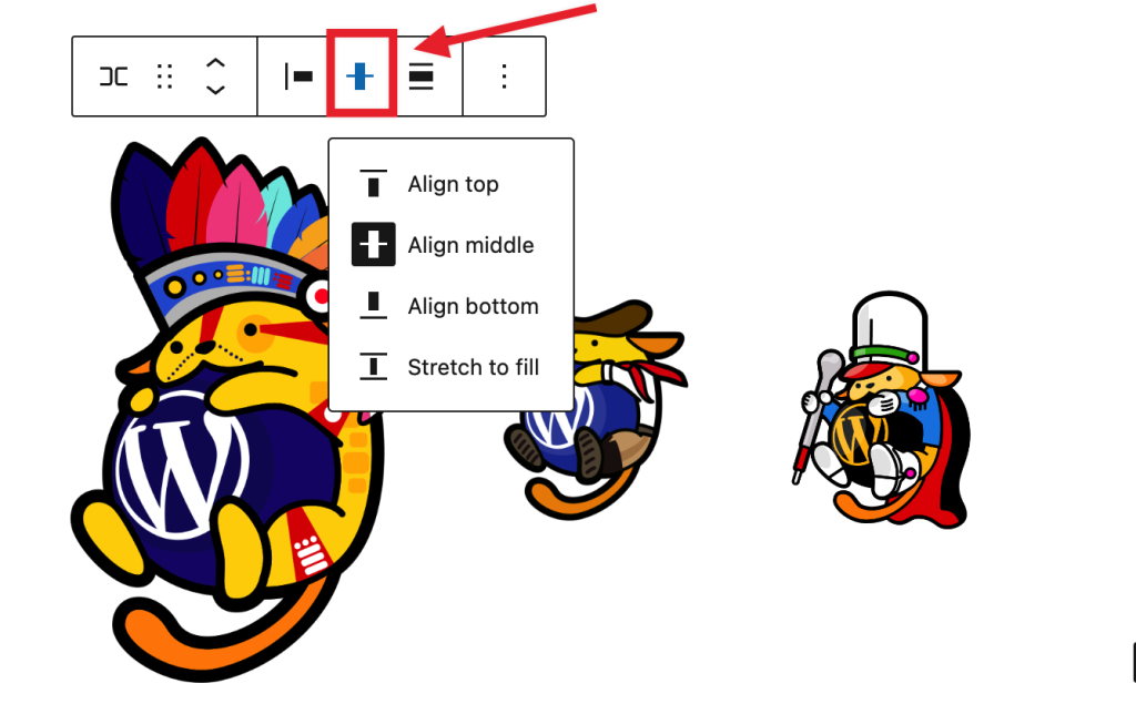
This is useful when the items inside the row have different heights, as seen in the example below:
Layout and content width
This is an advanced option that allows you to add custom content widths to the overall Group block for all blocks assigned to the center or wide columns. In many cases, you won’t need to use this option. When you toggle this option on, it allows the Group block to inherit the options set by your theme. When it’s toggled off, you can customize to your liking.
This article provides details about layout settings.
Position (sticky)

The “Position” group setting allows you make a group block stick to the top of the viewport instead of scrolling, as seen in the demo below:
Please note that only “top level” Group blocks can be set as sticky. If a Group block is embedded inside any other block, the “Position” setting will not be available in the settings.
Advanced
The “Advanced” tab lets you specify the HTML element used for the group and add HTML anchor & CSS class(es) to your block.

The HTML Element option allows you to select what HTML tag you want to use for that group. You can choose between the following tags:
- Div (default)
- Header
- Main
- Section
- Article
- Aside
- Footer
HTML anchor allows you to make a unique web address for a particular “Group” block. Then, you’ll be able to link directly to a “Group” block of your page.
The Additional CSS class(es) area lets you add CSS class(es) to your block, allowing you to write custom CSS and style the block as you see fit.
Color
When the group block is selected, you can see the color settings in the sidebar. You can select the text, background, and link colors to your liking.
See this guide for more information about changing colors.
Border
This option allows you to set a border around the Group block, including the color, the width, radius, and the style of the border.
Learn more about border settings.
Dimensions
The option to control block spacing and padding is enabled for the Group block. You can read more about these settings in the
Learn more about dimension controls.
Changelog
- Updated 2023-11-21
- Capitalization of headings to sentence case
- Updated 2023-04-04
- Added link to the list of blocks
- Updated 2023-03-29
- Updated to reflect the 6.2 changes
- Updated 2022-11-25
- Removed redundant content
- Added alt text to the some images
- Updated to include Dimension controls for WP 5.9 2022-01-17
- Updated with new images for WP 5.6 2020-11-27
- Created 2020-09-21