The separator block creates a break between two blocks of content with a horizontal line. This helps to create a separation between ideas or sections on your post or page.
In order to add a separator block, click on the Block Inserter icon.
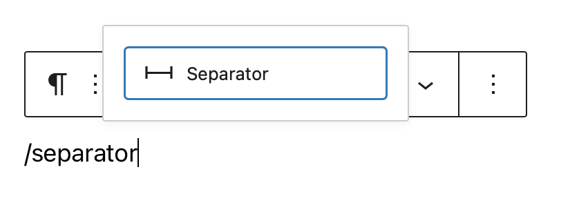
You can also type /separator and hit enter in a new paragraph block to add one quickly.
Detailed instructions on adding blocks
Block toolbar
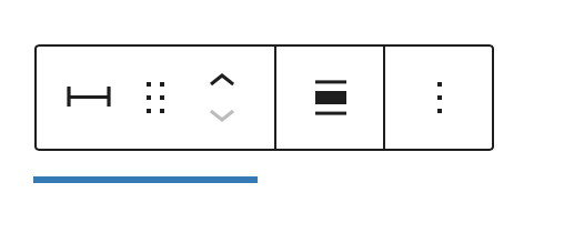
Each block has its own block-specific controls that allow you to manipulate the block right in the editor. The separator block has the following options in the Block toolbar.
Transform to
You can transform a Separator block into a Columns, or a Group block. You can also switch the styles from Default to Wide Line or Dots.

Block-moving tools

Use the block-moving tools to move the block up and down inside the editor. Use the six dots icon to drag and drop the Separator Block and reposition it anywhere on the editor. Alternatively, click on the up and down arrows to move the block up or down the editor.
Get more information about moving a block within the editor.
Change alignment
The change alignment tool lets you align the Separator block within the content. You can choose one of the following alignment options:

None: Leaves the block alignment as is.
Wide width: Increase the width of the block beyond the content size.
Full width: Extend the block to cover the full width of the screen (if supported by your site’s theme).
Align center: Align the block to the center of the content.
More options
These controls give you the option to copy, duplicate, and edit your block as HTML.
Read about these and other settings.
Block settings
Every block has specific options in the editor sidebar in addition to the options found in the block toolbar.?If you do not see the sidebar, simply click the ‘sidebar’ icon.

Styles
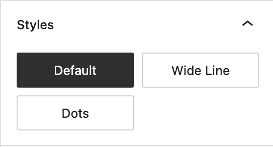
You can modify the Separator block’s look by choosing one of the styles available in the block’s settings on right-hand side under?Styles. You can either hover or focus click on each of the style buttons (e.g. ‘Default’, ‘Wide Line’ or ‘Dots’) to get a preview of the styles.
Note: The style options may vary based on your theme!
Color

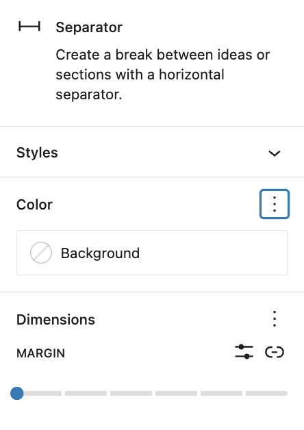
The color settings let you customize the color for the Separator block. Pick a color from the suggestions, or add a custom color using the color picker or by adding a color code.
See this guide for more information about changing colors.
Dimensions
The separator block provides the ability to add margin values via the Dimensions settings option, giving you more control over content separation.
See this guide for more information about dimensions settings.
Advanced settings
The “Advanced” tab lets you add HTML anchor and CSS class(es) to your block.
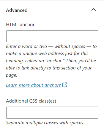
“HTML anchor” allows you to make a unique web address for a particular block. Then, you’ll be able to link directly to that block on your page.
The “Additional CSS class(es)” lets you add CSS class(es) to your block, allowing you to write custom CSS and style the block as you see fit.
When selecting one of the three styles available, this field is pre-populated with the CSS class that targets the chosen style. For example,
- The default separator adds
is-style-defaultCSS class - The wide line separator adds
is-style-wideCSS class - The dots separator adds
is-style-dotsCSS class
Changelog
- Updated 2023-06-28
- Updated video & screenshots for 6.2
- Added dimensions settings section
- Tweaked wording for Styles section to include preview on hover/focus click
- Updated 2022-11-22
- Removed redundant content
- Aligned images for mobile view
- Updated 2022-08-03
- Screenshot, content, and video updated for 6.0
- Added ALT tags for the images
- Updated 2020-08-23
- Updated images to WP 5.5
- Updated 2020-08-10
- Added link to the list of blocks
- Added changlog box
- Created 2019-03-07