Use the Archives block to display a date archive of your posts.

To add the Archives block to a page, click the block inserter (+) icon to open the block inserter pop-up window and choose the Archives block.

You can also use the keyboard shortcut /archives to quickly insert an Archives block.
Detailed instructions on adding blocks
Block toolbar
To view the block toolbar, click on the block, and the toolbar will be displayed.

Every block comes with unique toolbar icons and blocks specific user controls that allow you to manipulate the block right in the editor.
The Archives block shows five buttons in the block toolbar:
- Transform to
- Drag icon
- Move arrows
- Change alignment
- More options
Transform to
Click on the Transform button to convert the Archives block into a Group, Columns or Calendar block.
Drag icon

To drag and drop the block to a new location on the page template, click and hold the rectangle of dots, then drag it to the new location. The blue separator line indicates where the block will be placed. Release the left mouse button when you find the new location to place the block.
Move arrows

The up and down arrow icons can be used to move the block up and down on the page.
Get more information about moving a block within the editor.
Change block alignment

Use the change alignment tool to align the Archive block. Choose one of the following options:
- None – leaves the block the current size.
- Wide width – increase the width of the block beyond the content size.
- Full width – extend the block to cover the full width of the screen.
- Align left – aligns the block left.
- Align center – aligns the block to the center.
- Align right – aligns the block right.
The “Wide width” and “Full width” alignment settings must be enabled by your WordPress theme.
Options
The Options button on a block toolbar gives you more features to customize the block.
Read about these and other settings.
Block settings
The block settings panel contains customization options specific to the block. To open it, select the block and click the Settings icon next to the Publish button.
Settings
The settings section provides four possible options:

Display as dropdown – display the archives as a dropdown, rather than the default bulleted list.

Show label – displays the archives label on top of the dropdown list. It can only be enabled together with the Display as dropdown option.

Show post count – shows posts count.

Group by – sets and groups the posts by year, month, week, and day.
Typography
The Archives block provides typography settings to change the font family, size, appearance, line height, letter case, letter spacing, and decoration.
For details refer to this support article: Typography settings overview
Dimensions
The Archive block provides dimension settings options to change padding and margin size.

For details refer to this support article: Dimension settings overview
Advanced settings
The advanced tab lets you add a CSS class to your block, allowing you to write custom CSS and style the block as you see fit.

Changelog
- Updated 2023-02-07
- Updated screenshots
- Updated 2022-11-21
- Removed redundant content
- Updated 2022-08-01
- Added screenshots and updated content for 6.0
- Added ALT tags for images
- Created 2019-03-07
The Calendar Widget block displays your posts in a calendar format. When you publish a new post, it is automatically added to the Calendar block. If you click on a date, it will open the archive of posts published on that date.

The Calendar Widget block does not let you create a calendar of events. For that, you need an Events calendar plugin.
By default, it shows the current month and links to the posts published on various days in that month.

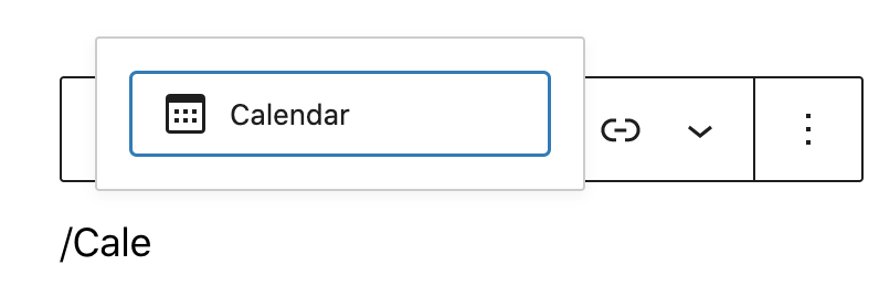
To add a Calendar Widget block, click on the Block Inserter icon. You can also type /calendar and hit enter in a new paragraph block to add one quickly.
Detailed instructions on adding blocks
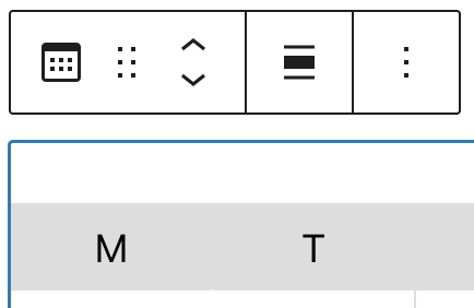
Block Toolbar
Each block has its own block-specific controls that allow you to manipulate the block right in the editor. The Calendar Widget block has the following options in the Block toolbar.
- Transform to
- Block moving tools
- Change alignment
- More options.
Transform to
You can transform a Calendar block into Archives, Columns or ‘Group’ block. Changing the Calender Widget block into a Group block lets you change the background color around the block.

Block moving tools
Use the block-moving tools to move the block up and down inside the editor. Use the six dots icon to drag and drop the Calender Widget block and reposition it anywhere on the editor. Alternatively, click on the up and down arrows to move the block up or down the editor.

Get more information about moving a block within the editor.
Change alignment
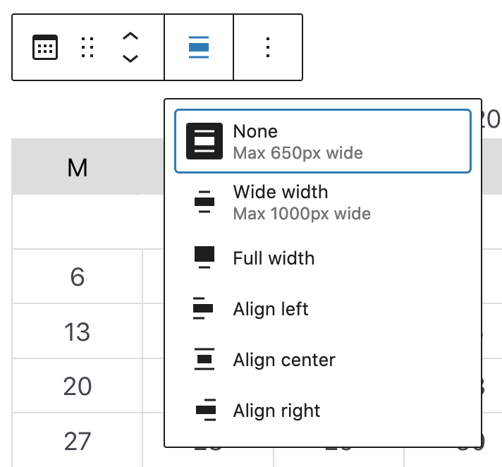
- Align left – Make the block left aligned
- Align center – Make the block alignment centered
- Align right – Make the block align right
- Wide width – Increase the width of the block beyond the content size
- Full width – Extend the block to cover the full width of the screen.
“Wide width” and “Full width” alignment need to be enabled by the Theme of your site.
More options
These controls give you the option to copy, duplicate, and edit your block as HTML.
Read about these and other settings.
Block Settings
There are no further settings available for the Calendar Widget block, except for the “Advanced Settings.”
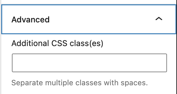
Advanced settings
The “Advanced” tab lets you add CSS class(es) to your block. This will allow you to write custom CSS and styles to the block.
Changelog
- Updated 2022-11-23
- Removed redundant content
- Aligned images for mobile view
- Updated 2022-08-04
- Added screenshots for 6.0
- Added ALT tags for the images
- Created 2020-04-28
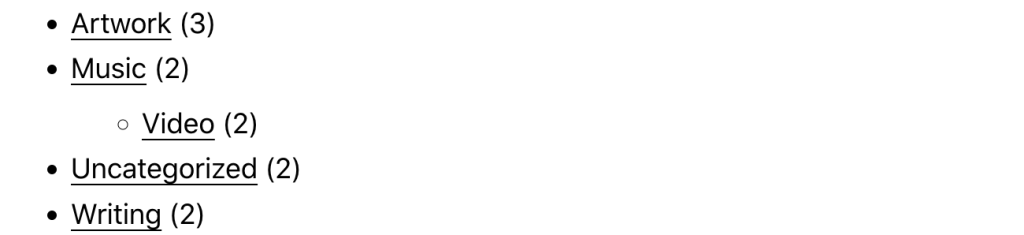
The Categories List block organizes your previously published posts by category. This can be handy for readers who want to find more of your posts about certain topics.

The Categories List block can be added to a page by clicking on the Block Inserter button. You can find the Categories List block listed under the Widgets section.
Alternatively, you can type /categories to select the Categories List block and hit enter in a new?paragraph block?to add one quickly.

Detailed instructions on adding blocks
Block toolbar
Each block has its own block-specific controls that allow you to manipulate the block right in the editor. The Categories List block has the following options in the Block toolbar.

Transform to
You can transform a Categories List block into a Tag Cloud, Columns, or a Group block.

Block-moving tools

Use the block-moving tools to move the block up and down inside the editor. Use the six dots icon to drag and drop the Categories List block and reposition it anywhere on the editor. Alternatively, click on the up and down arrows to move the block up or down the editor.
Get more information about moving a block within the editor.
Change alignment
The change alignment tool lets you align the Categories List block within the content. You can choose one of the following alignment options:

None: Leaves the block alignment as is.
Wide width: Increase the width of the block beyond the content size.
Full width: Extend the block to cover the full width of the screen (if supported by your site’s theme).
Align left: Align the block to the left of the content.
Align center: Align the block to the center of the content.
Align right: Align the block to the right of the content.
More options
These controls give you the option to copy, duplicate, and edit your block as HTML.
Read about these and other settings.
Block settings
Every block has specific options in the editor sidebar in addition to the options found in the block toolbar. If you do not see the sidebar, simply click the sidebar icon.

Categories List settings
The Categories List settings allow you to choose whether to display the categories list as a dropdown, or the default bulleted list. You also have the choice to show/hide the hierarchy, the top-level categories only, and the post counts.

Display as dropdown
Choose this option to display the categories in a dropdown menu rather than as a list. This is handy if you want to save space or have a lot of categories.

Show post counts
If this option is chosen, the total number of published posts for each category will be displayed next to the category link. You can show post counts in both the list and dropdown display formats.
Show only top-level categories
If you have parent and child categories (subcategories within main categories) you can choose to display only the top-level category.
Show empty categories
You have the option to show or hide empty categories in the categories list.
Show hierarchy
If you have parent and child categories (subcategories within main categories) you can choose to display the hierarchy or just leave the list without indicating which subcategories fit inside your main categories. You can show category hierarchies in both the list and dropdown display formats.

Typography
The Typography settings enable you to customize the font and text appearance of the content within the Categories List block. The settings have various options, such as font size, font style, font family, and letter spacing.
Get more details about changing typography settings.
Dimensions
The Categories List block provides dimension settings options to add padding and margin.
For details refer to this support article: Dimension settings overview
Advanced settings
The advanced tab lets you add a CSS class to your block, allowing you to write custom CSS and style the block as you see fit.

Changelog
- Updated 2023-05-23
- Added typography, dimension settings info
- Added option to show empty categories
- Changed name to Categories List block and updated the screenshots
- Added ALT tags
- Updated 2022-11-25
- Removed redundant content
- Aligned imaged for mobile view
- Updated 2022-08-04
- Added screenshots and content for 6.0
- Added ALT tags for the images
- Created 2019-03-07
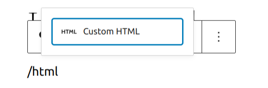
In order to add a custom HTML block, click on the Block Inserter icon.
You can also type /html and hit enter in a new paragraph block to add one quickly.
Detailed instructions on adding blocks
Editing the Block
Once you add the block, you can add your code and view it right from the block options. You also have all the standard block options.

Preview block

More Options
These controls give you the option to copy, duplicate, and edit your block as HTML.
Read about these and other settings.
Block Settings Panel
While most blocks have specific options in the editor sidebar in addition to the options found in the block toolbar, the HTML block does not have extra options.

Changelog
- Updated 22-11-26
- Removed redudant content
- Aligned images for mobile view
- Added heading
- Updated 2022-04-20
- Update screenshots to 5.9
- Add More Options section
The Latest Comments block displays the most recent comments readers have left on your blog, including the users and blog posts. This block is useful to show the recent activities and ongoing discussion on your blog.

Additional options for this block include to display the commenter’s avatar, comment date, and comment excerpt. Read the Block settings section to learn more about this.

It can be added to any template, template part, page, and widget area. Click the block inserter icon (+) to open the block inserter pop-up window and choose the Latest Comments block.
You can also use the keyboard shortcut /latest-comments to quickly insert a Latest Comments block.

Detailed instructions on adding blocks
Block toolbar
Every block has unique toolbar icons and blocks specific user controls that allow you to manipulate the block right in the editor.The Latest Comments block shows the following buttons:

To view the block toolbar, click on the block, and the toolbar will be displayed.
Transform to
When you click the Transform button, you can convert the Latest Comments block into another block type using the existing content.You can transform the Latest Comments block into Columns or Group blocks.

Block-moving tools

Use the block-moving tools to move the block up and down the editor. Use the six dots icon to drag and drop the Latest Comments block and reposition it anywhere on the editor. Alternatively, click on the up and down arrows to move the block up or down the editor.
Get more information about moving a block within the editor.
Change alignment

Use the Align button to change the Latest Comments block’s position inside the block editor. Choose one of the following block alignment options:
- None – the default option.
- Wide width – increase the width of the block beyond the content size.
- Full width – extend the block to cover the full width of the screen.
- Align left – make the block left-aligned.
- Align center – make the block alignment centered.
- Align right – make the block right-aligned.
The “Wide width” and “Full width” alignment settings must be enabled by your WordPress theme.
Options
The Options button on a block toolbar gives you more features to customize the block.
Read about these and other settings.
Block settings
The block settings panel contains customization options specific to the block. To open it, select the block and click the Settings button next to the Publish button.
Latest comments settings
The Latest Comments settings let you to choose whether to display the avatar, the date, and/or the excerpt. They are all on by default. You may also adjust the number of comments to display within the block by using the slider tool or inserting the number in the available field.

Dimensions
The Latest Comments block provides dimension settings options to change padding and margin size.
Dimensions settings can be accessed by opening the Styles section.

For details, refer to this support article: Dimensions Settings Overview.
Advanced
The advanced tab lets you add a CSS class to your block, allowing you to write custom CSS and style the block as you see fit.

Changelog
- Updated 2023-04-11
- Screenshots for 6.2
- Revised formatting
- Added Dimensions settings support
- Updates 2022-11-27
- Removed redadunt content
- Aligned images for mobile view
- Updated 2022-11-08
- Screenshots for 6.1
- Updated 2022-08-01
- Screenshots for 6.0
- Added transform and block moving tools info
- Added ALT tags for the images
- Updated 2022-07-27
- Screenshots as per WordPress 5.9
- Created 2019-03-07
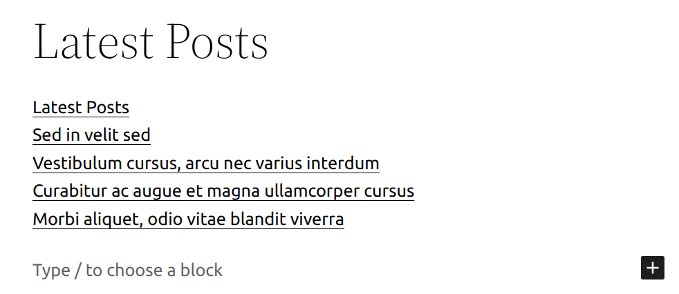
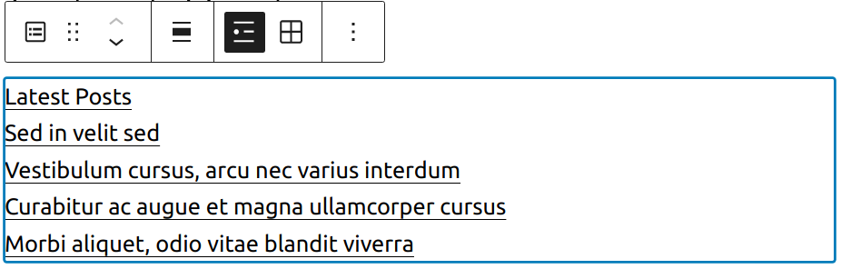
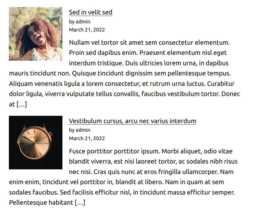
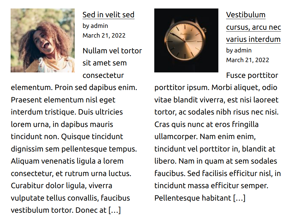
The latest posts block displays your most recent posts, making it easy for your readers to see what’s new on your blog.
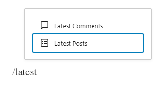
The latest posts block can be added to a page by clicking on the Add Block button. It can be found in Widgets section. Alternatively, you can type /latest and click on Latest Posts.
You can also choose the Latest Posts from the Add Block button.
Detailed instructions on adding blocks
Block toolbar
Each block has its own block-specific controls that allow you to manipulate the block right in the editor.
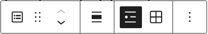
The block toolbar for the latest posts block has options for:
Changing Alignment
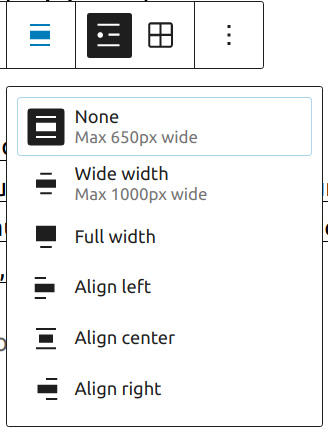
- None – default
- Wide width – Increase the width of the Latest Post block beyond the content size
- Full width – Extend the Latest Post block to cover the full width of the screen
- Align left – Make the Latest Post block left aligned
- Align center – Make the Latest Post block alignment centered
- Align right – Make the Latest Post block align right
List view (default)
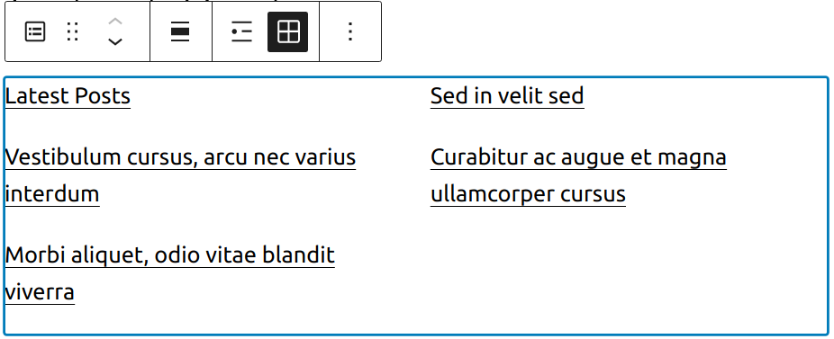
Grid view
More options
These controls give you the option to copy, duplicate, and edit your block as HTML.
Read about these and other settings.
Block settings
Every block has specific options in the editor sidebar in addition to the options found in the block toolbar. If you do not see the sidebar, simply click the ‘cog’ icon next to the Publish button.


Post content settings
You can choose to show full post content or post excerpt with the option to modify the number of words for the excerpt.

Post meta settings
Meta settings allow you to show or hide author’s name and post publish date.

Featured image settings

With Featured image settings you can select resolution, dimensions, alignment and whether you want image to link to the article itself.
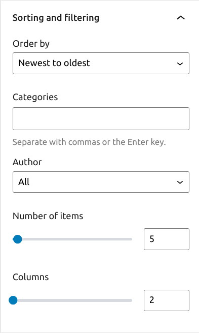
Sorting and filtering
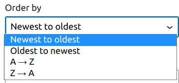
The Latest Posts Settings allow you to choose how you wish to order the posts, with choices of:
- Newest to Oldest (default)
- Oldest to Newest
- Alphabetical A to Z
- Alphabetical Z to A
You also have the option to choose a specific category or subcategory to display the posts from. You may also specify the number of posts to display (if you have fewer posts than the limit, that number of posts will show), as well as toggle the post date on and off.
If you select Grid view you’ll also have an option to choose how many columns you want grid to have.
Advanced
The advanced tab lets you add a CSS class to your block, allowing you to write custom CSS and style the block as you see fit.
Changelog
- Updated 2022-07-05
- Updated screenshots for 6.0
- Added new settings sections
- Updated 2020-12-15
- Updated Block Settings.
- Updated 2020-08-23
- WP 5.5 overall updates
- Updated images to WP 5.5
- Updates to Alignment, List & Grid View sections
- Added changelog
- Added list of blocks reusable block
- Created 2019-03-07
The Page List block allows you to display your website’s published pages in a page, post, and sidebar.
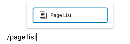
To add a Page List block, click the Block Inserter (+) icon and search for Page List.

Another way you can add the Page List block is by typing /page list and hitting enter in a new paragraph block.
Detailed instructions for adding blocks are in this support article.
Using this block on your website sidebar makes pages easily accessible to visitors. Each page name on the list links to its respective page.
Here’s how the block looks on your website sidebar:

Block toolbar
Every block has unique toolbar icons, and block-specific user controls that let you customize the block right in the editor. The Page List block has the following options on its Block Toolbar:
- Transform to
- Drag icon
- Move handles
- More options
Note: Move and Drag option is only available if you have more than 1 block in the editor.

Transform to
The Transform to button helps change the Page List block into a Group or Columns.

Drag icon
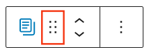
To drag and drop the block to a new location on the page, select and hold the rectangle of dots, then move it to that location. As you drag the block, the blue separator line shows where it can be dropped. When you find the desired location, release the left mouse button.

Move handles
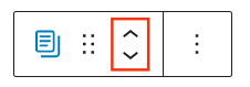
The up and down arrow icons let you move a block up and down on the page.
Here are more details on moving blocks in the editor.
More options
This control give you many other options like copy or duplicate your block, copy/page styles etc.
Read about these and other settings.
Block settings
Every block has specific options in the editor sidebar in addition to the options found in the Block Toolbar. If you do not see the sidebar, simply click the ‘sidebar’ icon next to Publish or Update button.

This block has controls categorised under Settings and Styles tab.
Settings

Parent
If you only want to list the child pages of any specific page, then select that parent page in this option. Start typing the page title and you will get the option to select.
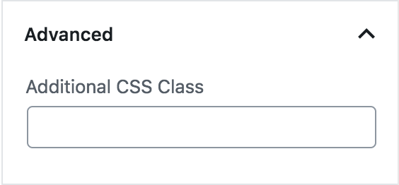
Additional CSS Class(es)
This option allows you to specify additional class(es) for the block, which can be used while writing custom CSS targeting particular blocks.
Styles
This block has only Typography settings under Styles

Read more about Typography Settings
Changelog
- Updated 2023-10-31
- Updated 2023-08-04
- Created 2022-12-12
An RSS feed is a machine-readable version of the content of a blog or a website.
With the RSS block, you can display content from any site’s RSS feed on your website. You can choose to display the Title, Author, Date, and Excerpt for each item in the feed. You can display the items in a list or as a grid in a set number of columns.
Steps to embed an RSS block
- First, you need to know the URL of the RSS feed that you want to embed. Some websites display an orange icon
 with the link of the feed. You can usually find this icon together with social network icons.
Our example uses the feed of the News section on www.ads-software.com. https://www.ads-software.com/news/feed
- Click the Block Inserter (+) icon to add an RSS block to your WordPress page/post. Alternatively, you can type /rss and hit enter in a new paragraph block to add one quickly.

Detailed instructions on adding blocks
- Paste the link of the RSS feed into the text box and click on the Use URL button

The RSS block now displays the titles of the feed items.

If you use an URL that can’t be embedded, the block shows the message “RSS Error: WP HTTP Error: A valid URL was not provided.”.

Use the options in the Block Toolbar and the controls in the Block Settings panel in your editor’s sidebar to fine-tune the display.
Block Toolbar
Besides the Mover and Drag & Drop handle, the Block Toolbar for the RSS block shows six other buttons:
- Transform To
- Change alignment
- Edit RSS URL
- List view
- Grid view
- More options

Transform to
You can transform the RSS block into Columns or a Group. Transforming to a group would give you the ability to change the background color around the embed.

Change alignment
- Align left – Make the block left-aligned.
- Align center – Make the block alignment centered.
- Align right – Make the block right-aligned.
- Wide width – Increase the width of the block beyond the content size.
- Full width – Extend the block to cover the full width of the screen.

The “Wide width” and “Full width” alignment settings must be enabled by your WordPress theme.
Edit RSS URL
Via the edit URL, you can change the RSS feed URL in the block. Overwrite the existing URL and click on the Use URL button.
List view
The List view option displays the feed items in an unordered list. Use the Block settings controls to customize the List view.

Grid view
Display the feed items in a grid. Use the Block settings controls to adjust the number of columns and the other display options.

More options
These controls give you the option to copy, duplicate, and edit your block as HTML.
Detailed instructions on adding blocks
Block Settings
Every block has specific options in the editor sidebar in addition to the options found in the block toolbar. If you do not see the sidebar, simply click the ‘cog’ icon.

Settings
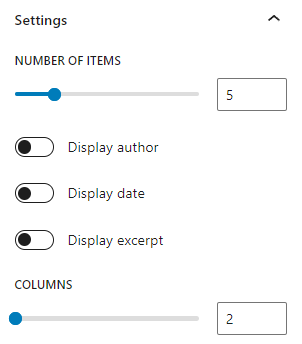
Number of items: Slider and number box to adjust the number of feed items you’d like to display. To change the number move the dot on the slider or update the number in the box next to it.
Display author: Switch on/off the display of the author’s name
Display date: Switch on/off the display of the published date of the feed items
Display excerpt: Switch on/off the display of an excerpt from the feed items’ content.
Max number of words in excerpt: Slider and number box to choose the maximum number of words that can be displayed in the excerpt. The minimum number is 10. This section is not visible if Display excerpt is in the OFF position.
Columns: Slider and number box to control the number of columns for the grid view. This option is only visible when you select the Grid view on the Block Toolbar.
Advanced
The advanced tab lets you add a CSS class to your block, allowing you to write custom CSS and style the block as you see fit.
Resources
Changelog
- Updated 2022-11-20
- Aligned images for mobile view
- Removed redundant content
- Added heading
- Updated 2022-11-08
- Updated “RSS Settings” screenshot
- Updated 2022-09-28
- Fixed font sizing under “Block Settings”
- Updated 2022-09-12
- Video walkthrough created
- Updated with images from WordPress 6.0
- Added new “Transform to” setting (Column)
- Added “Lock” information under More Options
- Added ALT tags for the images
- Updated 2022-02-08
- Update screenshots for 5.9
- Updated 2020-08-17
- Converted More Options reusable block to regular blocks
- Updated 2020-04-28
- changed category to “Widget Blocks”
- changed dates in Changelog to universal format
- Updated 2020-04-18
- Converted reusable block to regular blocks
- Added to “Core Blocks” category
- Updated: 2019-11-25
- change the first sentence and
- aligned images to the right of the text where it adds to readability
- Created: 2019-11-23 / WordPress 5.3
Use the Search block to place a search widget on your page or post.

Click Block inserter (+) icon to open the block inserter pop-up window and search for the Search block.
You can also use the keyboard shortcut /search to quickly insert a Search block.
Detailed instructions on adding blocks can be found here.
Block toolbar
To view the block toolbar, click on the block, and the toolbar will be displayed.

Every block comes with unique toolbar icons and blocks specific user controls that allow you to manipulate the block right in the editor.
The Search block shows standard eight buttons:
- Transform to
- Drag icon
- Move handles
- Change text alignment
- Toggle search label
- Change button position
- Use button with Icon
- More options
Adding placeholder text
When you add a Search block, you have an option to add placeholder text inside the search field. The placeholder text is displayed until the user starts typing in a search term in the search field.

Transform to

When you click on the Transform button you can convert the Search block into another block type while keeping the existing content.
Click on the Transform button to convert the Search block into a Columns or Group block. Group block gives you the ability to change the background color around the Search block.
Drag icon
To drag and drop the block to a new location on the page template, click and hold the drag icon, then drag it to the new location. The blue separator line indicates where the block will be placed. Release the left mouse button when you find the new location to place the block.
Move arrows

The up and down arrow icons can be used to shift a block up and down on the page.
Detailed instructions on moving a block within the editor can be found here
Change text alignment

Use the change alignment tool to align the Search block. The following is a list of the block align options:
- None
- Align left – Make the block left-aligned.
- Align center – Make the block alignment centered.
- Align right – Make the block right aligned.
Toggle search label

This button can be used to hide the search field label.
Change button position

This button can be used to change the position of the search button. There are three options to choose from:
- Button outside – the default setting.
- Button inside – the search button is part of the search text field.
- No button – removes the Search button and only displays the Search text field on the page.
- Button only – displays only the Search button and hides the Search input text field


Use button with icon
The search button can be either text or icon.

Clicking on the Search button or the Search title in the search block will display three more buttons in the Block Toolbar – Bold, Italic and More Rich Text controls.

Bold
You can select the text in the Search title or the Search button and use the Bold option or Ctrl+B / Cmd+B on your keyboard to bold it, which is usually heavier than the surrounding text.
Italic
You can select the text in the Search title or the Search button and use the Italic option or Ctrl+I / Cmd+I on your keyboard to italicize it, which usually appears slanted to the right.
More rich text options
The drop-down menu to the left of the More options menu contains a range of additional rich text editing options such as highlighting, inline code, strikethrough, and more.
Read about more rich text editing options.
More options
The Options menu represented by three vertical dots on the far right of the toolbar gives you more features such as the ability to duplicate or remove the block.
Read about these and other settings.
Block settings
The block settings panel contains customization options specific to the block. To open it, select the block and click the Settings icon next to the Publish button.

Display settings
It’s possible to adjust the Search block width with the help of the Display Settings:

Alternatively, you can drag the block itself with your mouse:

Color
The Search block provides Color settings options to change the text and background colors.
For details, refer to this support article: Color settings overview
Typography
The Search block provides typography settings to change the font family, size, appearance, line height, letter case, letter spacing, and decoration.
For details, refer to this support article: Typography settings overview
Border
The Search block provides border settings options to change border and radius size.

For details, refer to this support article: Border settings overview
Advanced
The Advanced tab lets you add CSS class(es) to your block. This will allow you to write custom CSS and styles for the block.

Changelog
- Updated 2023-08-24
- Updated screennshots and videos for 6.3
- Updated 2023-06-20
- Updated rich text options section
- Updated 2023-02-07
- Updated screenshots
- Fixed formatting
- Updated 2022-11-26
- Removed redundant content
- Updated 2022-06-16
- Updated screenshots, added video for 6.0
- Updated content for 6.0
- Added ALT tags for images
- Updated 2022-06-06
- Update settings screenshot for 6.0
- Add “Use button with icon” section
- Updated 2022-02-04
- Updated screenshots to 5.9
- Created 2020-12-03
A shortcode is a WordPress-specific code that lets you do nifty things with very little effort. Shortcodes can embed files or create objects that would normally require lots of complicated, ugly code in just one line. Shortcode = shortcut.
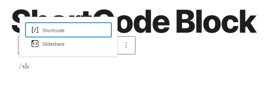
The shortcode block can be added to a page by clicking on the Add Block button. It can be found in Widgets section. Alternatively, you can type /shortcode and press enter.
Detailed instructions on adding blocks
In this video, you can see how you can use the short block and the different settings to modify how your content will appear.
Block Toolbar
Unlike other common blocks, the shortcode block does not include any specific settings in the block toolbar or editor sidebar.

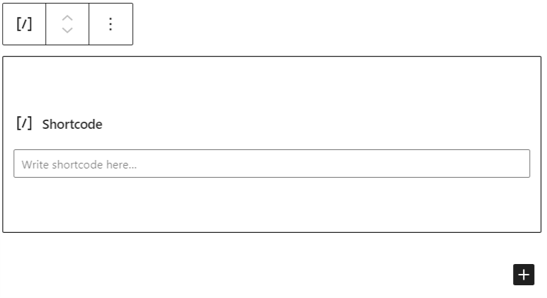
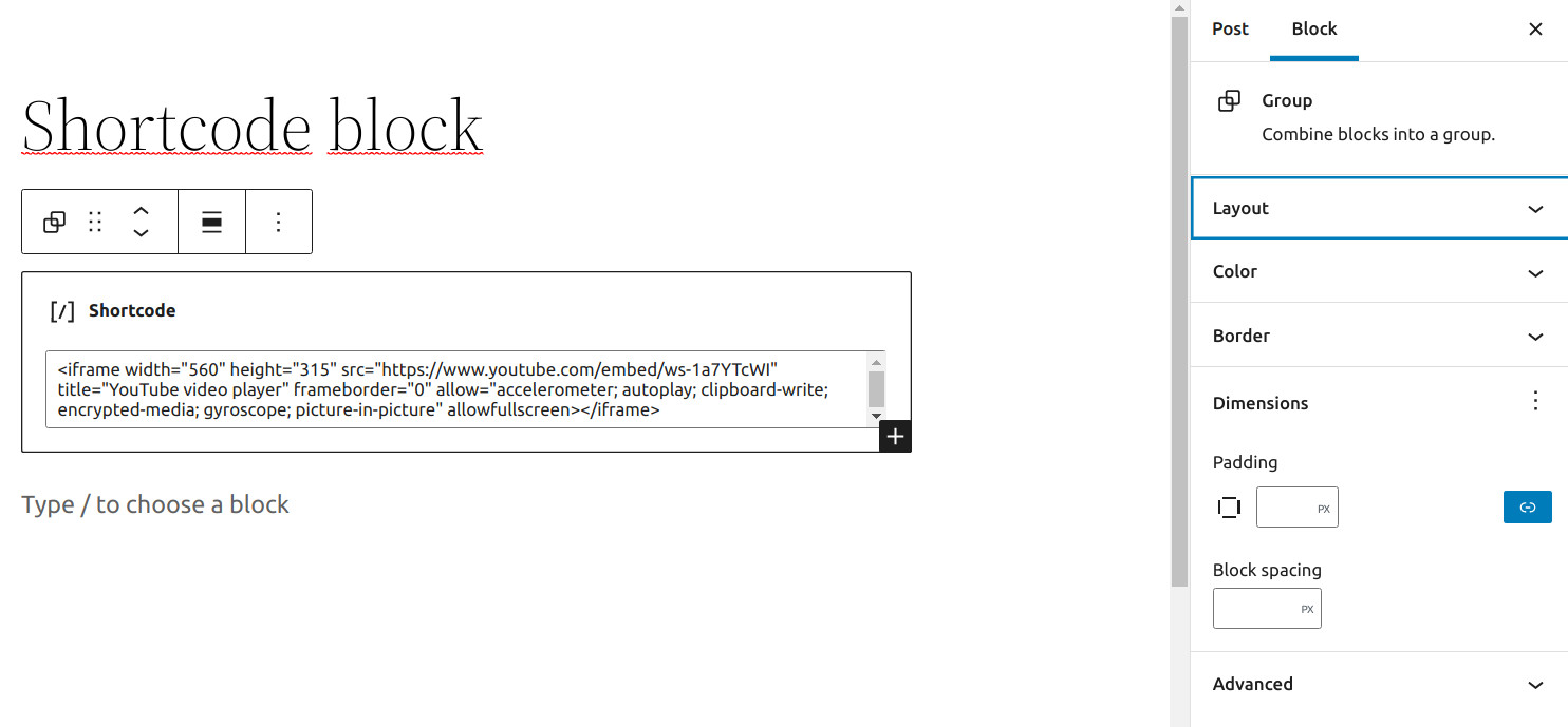
Writing Your Shortcode
You may type your shortcode into the box provided or paste it from the available shortcodes.
More Options
These controls give you the option to copy, duplicate, and edit your block as HTML.
Read about these and other settings.
Block Settings
Every block has specific options in the editor sidebar in addition to the options found in the block toolbar. If you do not see the sidebar, simply click the ‘cog’ icon next to the Publish button.
As you can see, the shortcode block doesn’t include specific settings in the block settings.

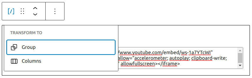
You can transform a shortcode block into a group or into a columns, so you can further apply custom settings to the block.
Color
Text and background colors can be set on a per-block basis, allowing you to call attention to important content.
Via the “Custom Color” link you can further modify the color choice.
See this guide for more information about changing colors.
Accessibility parameters are built into the new editor to warn you when the text may become illegible for persons with reading impairments.
Advanced
In the advanced panel of the block options, you’ll see options for HTML Anchor and Additional CSS Class.

“HTML anchor” allows you to make a unique web address for a particular Heading block. Then, you’ll be able to link directly to the Heading block of your page.
The “Additional CSS class(es)” lets you add CSS class(es) to your block, allowing you to write custom CSS and style the block as you see fit.
Changelog
- Updated 2022-11-27
- Added alt text to images
- Removed redundant content
- Updated 2022-02-04
- Updated 5.9 screenshot
- Updated 2020-09-07
- Updated 5.5 screenshot
- Added block settings
- Added changelog
- Added more options
- Added go to list block
- Created 2019-03-07