• 1. It took me a long time to figure out, but I discovered that the font weight of the default Headings in Source Serif Pro of your example website https://2022.wordpress.net/ show up differently on a Windows computer than on a Mac. On a Mac Headings 1-4 show up with line weight of 300 (Light) as it is set, but on a Windows laptop, the same Headings appear with a heavier line weight of probably 400 (Regular). I tried several browsers on Windows 10 (Firefox, Chrome, Opera) and Windows 11 on Firefox, with all the same results.
    I find the 300 weight elegant, and the 400 not at all.
    Is this a bug of the theme? Or a way to fix this?

    2. This is my first time working with a block editor and site editor. I have the impression that these will be more developed. It takes some time getting used to, and some things might be easier to fix with CSS. Though, if I would want the option to add a few CSS changes with Appearance > Customize, do I need to make a child theme?

Viewing 12 replies - 1 through 12 (of 12 total)
  • I’ve noticed two other things that are Windows-specific and are probably part of the same phenomenon:

    1. Inline HTML in post titles does not render in Windows, but does in Mac or Android. For example, if I enter this as the post title:

    White Clover (<i>Trifolium repens</i>)

    —the scientific name is correctly rendered in Android and on a Mac, but not in Windows (and, as sunnycloud mentioned, the weight is wrong).

    2. After I tweaked the typography in the “Styles” section of the site editor, all inline markup stopped rendering in Windows, even in the text of the posts. The buttons hovering over the paragraph show the “i” button pushed for “italics,” but the text is not rendered in italics either in the editor or on the front end. But it still renders in Android (haven’t been able to try Mac yet). I was about to ask about this bug, and probably would have got into a long and baffling conversation with sensible people using Mac and Linux computers who couldn’t reproduce it, but sunnycloud’s post here made me check whether it was Windows-specific. Apparently it is.

    Thank you for reporting this @sunnycloud and for the additional details @cbaile19.

    I did a few tests (I used Browserstack to test this on Windows) but I am not sure I can replicate the issues your describe:

    Source Serif Pro of your example website https://2022.wordpress.net/ show up differently on a Windows computer than on a Mac. On a Mac Headings 1-4 show up with line weight of 300 (Light) as it is set, but on a Windows laptop, the same Headings appear with a heavier line weight of probably 400 (Regular)

    I see what you mean:

    Chrome win

    This is what the headings look like across all browsers. I believe this is a design choice to style H5’s and H6’s in a different way, but they look consistent across all browsers. I could not find any open issues for this in trac but if you think this should be changed, you can open a discussion there.

    Inline HTML in post titles does not render in Windows, but does in Mac or Android.

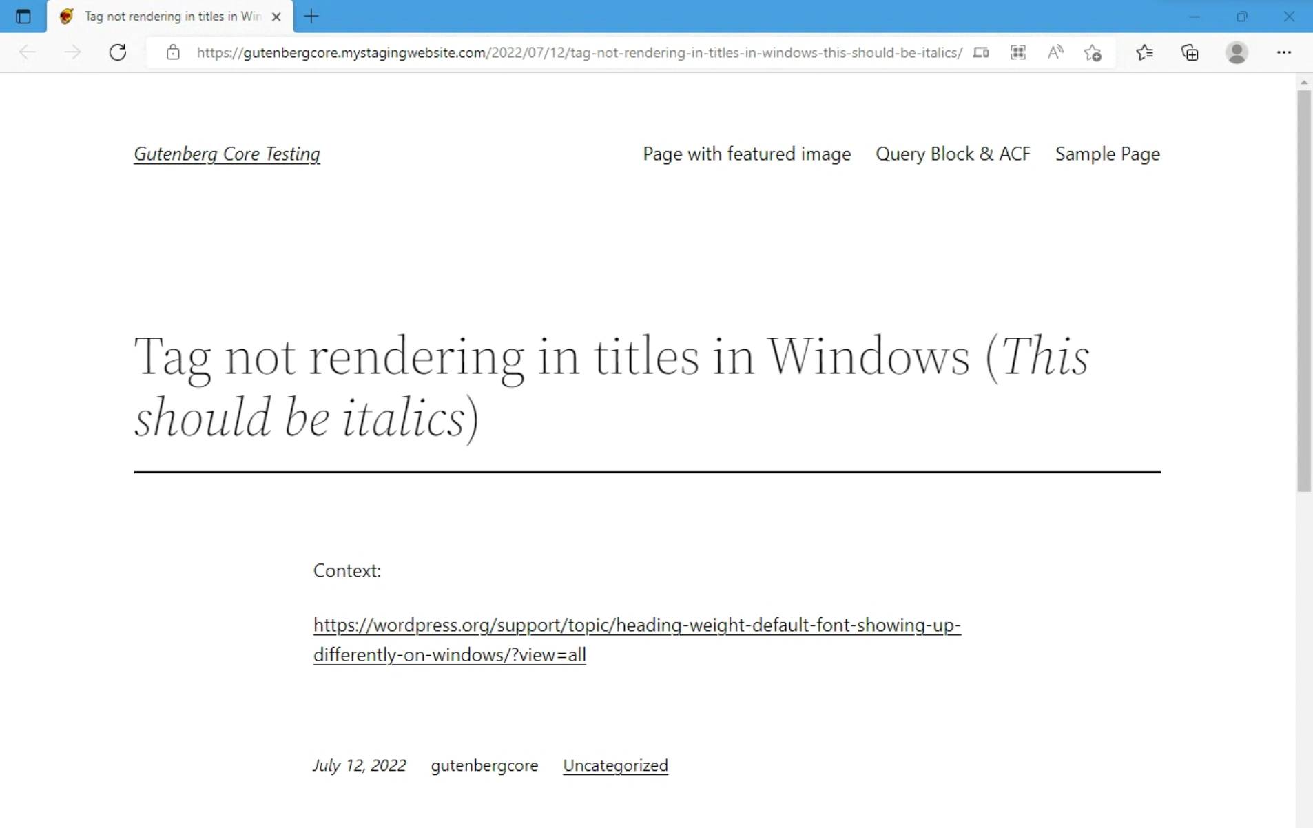
    I tested this on windows but the italics tag seems to apply correctly (below is an Edge on Windows example):

    Edge win italics

    If you can still reproduce this @cbaile19, could you share a link to a screenshot to illustrate how it looks on your end?

    After I tweaked the typography in the “Styles” section of the site editor, all inline markup stopped rendering in Windows, even in the text of the posts.

    Could you share more on what tweaks you applied so I can try to reproduce this?

    Thank you!

    Thread Starter sunnycloud

    (@sunnycloud)

    Hi @mrfoxtalbot, thank you for your efforts to investigate the issue.

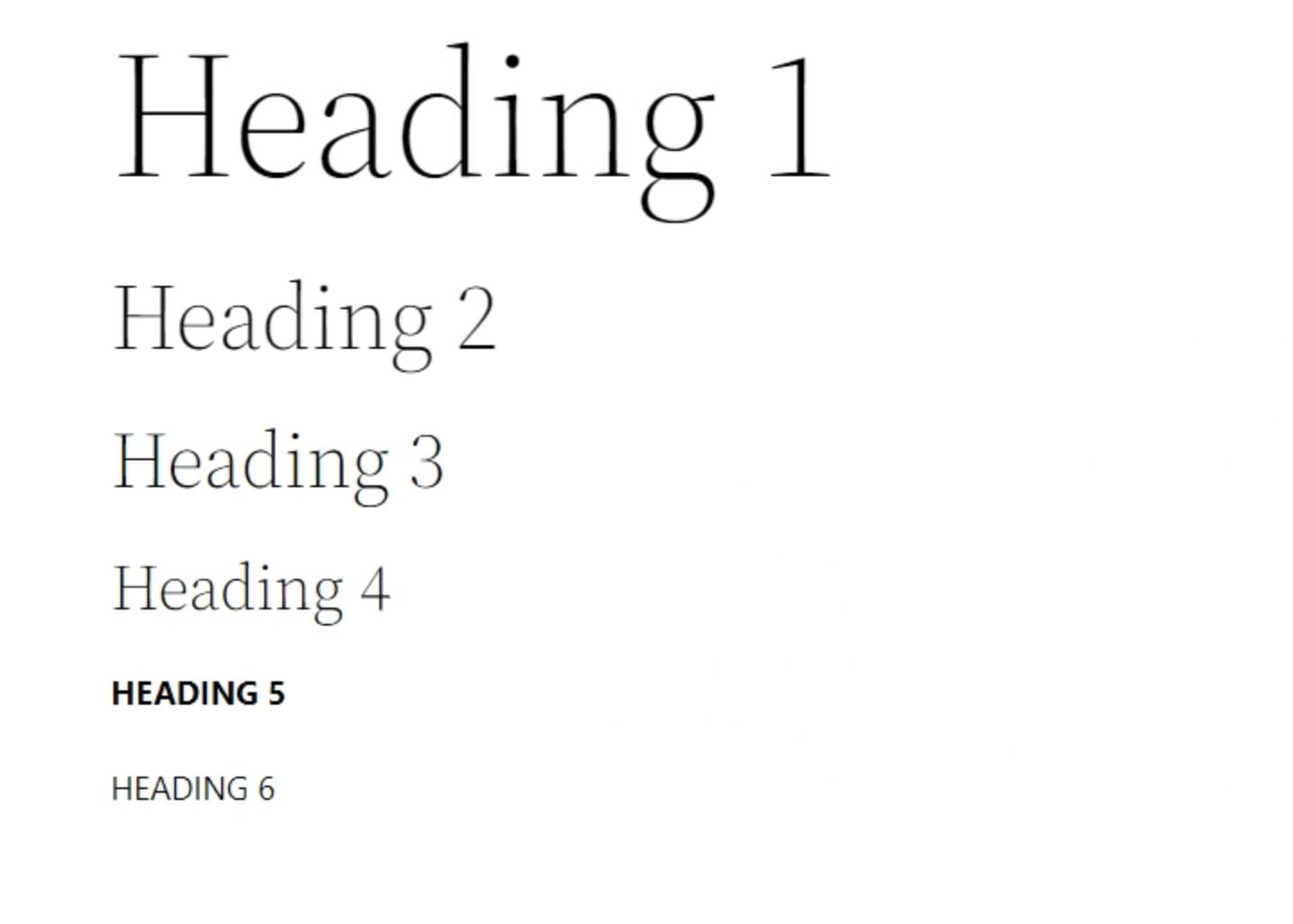
    The screenshot you show is not what I see on my end. Here is a screenshot of what I see on a windows device:

    screenshot

    As you can see, all default Headings 1 to 4 show up at weight 400 instead of 300, even though they are set at 300. I tested this on different browsers: Firefox, Chrome and Opera. I tested this on 2 Windows laptops.

    When I test this on a Mac laptop or an Android phone, the default headings show at the correct weight 300, as it is set.

    Would you be able to test this on a real Windows device? Maybe Browserstack isn’t a reliable way to replicate this specific issue.

    Thank you!

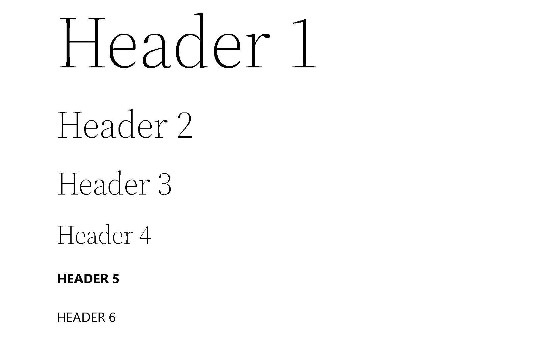
    Thank you for your reply @sunnycloud. I asked someone with an actual Windows computer to test this for me and they confirmed they are getting the same results as I am seeing using Browserstack. They shared this screenshot:

    Tt2 headers

    Could it be the case that this is only happening in your local computer due to local browser and/or fonts preferences?

    Have you had the chance to test this using a different Windows device?

    Thread Starter sunnycloud

    (@sunnycloud)

    Hi @mrfoxtalbot

    Thank you for checking it out on a genuine Windows device.

    It’s odd that I’m having different results. Makes me wonder why. I tried 2 windows devices and 3 different browsers. Anyway, good to know that what I’m seeing is not how it appears generally.

    I was wondering if you could also shed a light on my second question?
    This is my first time working with a block editor and site editor. It takes some time getting used to. I understand the purpose of it is to work without code, but sometimes helpful to add CSS fixes (besides the CSS in the editor, which does not seem to work for me anyway). So I was wondering, if working from a child theme of 2022 would allow the option to add a few CSS changes with Appearance > Customize?

    Moderator Kathryn Presner

    (@zoonini)

    Hi @sunnycloud – you don’t need a child theme to add custom CSS.

    By visiting your site and adding /wp-admin/customize.php after it, you should gain access to the Customizer, where you can add custom CSS in the Additional CSS panel, as usual.

    Moderator Kathryn Presner

    (@zoonini)

    Hi @sunnycloud, I just came across another thread discussing font weight on Windows machines.

    It’s odd that I’m having different results. Makes me wonder why. I tried 2 windows devices and 3 different browsers.

    Do you happen to have Source Serif Pro/normal weight installed on those machines? If so, it’s possible that this is the issue. If you’re able to try uninstalling that font on one of your machines temporarily, could you tell me if that solves the issue and gets the lighter weight to show up? That would confirm the theory that this is happening only on Windows machines that have this font/weight installed.

    Please let me know, thanks!

    Moderator Kathryn Presner

    (@zoonini)

    I went ahead and reported this as a bug here:

    https://core.trac.www.ads-software.com/ticket/56332

    It’s probably because of the local("Source Serif Pro"). If you wan to verify without uninstalling the font, you could try this in the Customizer’s Additional CSS:

    @font-face{font-family:"Source Serif Pro";font-style:normal;font-weight:200 900;font-display:fallback;src:url('/wp-content/themes/twentytwentytwo/assets/fonts/source-serif-pro/SourceSerif4Variable-Roman.ttf.woff2') format('woff2');font-stretch:normal;}@font-face{font-family:"Source Serif Pro";font-style:italic;font-weight:200 900;font-display:fallback;src:url('/wp-content/themes/twentytwentytwo/assets/fonts/source-serif-pro/SourceSerif4Variable-Italic.ttf.woff2') format('woff2');font-stretch:normal;}

    (If your site uses a subdirectory, that needs to be in both url references.)

    Thread Starter sunnycloud

    (@sunnycloud)

    My apologies for this late response. I forgot to check the thread until now.

    Thank you Kathryn @zoonini, for your swift and adequate response.

    Yes, removing Source Serif Pro from my fonts in Windows does fix the issue!

    Thank you @sabernhardt for the temporary workaround. It works like a charm!

    ****

    In addition, there is apparently also an issue with Headers 5 and 6. Though this is not as important as the previously discussed issue, as I found a simple workaround.

    Default Headers 5 and 6 both show up as Segoe UI Light (see my screenshot shared earlier). Whereas I noticed in screenshot above from @mrfoxtalbot, Header 5 is supposed to be Bold and Header 6 Regular.

    This must be different type of issue than H1 – H4, because I can clearly see the correct Header 5 and 6 in the test page of @elbsegler.

    As mentioned, I found a simple workaround. When I manually change Header 5 in the block editor to Bold, and Header 6 to Regular, they show up as such in frontend.

    Moderator Kathryn Presner

    (@zoonini)

    Hi @sunnycloud Thanks for confirming that Stephen’s workaround… works!

    As for the H5 & H6 issue, I’m glad you found a workaround in the editor.

    If you’d like to troubleshoot further, do you have any versions of Segoe UI installed on your PC, and does deactivating them temporarily as a test solve the issue?

    Thread Starter sunnycloud

    (@sunnycloud)

    Before using @sabernhardt workaround I removed Segoe UI, which resulted in the correct font weight.

Viewing 12 replies - 1 through 12 (of 12 total)
  • The topic ‘Heading weight default font showing up differently on Windows’ is closed to new replies.