• Hello, despite showing wrapping correctly on the Gutenberg editor, when I align the image block right or left so the text wraps, the paragraph ignores it instead and is under it in the actual page. Also the image size is always the same instead of the one changed in the editor. I’ve been searching for a working solution for hours with no success so far.

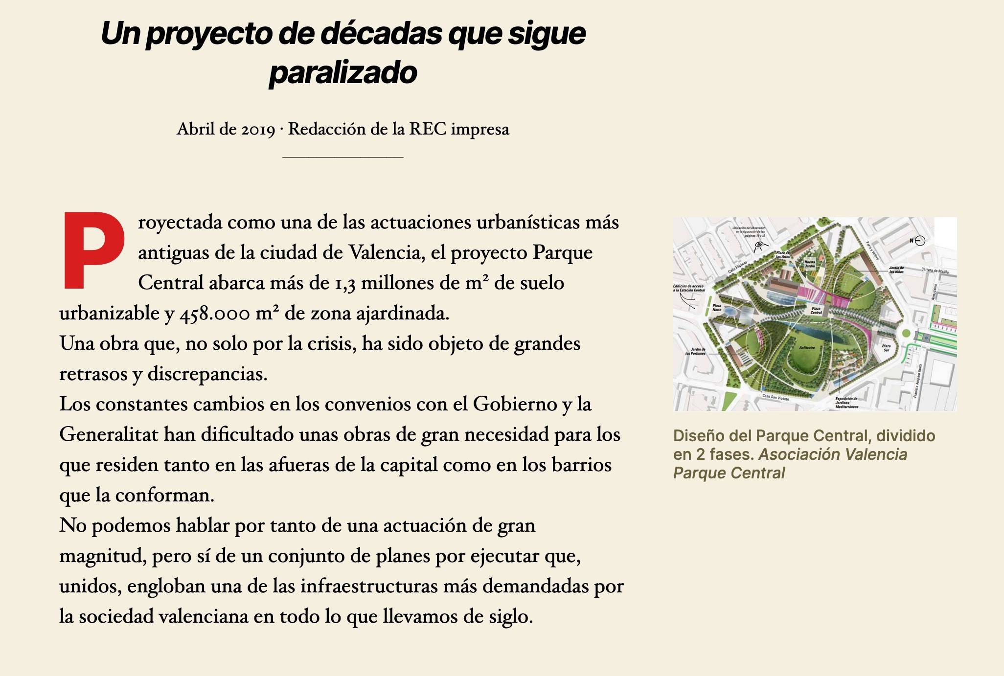
    What I see in the editor
    What the page looks like actually

    Thanks for any help.

    • This topic was modified 2 years, 2 months ago by cl415.

    The page I need help with: [log in to see the link]

Viewing 6 replies - 1 through 6 (of 6 total)
  • Moderator Kathryn Presner

    (@zoonini)

    Hi @cl415, the issue is coming from your custom CSS. I can see this by temporarily removing your custom CSS in the browser inspector, and observing that the wrapping is correct then.

    You’ll need to rework this to fix the issue:

    .entry-content > *:not(.alignwide):not(.alignfull):not(.alignleft):not(.alignright):not(.is-style-wide) {
        max-width: 70%;
    }
    .just {text-align: justify}
    /*Img Wrap*/
    .alignright, .alignleft {
    min-width: 33rem !important;
    }
    @media screen and (max-width: 600px) {
    .alignright, .alignleft {
    float: none !important;
    margin: auto !important;
    text-align: center !important;
    }
    }
    Thread Starter cl415

    (@cl415)

    Thanks for your answer, @zoonini . In my case, when I remove the CSS I don’t see any wrapping, only the text returning to the default block width of the theme (result of the first lines of the CSS) so it doesn’t overlap with the picture, which stays the same despite being set to be way bigger (1000px wide so I could test the wrapping).
    I don’t know if it could be that my screen is wider than usual, if the small image size is something forced by the theme or something else but right now I’m not able to see any wrapping as the image size I set on the editor is apparently ignored.

    Thanks for any help!

    • This reply was modified 2 years, 2 months ago by cl415.
    Moderator Kathryn Presner

    (@zoonini)

    Right- and left-aligned images in Twenty Twenty are designed to be small, and outdented.

    You can see how it’s designed to look by removing your custom CSS:

    Estacio n central de Valencia Revista de Estudiantes de Caminos

    This is entirely by design: it’s how posts are meant to look in this theme when you choose right- or left-alignment on images.

    I understand you may not like this design, though, and are trying to achieve a more conventional text-wrapping look by adding custom CSS. ??

    Hopefully this helps point you in the right direction for rewriting your CSS.

    If you still get stuck, let me know and I can try to have another peek.

    Thread Starter cl415

    (@cl415)

    Thanks for your help, @zoonini . If I understood you right, there is no way to place bigger images with text wrapping around them as I intended and the first picture shows, because the theme prevents it.
    If that is the case, I won’t rewrite the CSS as the wider text that causes the overlap is something I want and the imagery is too small anyway; I’ll simply avoid using images with side alignment and resort to workarounds with columns and other stuff.
    If there is, on the other hand, some way to overcome the theme limitations on image size and placement, I’d be very grateful to know.
    Thank you very much for your help.

    Moderator Kathryn Presner

    (@zoonini)

    You could increase the content width on wider screens pretty simply by using the Options for Twenty Twenty plugin, when then writes a bunch of CSS for you behind the scenes.

    The content-width option is found in the Content Options area in the Customizer:

    Customize Self hosted Test not just another fake company

    And then you could this custom CSS in addition to that, to increase the size of left- and right-aligned images on wider screens, modifying the 500px image width as you prefer:

    @media (min-width: 1280px) {
      .entry-content > .wp-block-image figure.alignleft, 
      .entry-content > .wp-block-image figure.alignright {
        max-width: 500px;
    }
    Thread Starter cl415

    (@cl415)

    Thanks for your insightful suggestion, @zoonini .
    Unfortunately, the installation of plugins is not allowed by the site hosting.
    Thank you, nevertheless.

Viewing 6 replies - 1 through 6 (of 6 total)
  • The topic ‘Text won’t wrap around images’ is closed to new replies.