• Resolved rvjenterprises

    (@rvjventures)


    Hello, All,

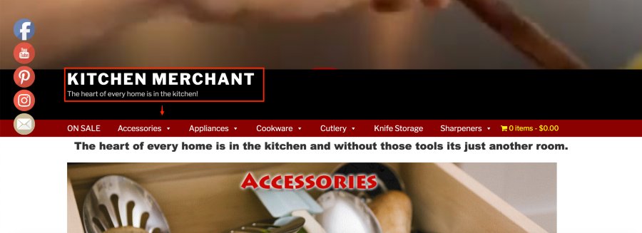
    I’ve been racking my brain out trying to figure out how to remove the gap I’m experiencing on my WP Twenty Seventeen theme for my website between the .

    https://kitchenmerchantstore.com

    If anyone can offer some assistance, it would be greatly appreciated.

    Thanks.

    The page I need help with: [log in to see the link]

Viewing 4 replies - 1 through 4 (of 4 total)
  • Moderator Kathryn Presner

    (@zoonini)

    Hey there @rvjventures – I’m not 100% sure which gap you’re trying to adjust, I think something might have gotten cut off in your post.

    Are you wanting to move your site title and tagline down a little more in this area so that it’s a bit more vertically centred within the black strip?

    Kitchen Merchant The heart of every home is in the kitchen

    Or are you trying to do something else, in which case, could you please provide a screenshot so I can better understand your goal? Thanks!

    Thread Starter rvjenterprises

    (@rvjventures)

    Hello, Kathryn,

    Yes, I want to center the site title and tagline between the black area.

    I tried everything thru css and using the browsers element inspect but I just can’t figure it out.

    Thanks.

    Moderator Kathryn Presner

    (@zoonini)

    Hey there – this CSS should center the text vertically by adding a bit more space above the site title, on wider screens:

    @media screen and ( min-width: 48em ) {
        .custom-header .wrap {
            margin-top: 30px;
        }
    }

    I think this looks good visually, giving the design a little more breathing room, so I’d recommend this over removing space in this area.

    Let me know how it goes.

    Thread Starter rvjenterprises

    (@rvjventures)

    Great, Thank you!

Viewing 4 replies - 1 through 4 (of 4 total)
  • The topic ‘Gap btwn Header and menu’ is closed to new replies.