Hello! First of all i found your theme while searching for something light, clean and fast and this Theme does that job seamlessly! Could anyone please help me with what is needed to create the separator line with “read more” etc. at the boom of this page: https://headthemes.com/head-blog-demo/
from inspector i see this:
.widget-title {
    font-size: 18px;
    position: relative;
    width: 100%;
    clear: both;
    margin-top: 10px;
    margin-bottom: 10px;
    text-transform: uppercase;
    display: inline-block;
    text-align: center;
padding: 0 15px;Hi,
we really love your theme. But we wanted to change the font size of our Heading “VeganNomads” so it fits also on mobile devices. Do you have any advices?
Thanks for your help:)
]]>Hi.
In content.php in line 2 then
<div <?php post_class(); ?>>
remains unclosed.
I think it needs a </div> at line 39
Hi.
Thanks for the great theme.
I noticed that in content.php, line 33 is a Stray end tag h2
Bests
Lena
Hi, after upgrading to WordPress 6.0 each Page shows as ‘no content’. Website header, background, widgets , menu items etc are all still intact, but clicking on any page just shows ‘nothing found’. Any ideas? thankyou
]]>The title image on mobile devices is not scaled, but simply cropped! It turns into a piece of a banner in the form of a square, which is very ugly! Disgusting! How to fix it?
]]>εχω εγκαταστησει σαν θεμα το head blog to σιτε ?χει αν?βει κανονικ? αλλα τα αρθρα συνεχιζουν και ε?ναι localhost
]]>I am not a fan of the brown category don’t colour and the search button bg colour. Can we change this?
]]>I would like to change the font to Georgia or something. Can I do this?
]]>I feel like my header image is too stretched in mobile view, making it look blurry. Can I reduce the height in mobile view?
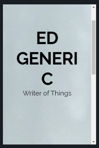
]]>Created a website using your theme with the name “Ed Generic”. In customize, previewed the site at phone size. The above URL is a screenshot of the result. Fortunately, this is not an accurate simulation of how it appears on a phone screen, because the latter looks fine. Unfortunately, it’s not an accurate simulation of how it appears on a phone screen, because it is supposed to be accurate. I suspect it’s resizing the text based on the width of the window including scrollbar?
Hello!
I just created my first website, and I’m using Hestia; I uploaded a picture of myself to the website in the Big Title section, but it’s not displaying on Mobile. Could someone let me know what the problem might be and how to resolve it? I’m using a Oneplus 6T, if that helps.
Thanks,
V.
Hi all,
I can’t change in any way the border color which appears hovering each button of the navbar and the static border which signs the “active menu button”.
Any clue?
Thanks in advance!
Hello,
I did a header image 450 x 2000 px, as requested. When I am on a computer with a smaller screen, the image is cut.
How can I get it shrinked based on the screen’s width?
Thank you in advance for your help.
Tisaya
hello, i just want to know if it is possible to delete this empty box I have on every of my pages between the content and the “word press cpoyright”.
]]>Hello everyone!
I am currently helping my mom set up a website and I am almost finished. The big problem I am encountering is that the title and the sub-title (not sure what the word for it in english is) is not adapting properly when used on a mobile phone. I’ve tried adding extra CSS but I think the title is too long and even when I managed to make the font turn smaller on phones, it is still too long of a word and I don’t know how to change it. Also the sub-title explaining what the page is about disappears when resized to fit phones.
I’m sorry for my ignorance on these subjects but I really need to fix this and I would love any help I could get.
Thanks!
]]>Hi all,
I’ve just started building my first site, and naturally, I’m trying to get the background structure looking pretty before loading content. I found a theme (Head Blog). I cropped myself a header image, and found an appropriate textured background image. I found that my Menu looked a little weird, so I downloaded the Max Mega Menu Plugin. Set up the Menu colour, stretched it down to remove some of the white space underneath the menu and above the background image/site content.
Here’s the site as it now stands. [url]www.munitora.com[/url]
But now I’m a bit stuck. Firstly, I’ve got these white bars either side of the menu. Nothing I do in tweaking the menu or the background image seems to affect it. So how do I get rid of it? Ideally, I’d like to fill it in like the rest of the background image.
Secondly, when I view the site as if from a tablet, the lines between the different menu options don’t line up. Is it possible to make it so they do. I already had to set the item spacing quite high to ensure they weren’t all clumped up. I’m happy to delete that if there’s another way of making the options equally space throughout the menu.
Many, many thanks for any help offered.
]]>Hi, On mobile devices, the header image of my website takes up the whole screen. Therefore for mobile devices I’d like to hide the header image so viewers can see my website clearly in their devices.
In Appearance => Customize => Additional CSS I have added this code but Menus was also disappeared alongwith header image:
@media only screen and (max-width: 768px)
{.site-header { display: none !important; }
}
So what does the CSS need to be to hide the header image for mobiles please (making sure the menu buttons will display properly).
]]>I upload a featured image to my posts, so the image shows in the homepage. However, because my posts contain embedded podcasts the image shows up twice – once as the featured, once as the podcast episode.
Is there a way to have a featured image only appear on the homepage, and not on the post page?
]]>I’m trying to centre the blog subscription widget in my footer – it is currently left-aligned.
Thanks!
]]>My header image is full screen, which I like on the homepage. However, it’s really annoying when I click on any other page that the whole screen is taken up with the logo again, and users have to scroll down – on every page.
Is there a way to have it full screen on the homepage, but either not present or much slimmer on all other pages?
]]>I would like to display the full text of my current post and excerpts for the following on my Posts page. I have seen this on other sites but find no way in the Theme customization to make it happen. I have looked at the php and it looks pretty complex as is. Anyone have ideas.
]]>I would like to move the Site Title and description further to the left on the header image instead of centered in the container. Have tried several options but all seem to break the responsiveness of the image. Any suggestions are welcome.
]]>The header image does not display properly on mobile? I have set WP Touch to take over temporarily so you may need to switch to desktop mode on a mobile device to see what I mean. Any help would be greatly appreciated.
]]>Hi, Is there a quick and easy way with this theme to remove/edit the wordpress copyright information? I am slowly migrating my site to word press but want to keep my professional footer as per my original site see https://natalchoices.co.uk/
Many thanks!
]]>Is there anyway to view the blog posts differently? I.E side by side in columns rather then huge posts in one big column?
Also, the Author on each post is displaying in CAPITALS and it’s rather unnecessary. This isn’t how I’ve inputted my name and it’s not how it shows up anywhere else. Is there a way to prevent this forced uppercase?
Thank you
]]>Is there a way to change the header height in this theme? I’ve decided I would like the header much slimmer than it currently is.
Nay help would be much appreciated.
]]>Hi
I’m struggling with RTL support in paragraphs with words in RTL language and English.
When i save a new post, those paragraphs get messed up.
I then select all the text in the post and try to do paragraph -> Right to left. i see that Left to right and right to left are marked. I choose only Right to left, everything looks good, save draft, everything messed up again.
On mobile the header image takes up the whole screen. Therefore for mobile devices I’d like to hide the header image so readers can see my blog post title without having to scroll down.
In Appearance > Themes > Edit CSS I have added this code but to no joy:
@media only screen and (max-width: 768px) {
.header_bg { display: none !important; }}
So what does the CSS need to be to hide the header image for mobiles please (making sure the menu buttons and blog post itself then move up the screen to fill the gap).
]]>Hi all,
I can’t change in any way the border color which appears hovering each button of the navbar and the static border which signs the “active menu button”.
I’ve changed every single html code color in each css but still I keep getting the same color!
Any clue?
Thank you.