By-the-way, this developer has created a whole “swiss army knife” range of additional plugins for Gutenberg: Flexible Spacer Block, Flexible Table Block and more.
Well done, thank you, and keep up the great work, Very Best Wishes!!!!
]]>Now, this works nicely on desktop for the typing texts I have configured it for, but on mobile devices, the width of screen is narrower so there’s more line breaks and thus the “typing text” keep pushing the rest of the page up or down every time a new “typing text” word changes.
So, how do I:
1. Create an alternative “typing text” version that is shown on mobiles only?
2. Optionally simply use a text that is not “typing text” on mobiles only?
3. I can think of perhaps using the “lemmony-mobile-hidden” and “lemmony-desktop-hidden” if that is a good way of doing it? But it would perhaps be better if each page had an optional “mobile version” that can be edited, so that shortcodes like that doesn’t need to be used (they feel more like a hack than a normal functionality?) But please keep them as they are needed either way.
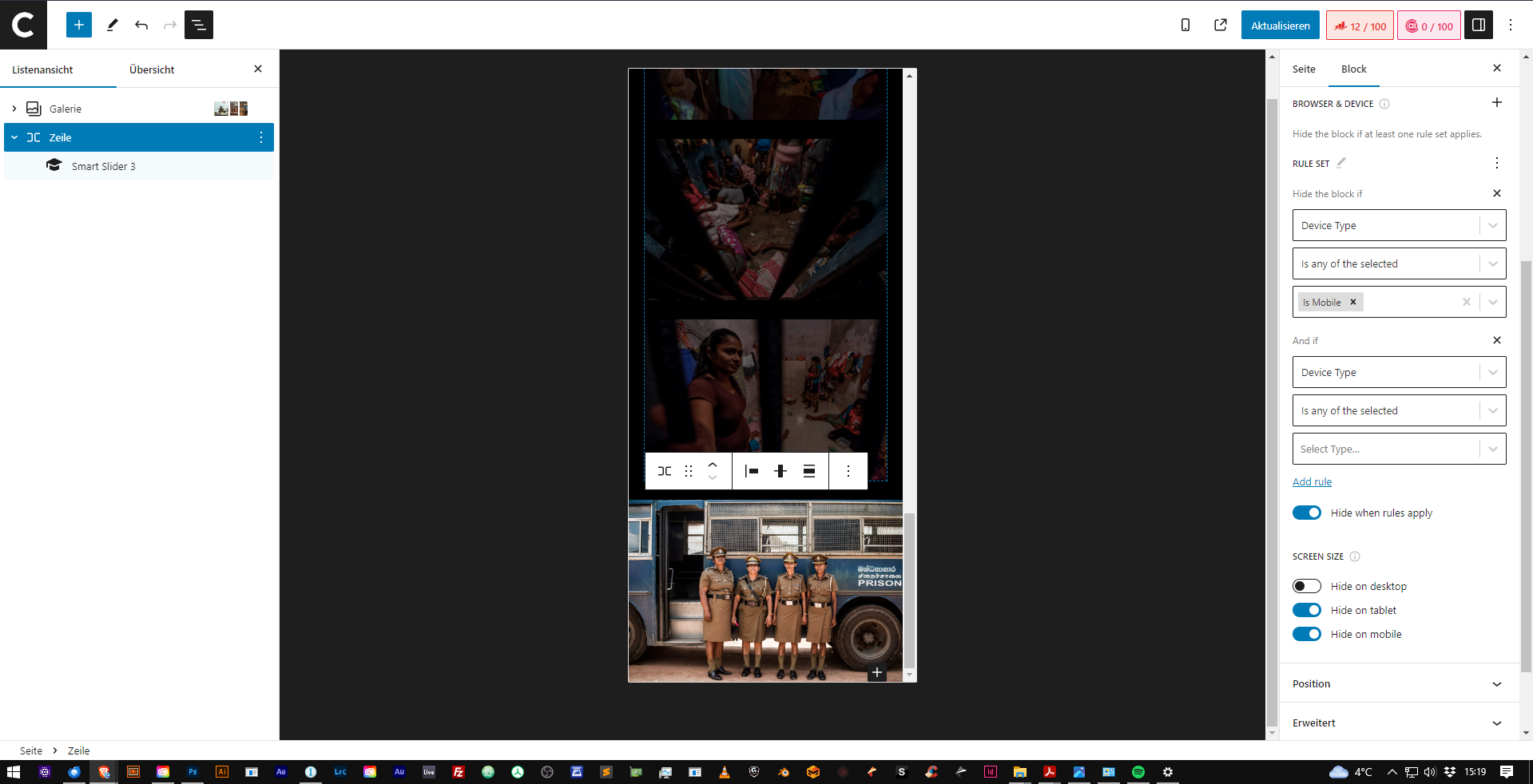
After updating the plugin, the visibility controls don’t apply to mobile or tablet anymore for subpages. Desktop visibility however does work. Is it due to incompatibility with Smart Slider? It does work however for the header including the navigation menu for small devices vs desktop.
Thanks in advance.
I’ve created a very simple website for an independent artist with the use of the “Block Visibility” Plugin – unfortunately, I’m now facing [EDIT]
[Edit ] This issue solved itself: I don’t know why or how.
On gallery subpages, I have a slider for the desktop variant of the site, as well as a straightforward gallery to scroll through. I am facing the same here, both elements are visible.
I’d be more than happy if somebody could advise me on this issue. Thanks in advance.
]]>
I am using the following:
Generatepress – version 3.3.0
Jet Pack Boost – with image guide switched on
TinyPNG for image compression
WordPress image sizes are set to Large – 1200 x 1200, Medium 300 x 300 and Thumbnail 150 x 150.
Generatepress – customize, blog, images for Archives, Posts & Pages are set to 500 x 300
Is there a particular size I should be using as the ‘featured image’ (landscape) on each post? I ask because when I look at my home page [ https://superbsalt.com ] on my desktop the images appear to be okay.
BUT, when I view an individual post such as [ https://superbsalt.com/best-substitutes-for-garlic-powder/ ] the image guide is saying they are too large. Also, it affects images included within the post (portrait).
I have also noticed that if I reduce my desktop screen size the file dimensions for the image get worse. Does that make sense?
I have 54 articles already published but I feel this needs to be addressed before I publish any more.
Also Ahrefs indicates that the ‘html to text ratio’ is wrong – not sure if I need to open another query for that too???
Can someone please let me know what am I doing wrong?
Thanks for looking at this.
]]>I was wondering if any word press experts could please assist me with my issue that i’m having on my website.
I know that all screens, desktop and laptop are automatically set to 100% screen size view. However, when my laptop 15 inch is set to 100% the content of the website appears to be zoomed in, making the site (widgets, menu, layout size) look out of place, only if the laptop screen size is set to 80% does it then look normal. Though on my 24 inch desktop, the 100% screen view is all perfect. I know you make changes for phone, tablet and dektop, but i’d like to know how to make the website responsive for all different desktop screen sizes, big and small.
How do I do this?
Thanks in Advance,
Laikha
Now I’m facing a problem that the image shrinks too much on mobiles and isn’t good. I’d like to show a cropped version of the image on mobiles and tablets.
I’ve searched and not found any plugin that will do this, so it looks like it’ll have to be CSS – but how would I specify the different images? I can only think of using background-image but then the HTML element would have no height. I figure this would be the best media query:
@media (max-width: 768px) {
	.my-image {
		something: ???;
	}
}

@media (min-width: 769px) and (max-width: 1024px) {
	.my-image {
		something: ???;
	}
}

@media (min-width: 1025px) {
	.my-image {
		something: ???;
	}
}I have a page that embed an online calculator on my website. This page is html inserted into a wordpress page. The code I was given to embed has fixed width and height.
While my Customizr them is fully adapting to different devices, this “widget” (it truly is more of a software) doesn’t and remains the same size.
I absolutely need it to be responsive to phones in particulars, and have the chart produced by the calculator to be zoomed out and fit on a phone screen automatically.
The author of the software tells me that the part called “luck pillars”, the longest part of the chart, is dynamically produced by javascript and is probably what causes problem. He however doesn’t have the time to help me. I would really appreciate your assistance as I need this page to work properly…Thank you! ]]>
https://i.gyazo.com/6eba93f0a8510b5ef8f0c6ab119eeee5.png IPAD
So the problem in the pictures is that when the screen is between 600px and 781px big, the pictures and the text flip out.
My solution for this is to make some css code that does so it looks the same on phone until 781 px big. So I put an ID on the column, there are 3 columns, 2 empty ones because I had a hard time getting the middle part where I wanted it to be.
The empty ones have ID “hide1” and the css code for them are:
@media screen and (max-width: 781px) {
#hide1 {
display: none;
}
}
I put this in because I first thought this was the problem, but it didn’t help much.
Now Im trying to get css code that will actually help me, I found the stuff in the google chrome inspect element, but have no clue how to make css code for it.
I IDd the column that I want to make the css code in with ID: stackmobile and from the inspection tool I found this code:
@media (max-width: 599px)
style.min.c…ver=5.9.3:1
.wp-block-columns:not(.is-not-stacked-on-mobile)>.wp-block-column {
flex-basis: 100%!important;
}
This is what I want to put in css format, and upp the max-width to 781px but I dont know how to, unless there is a smarter way, or someone has a better idea.
The flex-basis does not seem to matter too much either.
Big thanks for reading this!
]]>