2 Browser Menu issues
-
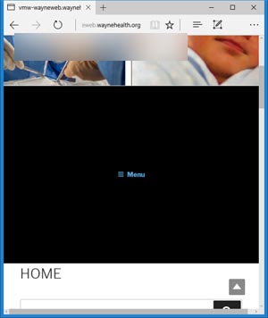
I have two distinct issues that I hope can be resolved. The first of which is the size of my menu bar when the site is viewed on a mobile device or smaller screen. Here is what it looks like in Mozilla, IE, Edge & Chrome when the screen size is smaller then 550 or so.
https://transamcountry.com/site/wp-content/uploads/2017/03/edge-533.jpg

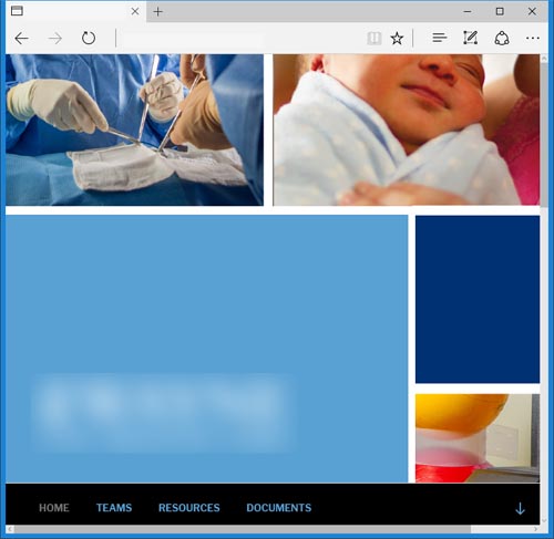
Here is what it looks like on screens larger then 550

I am running a child theme, but it does this with or without it. That is the first issue.
The second issue IE tries to display my page in a one column + menu link no matter how big the screen is. Edge, Chrome, and Mozilla behave as expected. Even at 1086 IE acts like it is on a small screen. The pictures begin to skew. With that I mean they actually become larger then they were originally. It makes the screen jerky as well. The other notable thing is the menu bar ignores my css to change to black in IE. I am running IE 11.576.14393. I was able to locate another workstation with an older version of IE 11.0.. and it displays correctly. Here is what I see

Any help with these issues is appreciated.
- The topic ‘2 Browser Menu issues’ is closed to new replies.
