Thank you. I tried using that CSS but can’t make it work. My CSS is below. Can you give me some pointers?
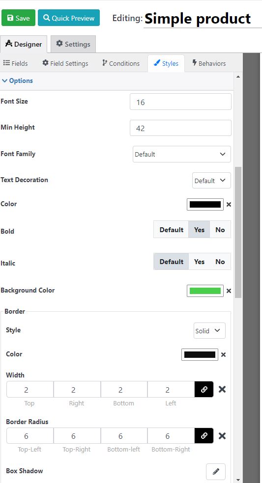
.rnField_10 is the buttons
.rnField_10 .option_item label{font-size:16px !important;line-height:16px !important;color:#000000 !important;font-weight:bold !important;}
.rnField_10 .option_item{background-color:#4acf4d !important;border-style:solid !important;border-top-width:2px !important;border-right-width:2px !important;border-bottom-width:2px !important;border-left-width:2px !important;border-color:#0e0e0e !important;border-top-left-radius:6px !important;border-top-right-radius:6px !important;border-bottom-left-radius:6px !important;border-bottom-right-radius:6px !important;}
.rnField_10.rnField{margin-top:1px !important;margin-right:1px !important;margin-bottom:12px !important;margin-left:1px !important;}
.rnField_10  .buttonselectoritem{min-height:42px !important;}
.rnField_2  button,.rnField_2  .RNIconOrImage{color:#000000 !important;}
.rnField_2  button{background-color:#4acf4d !important;border-color:#000000 !important;border-top-width:2px !important;border-right-width:2px !important;border-bottom-width:2px !important;border-left-width:2px !important;font-size:16px !important;line-height:16px !important;padding-left:60px !important;padding-right:60px !important;padding-bottom:10px !important;padding-top:10px !important;border-top-left-radius:6px !important;border-top-right-radius:6px !important;border-bottom-left-radius:6px !important;border-bottom-right-radius:6px !important;}
.rnField_2  rn-spinner-button{text-align:center !important;}
.rntext .rednaoLabel label{font-size:15px !important;line-height:15px !important;}
.rnemail .rednaoLabel label{font-size:15px !important;line-height:15px !important;}
.rnbuttonselection .rednaoLabel label{font-size:15px !important;line-height:15px !important;}
.rncheckbox .rednaoLabel label{font-size:15px !important;line-height:15px !important;}
.rnnumeric .rednaoLabel label{font-size:15px !important;line-height:15px !important;}
.rnbuttonselection .option_item label{font-size:16px !important;line-height:16px !important;}
.rnsubmit_button  button{font-size:16px !important; font-weight: bold !important; line-height:16px !important;}
.rnField_21 .rednaoLabel label{font-size:15px !important;line-height:15px !important;}
.rnField_18 .rednaoLabel label{color:#cf2323 !important;}
.rnField_20 input{}
.rnField_20 .rednaoLabel label{color:#cf2323 !important;}
.rnField_12 .rednaoLabel label{color:#cf2323 !important;}