• Resolved Bob

    (@bobk88)


    How can I center the footer widgets and copyright info on this page?

    Previously using a paid child theme, I rebuilt the site in the 2022 theme last year. I could be wrong, but I think that at that time the footer content was centered, and a later update pushed it to the left.

    I tried disabling all plugins, but that had no effect.

    Thanks!

    The page I need help with: [log in to see the link]

Viewing 6 replies - 1 through 6 (of 6 total)
  • Thread Starter Bob

    (@bobk88)

    Correction: I observed the issue in desktop browsers (Safari, Brave, Firefox and Opera) on macOS Monterey (latest).

    In iPad OS (16.4) the footer elements are centered. I checked in the latest versions of Safari, Chrome, Firefox, and Brave for iPad.

    WordPress version is 6.2

    • This reply was modified 1 year, 6 months ago by Bob.
    • This reply was modified 1 year, 6 months ago by Bob.

    Hey, @bobk88!

    By “center the content”, do you mean to have each of the two columns take up 50% of the available space? I am asking because it looks like you have three columns there. You will want to edit your site’s footer and change that to two columns.

    You can do this by navigating to Appearance > Site Editor > Template Parts > Footer.

    Let me know if that helps!

    Thread Starter Bob

    (@bobk88)

    There are already just two columns in the footer template: “More” and “Subscribe”! The copyright info is in a separate paragraph block below.

    And yes, I want those two columns to each take up half the space.

    It looks fine in the Template Editor:

    It also looks fine if I switch from “List” view to “Live” view.

    • This reply was modified 1 year, 6 months ago by Bob.
    • This reply was modified 1 year, 6 months ago by Bob.

    Thank you for the additional details and the screenshot, @bobk88

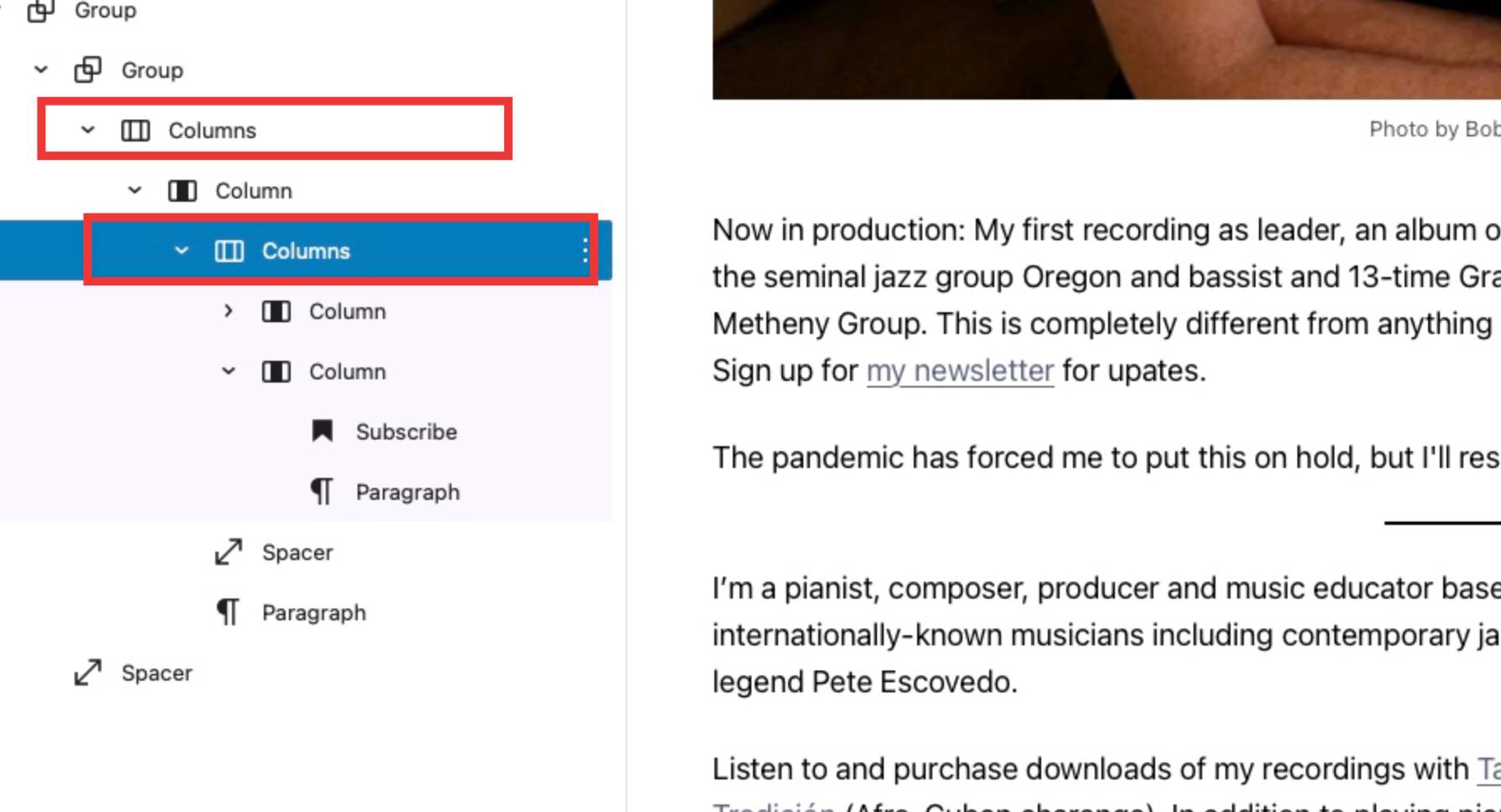
    It looks like you have two levels of nested columns:

    Screen Shot on 2023 04 04 at 13 46 07

    Could you try to move the “child” Columns block right underneath the Group block? I think that your “parent” column is not using all the available space.

    Thread Starter Bob

    (@bobk88)

    @mrfoxtalbot Thank you, Alvaro!

    I moved the lower Column block you highlighted up and then deleted the un-needed Column blocks.

    I don’t recall how I did it, TBJ – when I tried to drag it to just beneath the “Group” block, that didn’t work: I didn’t see the little underline that shows where you can drop a block, and it wouldn’t let me drop it there. But somehow I eventually moved it. The list view now looks like this:

    At that point, the footer columns were centered, but in a wide desktop browser window, they were a bit far apart, with the text on the right column going outside the text of the Content area, as in the screen shot below. (Not a big deal, but I liked how the columns were closer together in the above screen shots.)

    I selected the Group block just above the top Columns block, toggled on “Inner blocks use content width”, and set the “content” and “wide” values to 1,000 px. That fixed it.

    Thanks again, @mrfoxtalbot!

    • This reply was modified 1 year, 6 months ago by Bob.

    I selected the Group block just above the top Columns block, toggled on “Inner blocks use content width”, and set the “content” and “wide” values to 1,000 px. That fixed it.

    Brilliant use of the block group! I am happy I was able to help ?? Take care @bobk88!

Viewing 6 replies - 1 through 6 (of 6 total)
  • The topic ‘Center footer content’ is closed to new replies.