Change the color only of mobile menu
-
Hi there,
so I have problem where I could not find an easy solution with css.
I would love that as soon theme switches to the mobile vision that the 3 circles of the mobile menu are black and the background white. Altough when opening the mobile menu on the phone. Is there a way for changing the (X) to close the menu to black and withe background. Same thing on the arrow at (Anlagen). Would be awesome if we could fix this.
Thx
The page I need help with: [log in to see the link]
-
Hi @kulius – Give this a try in your custom CSS editor at Appearance > Customize > Additional CSS:
/* Mobile menu SVG icons */
.nav-toggle .svg-icon,
.close-nav-toggle .svg-icon,
.sub-menu-toggle .svg-icon {
    background-color: transparent;
    color: #000000;
}
Let me know how it goes!
Hi there,
thanks you very much again. Help me a lot.
I only have a small quick question.
Somehow there is on every page in the start except their start page. A gab Called (element.style) with margin-top 84px. I would like to change this to 0 via css. I tried it but I can’t get it to change.
This would be perfect to fix.
Thx
Altough I would like that the site header is underlined.
I only got It working for other text headings.
This is the code:
.ueberschrift {
border-bottom: 3px solid #6ea24d !important;
display: inline-block !important;
line-height: 0.85 !important;
}This is the better code:
.ueberschrift {
border-bottom: 3px solid #6ea24d !important;
display: inline-block !important;
text-decoration-skip: ink !important;
}Hey there @kulius –
Altough I would like that the site header is underlined.
I’m not seeing any underline anywhere in your site header area. Is this on the homepage or somewhere else? Let me know if you still need help with this. If you could provide a link to the specific page or post and a screenshot, that would be helpful. ??
It’s a good practice to avoid using
!importantin CSS unless there’s absolutely no other way, such as to override an inline style.Somehow there is on every page in the start except their start page. A gab Called (element.style) with margin-top 84px. I would like to change this to 0 via css. I tried it but I can’t get it to change.
Could you please confirm whether this is the space you’re trying to reduce, on pages other than the homepage?
If yes, then you can try this CSS to remove that space on all pages other than the homepage, on all screen sizes:
/* All pages other than homepage – adjust top margin */
body:not(.home) {
margin-top: 10px !important;
}This is an example of where we do need to use
!importantas that’s the only way to override the inline style: the CSS that’s directly being applied by the theme to the HTMLbodyelement.Let me know how it goes.
p.s. for new questions, please create a new topic rather than continuing to add to this thread. Thanks!
Hi there,
thanks for that quick reply.
by underlining the side header I ment the following. See the following screenshot: Bildschirmfoto 2023-06-15 um 16.51.42.png
Moving up the side header on every page worked perfect. The
Thanks for the screenshot!
I see that you also already wrote a couple of pieces of custom CSS applying to this same page title element, in a few other places.
To avoid confusion, redundancy, and further conflicts between “competing” CSS, I would suggest you remove them all (see below for the CSS I’m referring to) and just use what I provided above, if it does what you want. I can also help you adjust it if you need tweaks.
Your current custom CSS that I suggest removing:
/* Entry Title size */
.singular .entry-title {
font-size: 4rem !important;
padding-bottom: 50px !important;
font-weight: 700 !important;
}
element.style {
margin-top: 0px !important;
}
/* Seiten überschrifft Code */ h1.entry-title { font-size: 50px !important; color: #000000 !important; margin-top: 0px !important; } .singular .entry-header { padding-top: rem !important; padding-bottom: 0rem !important; margin-top: 0px !important; }Also, keep in mind that
element.styleis not a valid selector, it’s just what shows in the inspector when an element has an inline style.Once you’ve removed that CSS, the CSS below should do the trick to resize your page titles and add a green bottom border, without needing
!importantanywhere, because I’ve made the CSS specific enough to do the overrides without it:/* Header page titles */ .singular .entry-title { border-bottom: 3px solid #6ea24d; display: inline-block; } .page .entry-header-inner h1.entry-title { font-size: 4rem; }Let me know how it goes!
Hi there,
thx for that.
The only problem left know is that on the News Padge there is although every header underline wich looks offset in the height. Altough it seems like that the Site headings have to much width. Is it possible to design it in the size of the sentence “Hersteller von Biomassentrockner” on the Start page.
Would be gerat.
Thx.
Kind regards Julius
Altough the heading of my Post in the News needs to be the same the the
“Hersteller von Biomassentrockner”
Is to big and the underline doesn’t look correct.
I’ll have to deactivate the New CSS for presentation. But when I am done I will activate it for you again. So don’t wonder.
-
This reply was modified 1 year, 9 months ago by
kulius.
The only problem left know is that on the News Padge there is although every header underline wich looks offset in the height. Altough it seems like that the Site headings have to much width. Is it possible to design it in the size of the sentence “Hersteller von Biomassentrockner” on the Start page.
The styling on your posts on the News page is coming from your page builder plugin, not the theme. So I’d suggest you go into your page builder’s settings and make the changes there. Do be sure to first remove all the custom CSS I specified earlier, as that code is currently overriding a lot of other styling due to the use of
!important, making things confusing. Your page builder should allow you to set your desired font size for post titles without needing custom CSS. If you do need custom CSS, you can ask via the page builder’s support channel.Altough the heading of my Post in the News needs to be the same the the
“Hersteller von Biomassentrockner”
Is to big and the underline doesn’t look correct.
I’ll be glad to take another look at this once you remove the code I showed you earlier and add the new CSS. At the same time, please also provide a screenshot and explain what doesn’t look correct about the underline in more detail so I can better understand the issue.
Hi there,
so I have quickly activated your code back.
Now the underline isn’t there where it should be.
See screenshot underline.JPG
Would be nice if there is just a normal underline that underline the site header.
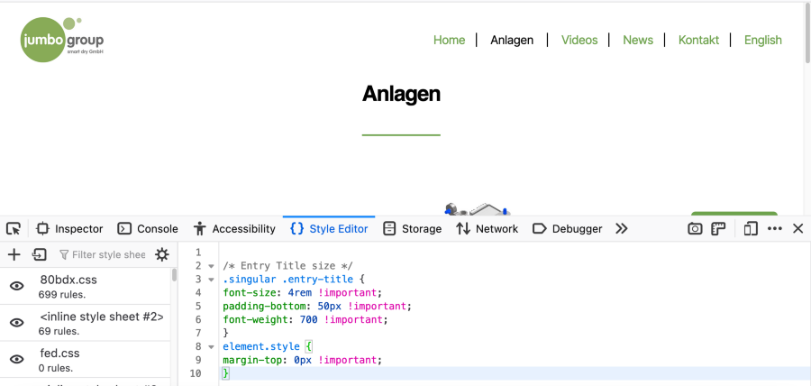
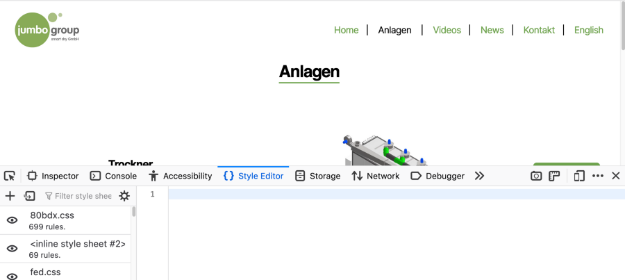
Hi @kulius – looks like you still haven’t removed all the code I recommended you delete last week.
Once you remove this custom CSS you’d added previously, the underline should be in the right spot:
/* Entry Title size */
.singular .entry-title {
font-size: 4rem !important;
padding-bottom: 50px !important;
font-weight: 700 !important;
}
element.style {
margin-top: 0px !important;
}
Before removing it:
After removing it:
Hi there,
sry for that I forgot.
So now I just have to change the h1 settings for the site header right ?
What further changes would you like to make? Please provide screenshots for clarity. Thanks!
Could we disable underlining on the headings of the post here.
-
This reply was modified 1 year, 9 months ago by
- The topic ‘Change the color only of mobile menu’ is closed to new replies.


