Custom CSS for header/log resizing (mobile responsive)
-
I tried the custom header and it kept shrinking when viewed on mobile, so I switched to logo. That worked for a while. However I have since redesigned the image, and it looks wonky.
Thanks, Kathryn!
-
Hi adonyawong! Thanks for starting a new thread. I resized your page going down to phone size and it looks pretty good to me. Could you show me a screenshot so I can get a better understanding of the wonkiness?
Here’s a guide on how to make a screenshot:
https://en.support.wordpress.com/make-a-screenshot/You can upload the screenshot – in a graphic format like JPG, PNG, or PDF – in your Media Library, and provide a link so I can see it, or upload it with a service like Imgur or Snaggy.
When you post the screenshot, also let me know:
– how does the screenshot differ from what you’re expecting to see?
– what specific device you’re using (i.e. Nexus 7)
– what version of Android you’re using (i.e. Android 4.4.4 Kitkat) – visit https://whatismyandroidversion.com/ if you’re not sure
– what browser you’re using (Chrome)Thanks!
My bad, Goddess. I realize I was not very clear in my previous post.
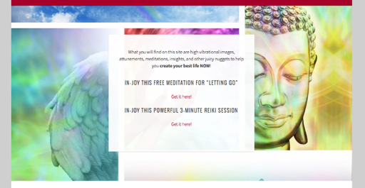
Is there a way to have the image fill in more of the header space? There is a lot of blank space on the sides.
Thanks for the speedy reply.
https://www.dropbox.com/s/sqfy5vkdf1numgx/Screenshot%202016-02-12%2015.46.27.png?dl=0
*fill in more header space in desktop view.
The recommended maximum header image size is 1180 × 160 pixels – if you upload an image that size it should fill most of the header space.
It looks like you’ve disabled right-clicking so I’m unable to use my browser inspector, which makes it much more difficult to examine your code. Could you disable that if you need further help?
See new link: https://www.adonyaisms.com. r-click disabled.
Thanks. I just tested with your featured image and it filled the whole area as expected: https://cloudup.com/cOq7gH9KkUX
For some reason on your site, the image is being downsized to 610px wide.
Are you running some kind of responsive-image plugin? “vc_responsive”
If so, you can try turning it off and reuploading the featured image on your homepage.
In terms of your header image, it is only 675 by 380 px.
https://www.adonyaisms.com/wp-content/uploads/2016/05/adonyaisms-header-site-new-675×380.jpg
As I mentioned earlier, Sela supports a header image of up to 1180px wide, so if you can create an image that’s wider, it’ll fill more space.
That is weird. I uploaded a file that is 1180px. Here is the custom CSS on my site. It is possible I have some conflict since my featured images are also displaying wonky. Oy!
#post-260 h1 {display: none;
}
#post-260 h2 {display: none;
}
.site-branding {
	background: #b5103a;
}
a {
	color: #b5103a;
	text-decoration: none;
}
a:active {
	color: #868686;
	text-decoration: none;
}
.footer-widget-area a:hover {
	color: #b5103a;
}
.entry-title a:hover {
	color: #f2f2f2;
}
.main-navigation ul ul > li.focus > a {
		color: #b5103a
}
.main-navigation a:hover,
.main-navigation ul > :hover > a,
.main-navigation ul > .focus > a {
	color: #868686;
}
.nav-menu > li > a:after {
		color: #f26c8e;
		content: " \2022";
		margin-left: 1em;
	}
.main-navigation {
	background-color: #b5103a;
	border-bottom: 2px solid rgba(0, 0, 0, 0.15);
	color: #fff;
	display: block;
	padding: 0 1em;
}
.main-navigation li.current_page_item > a,
.main-navigation li.current-menu-item > a,
.main-navigation li.current_page_ancestor > a,
.main-navigation li.current-menu-ancestor > a {
	color: #868686;
}
.social-links ul a:before {
	background: #b5103a;
	color: #fff;
	content: "\f415";
	display: block;
	font-size: 16px;
	font-size: 1.6rem;
	padding: 8px 6px 8px 8px;
	position: relative;
	text-align: center;
	-webkit-border-radius: 50%;
	   -moz-border-radius: 50%;
			border-radius: 50%;
	-webkit-transition: all 0.1s ease-in-out;
	   -moz-transition: all 0.1s ease-in-out;
		 -o-transition: all 0.1s ease-in-out;
			transition: top 0.3s ease-in-out;
			transition: all 0.1s ease-in-out;
}
.site-footer {
	background-color: #000;
	border-top: 1px solid #000;
	color: #f2f2f2;
	font-size: 8px;
	font-size: 0.8rem;
	padding: 24px 34px 24px 34px;
	text-align: center;
	letter-spacing: 2px;
	text-transform: uppercase;
}
.sidebar-widget-area .widget-title {
	color: #b5103a;
}
[class*="navigation"] .nav-previous {
	float: left;
	width: 50%;
}
[class*="navigation"] .nav-next {
	float: right;
	text-align: right;
	width: 50%;
}
[class*="navigation"] .nav-previous .meta-nav:before {
	content: "\2190";
	margin-right: 5px;
}
[class*="navigation"] .nav-next .meta-nav:after {
	content: "\2192";
	margin-left: 5px;
}
.post-navigation a,
.paging-navigation a,
.comment-navigation a {
	color: #b5103a;
	display: inline-block;
	font-family: "Droid Serif", Georgia, serif;
	font-size: 13px;
	font-size: 1.3rem;
	line-height: 2;
	max-width: 100%;
}
.post-navigation a:hover,
.paging-navigation a:hover,
.comment-navigation a:hover {
	color: #666;
}
.share-button-verb b {
display: none;
}

#page-container + div[align="center"]::after {
content: "Membership software by the great Guru, WishList Member. Namaste!";
font-size: 14px;
}

div.sharedaddy h3.sd-title {
	font-size: 24pt;
}
[added code tags around your CSS for better display – kp]
Nope, it’s not your custom CSS as the HTML image code itself is being affected.
As I asked earlier:
Are you running some kind of responsive-image plugin? “vc_responsive”
If so, you can try turning it off and reuploading the featured image on your homepage.
Can you let me know how that goes?
I uploaded a file that is 1180px.
Ah, I see what you’ve done – you uploaded your graphic in the Site Logo panel, not the Custom Header panel. This logo file is not 1180px wide, though, as I showed you above.
I suggest leaving it as is, as the site logo will scale well on small screens, while the header is designed to be a background image, which works best with abstract or patterned images, since it may crop on small screens.
What you can do to get rid of some of the space above and below the logo is add this custom CSS:
.site-branding { padding-top: 0; padding-bottom: 0; }I do not have any auto-resp plugins. It could be the code in the theme as it is auto-res.
Thanks, Kathryn,
The code on your site that’s restricting the width featured image on the homepage is not coming from the theme itself, as I don’t have the issue on my test site, and no other Sela users have the problem, so it’s something specific to your site.
I think “vc” may stand for Visual Composer.
To rule out a plugin conflict, you could try temporarily deactivating all your plugins (or just Visual Composer first) and then re-uploading the homepage featured image. If the problem is gone, reactivate your plugins one-by-one, look at the site in between each reactivation, to find the conflict.
Thanks, Kathryn. Deactivated everything and nothing changed. I will figure it out.
Looks to me like you got this solved – your front-page featured image now takes up the full width rather than being restricted to 610px:
If you need help with something else, feel free to start a new thread.
The screen shot you took is not of my site header/logo. This a screen shot.
https://www.dropbox.com/s/ekchn3p2aibfinw/Screenshot%202016-06-16%2010.16.11.png?dl=0
As you can see, the image does not fill in the entire header space.
Hi Adonya,
Sela is programmed to crop the logo at 1180px by 380px. This is set in the sela_jetpack_setup() function in the theme’s inc/jetpack.php file:
add_image_size( 'sela-logo', 1180, 380 );If the image that you’ve uploaded as your site’s logo is more than 380px in height then the theme will have scaled its width down also.
You can override the parent theme’s function by first creating a child theme and then adding the following to the functions.php file in your child theme:
function sela_child_logo() {
    add_image_size( 'sela-logo', '1180', '380' );
}
add_action( 'after_setup_theme', 'sela_child_logo', 11 );
Increase the value of “380” in the above to whatever the original height of your image is.
You may need to regenerate your thumbnails before noticing a change. The following plugin will handle that on your behalf:
https://www.ads-software.com/plugins/regenerate-thumbnails/
Let me know how you get on with those steps or if you have any extra questions while walking through them.
- The topic ‘Custom CSS for header/log resizing (mobile responsive)’ is closed to new replies.
