• Resolved cornandbread

    (@cornandbread)


    Does anyone know how to fix this issue? It’s the default Twenty Twenty-Two blog format on mobile (full blog, not a single post). Adding a featured image pushes the text into this narrow space, and for some reason the blocks don’t automatically stack. Thanks in advance for any advice.

    The page I need help with: [log in to see the link]

Viewing 5 replies - 1 through 5 (of 5 total)
  • Moderator Kathryn Presner

    (@zoonini)

    Hey there @cornandbread – looks like you’ve got the class alignright on your featured images, which means that you’ve selected the “Align right” option on the Featured Image block. Doing that moves the images to the right of the excerpt – but it does stay that way, even on smaller screens.

    If you’d like to keep the customizations you’ve made so far, just but want to fix the display issue above, you could accomplish that by using columns.

    1. To put your excerpt next to your featured image on wider screens, use a Columns block.
    2. Put your Post Excerpt block inside one column.
    3. Put your Featured Image block inside the other column.
    4. Make sure to toggle on the option to “Stack on mobile,” as you see in the screenshot here.

    Let me know how it goes!

    Thread Starter cornandbread

    (@cornandbread)

    Thanks for the quick & helpful reply. This is on the posts page, not a single post. Would I need to add a query loop?

    Moderator Kathryn Presner

    (@zoonini)

    Hey there @cornandbread – the template being used for the posts page should already have a Query Loop block in it – that’s how your post are being output automatically.

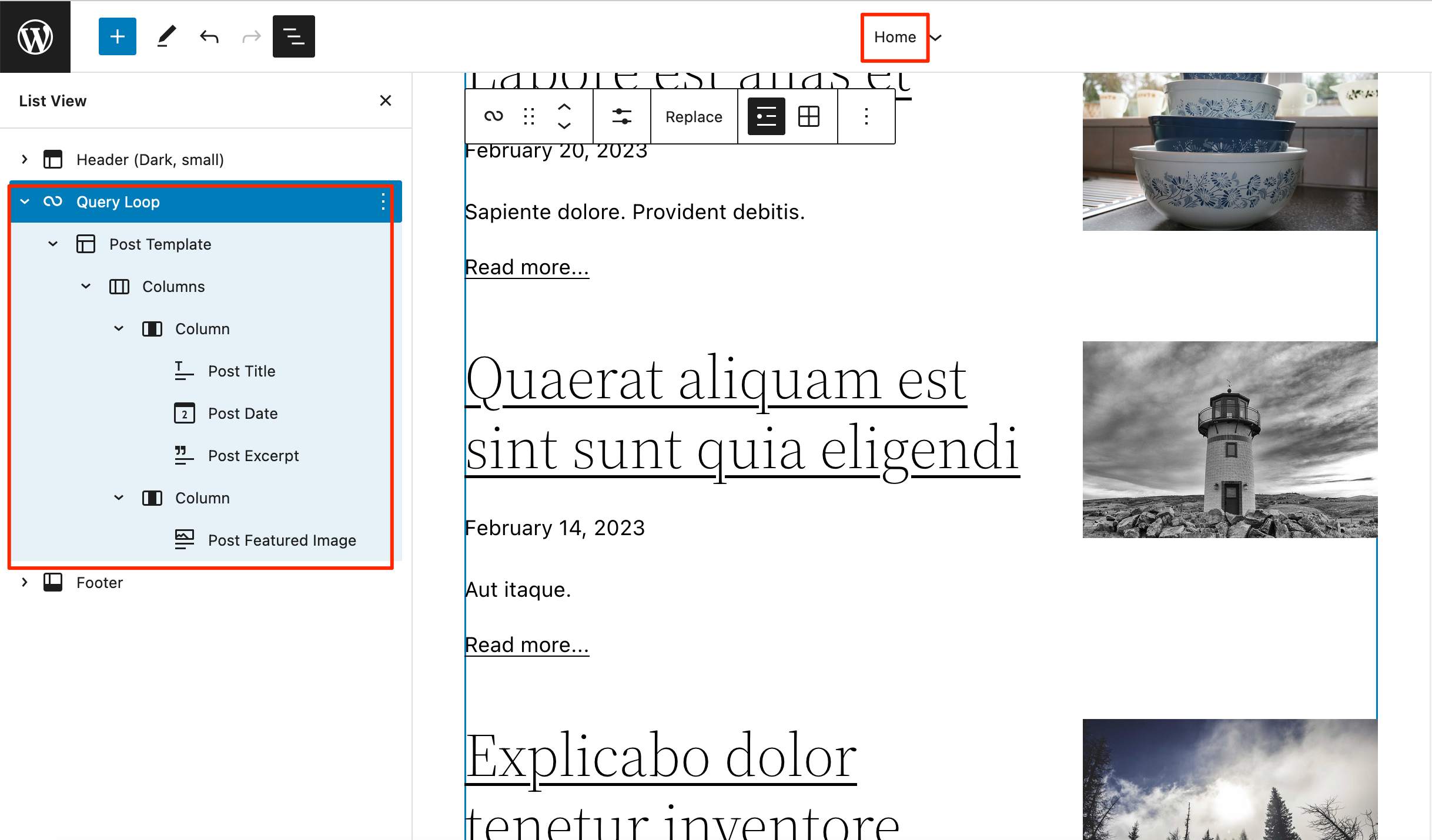
    What you’ll need to do is edit the blocks within the Query Loop so they are arranged something like this:

    The default template for the Posts page (blog) is called Home (yes, even when your posts aren’t actually on the homepage ?? )

    You can edit the Home template at Appearance > Editor > Home.

    If you aren’t brought directly to the Home template after reaching the Editor, choose Appearance > Editor > Browse all Templates > Templates > Home.

    I suggest opening up List View – as shown in the screenshot above – to make it a little clearer which blocks you’re placing where.

    Just let me know if you need further help.

    Thread Starter cornandbread

    (@cornandbread)

    Thank you! This is so helpful. The construction of how the blocks fit together on the posts (home) page is what I was stuck on. I really appreciate your attention. I did get it to work. Many, many thanks!

    Moderator Kathryn Presner

    (@zoonini)

    @cornandbread Great, I’m glad you got it sorted out!

    I’ll mark this thread as resolved, but feel free to start a new one if you have other questions.

Viewing 5 replies - 1 through 5 (of 5 total)
  • The topic ‘Default Post Featured Image screwing up Post Date & Excerpt on mobile’ is closed to new replies.