Desktop vs Mobile Formatting
-
Hello,
I really like this plugin as it lets me use custom column widths, which the default Gutenberg editor does not allow.
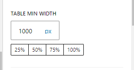
However no matter what settings I change, the table is very bad to look at on mobile. I have messed around with the scroll/stack on mobile, as well as fixed control and min table widths. However the table still “overflows” text, and stacks letters vertically.
Is there a solution to this? Thanks.The page I need help with: [log in to see the link]
Viewing 2 replies - 1 through 2 (of 2 total)
Viewing 2 replies - 1 through 2 (of 2 total)
- You must be logged in to reply to this topic.
