• Resolved headachebee

    (@headachebee)


    Hello,

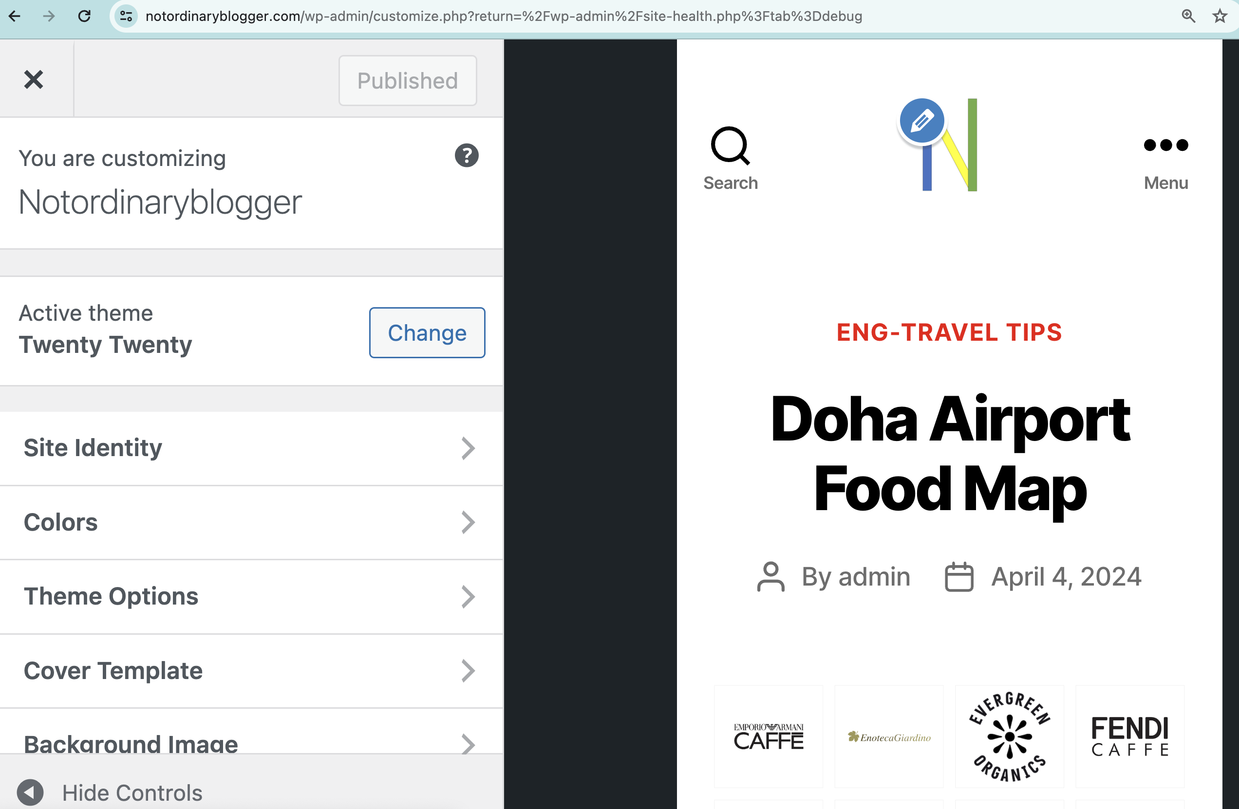
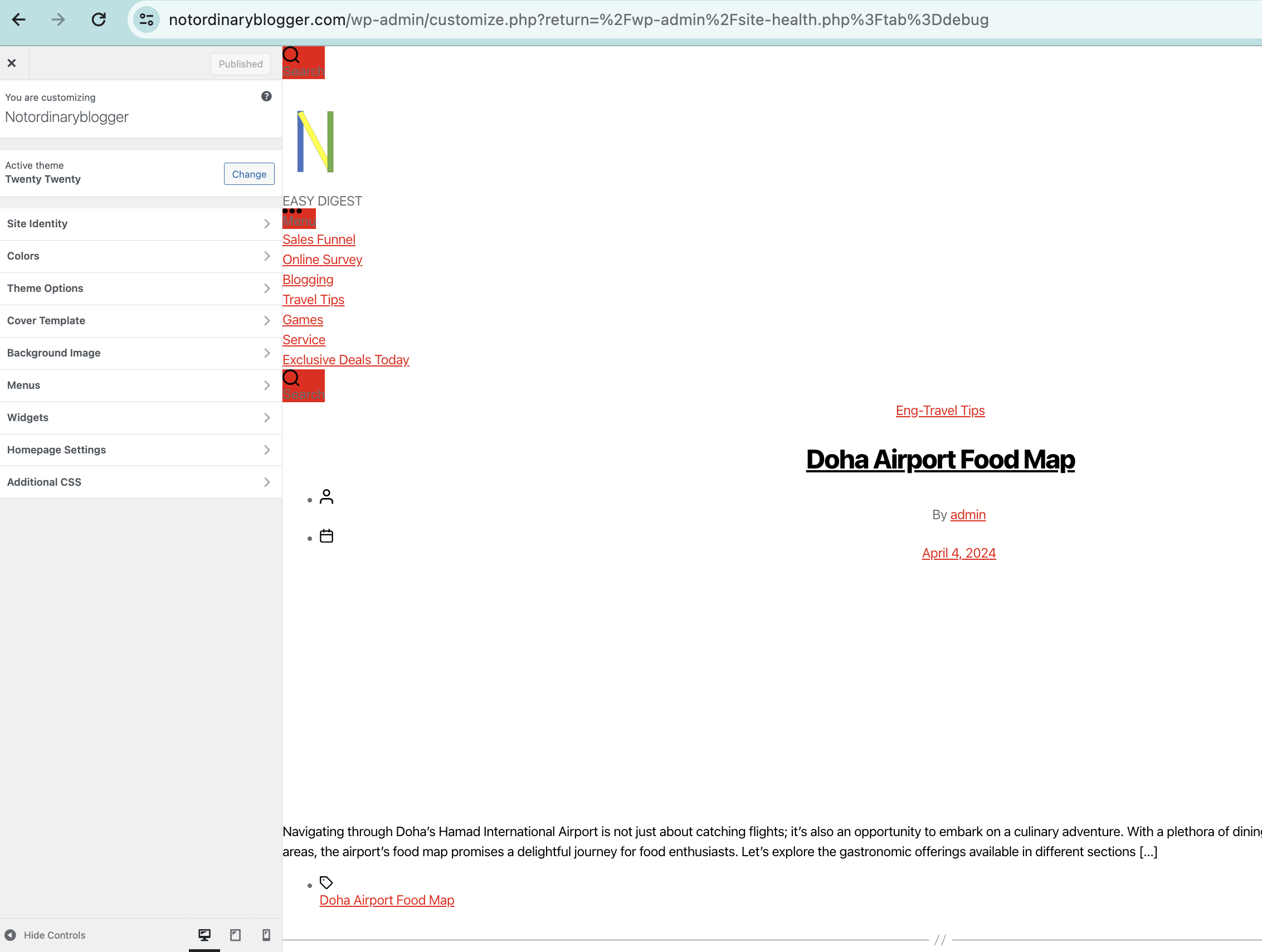
    I recently updated the Twenty Twenty theme as recommended by WordPress. This has been a routine task for quite some time. However, starting yesterday, April 5, 2024, I noticed that the display on desktop and tablet devices appears scrambled. Surprisingly, the mobile version remains unaffected.

    To ensure consistency, I’ve relied on the AMP plugin for WordPress to enforce a consistent mobile display, extending its functionality even to desktop and tablet viewers. Additionally, I’ve made slight adjustments to image and column displays within posts. This method had consistently delivered satisfactory results until the recent theme update.

    Despite attempting various suggestions found online, such as removing cache plugins, deactivate AMP plugin, I’ve had no luck resolving the issue.

    As someone not particularly tech-savvy, my last action was simply updating the theme as prompted by the WordPress system.

    I’m reaching out for any suggestions to rectify this situation, as I’m eager to restore the aesthetic appeal of my WordPress blog on desktop and tablet devices. Any assistance would be greatly appreciated.

    Thank you.

    Here’s how mobile version unaffected and how desktop/tablet error:

    • This topic was modified 6 months, 2 weeks ago by headachebee.
    • This topic was modified 6 months, 2 weeks ago by headachebee.
Viewing 1 replies (of 1 total)
  • Thread Starter headachebee

    (@headachebee)

    I’m pleased to share how I resolved my issue, which, thankfully, is now significantly better than before. If anyone else is encountering a similar problem, here’s what worked for me:

    I devoted considerable effort to adjusting the featured media and width manually through CSS and PHP, scouring search engines and video tutorials for guidance. While I can’t recall all the steps I took, the last two actions I remember were:

    1. Removing the AMP plugin.
    2. Modifying the code in functions.php as follows:

    // Add support for wide and full align images
    add_theme_support( ‘align-wide’ );

    // Register custom image sizes
    add_image_size( ‘custom-image-small’, 300, 250, true ); // Small size
    add_image_size( ‘custom-image-medium’, 450, 300, true ); // Medium size
    add_image_size( ‘custom-image-large’, 580, 9999 ); // Large size, height set to 9999 to allow for unlimited height

    After making these changes, I saved the file.

    Next, I cleared my browsing cache. To my surprise, my blog now looks much better, almost like it did before the theme update.

    I hope this solution proves helpful to anyone facing a similar challenge.

Viewing 1 replies (of 1 total)
  • The topic ‘Display Error on Desktop / Tablet After Update’ is closed to new replies.