Featured Image
-
I have been reading through this thread and all of this is new to me. I switched my theme over to Sela and I noticed that all of my featured images are cut into my the post title.
1. Is this the design of the theme? It seems from one of the threads that this is intentional, but I am not sure
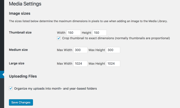
2. What is the optimal size for the featured images? Some of mine are right justifed and have a grey area to the right, while others are too tall etc.
I really don’t want to mess with code right now since I am so new to this, but I do like the featured images showing up. I think it adds to the post as people scroll.
here is one of the examples: teamgreen.rocks/diy-fall-handprint-footprint-art-september/
Viewing 6 replies - 1 through 6 (of 6 total)
Viewing 6 replies - 1 through 6 (of 6 total)
- The topic ‘Featured Image’ is closed to new replies.

