• Resolved rebecca

    (@rebeccayoung)


    Hi,

    I’m looking for some help to achieve a desired behaviour in the block editor (I’m not sure if the issue is specific to the Twenty Twenty Three theme).

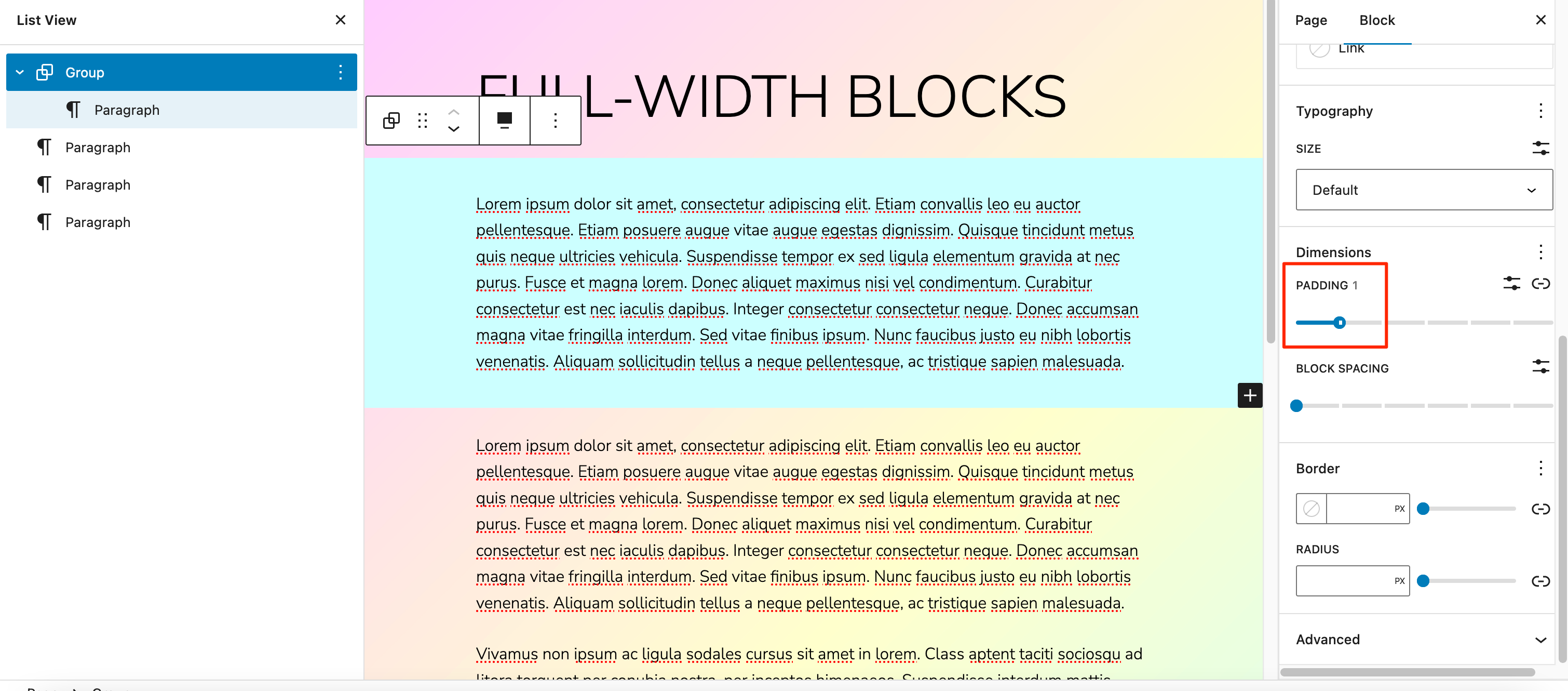
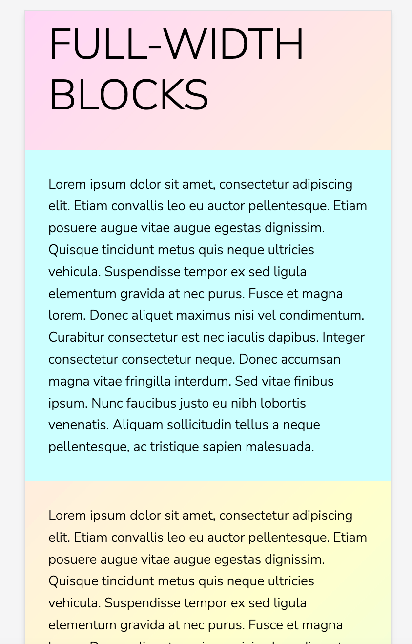
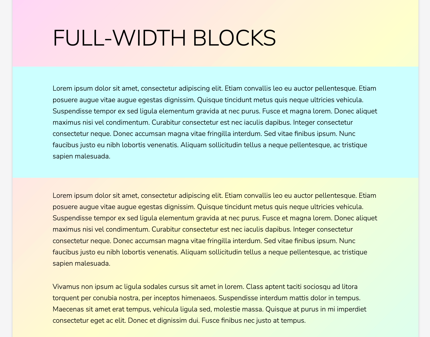
    When I create a full-width block (such as Cover or Group) with inner content blocks that are constrained to the site’s content width (‘Inner blocks use content width’), the inner content stretches right to the edges of the page on smaller screen sizes, without any left/right padding. However, content outside of the full-width block has left/right padding by default.

    The examples below show a full-width group block and paragraph block together in a fresh Twenty Twenty Three install, at large and small screen sizes:

    How can I ensure that content width and left/right padding remain consistent between the inner content blocks inside a full-width container block, and all other content blocks? Ideally all content blocks should line up exactly, at all screen sizes, with only the full-width container itself stretching to the edge of the page.

    Of course, I can’t just group the full-width container’s inner blocks together and add the required padding; this looks right on smaller screen sizes, but doesn’t line up at larger sizes (the full-width container’s inner blocks appear indented).

    Hopefully there is something fundamental I am misunderstanding! I would be really grateful for any help. Thank you.

    • This topic was modified 1 year, 12 months ago by rebecca.
Viewing 7 replies - 1 through 7 (of 7 total)
  • Moderator Kathryn Presner

    (@zoonini)

    Hey there @rebeccayoung – I don’t think you’re missing anything! Responsive settings in the block editor are still a work in progress, so in some contexts there isn’t a built-in way to set things to appear one way on wider screens, and a different way on smaller screens.

    One way to achieve what you’re after would be by adding a media query in some custom CSS – and I’d be glad to help you with that. Could you provide a link to the specific page or post on your site so I can have a look directly? Thanks!

    Thread Starter rebecca

    (@rebeccayoung)

    Hi @zoonini , thank you for taking the time to reply, and for your offer of further help. I really appreciate it.

    I’m not really trying to achieve a different appearance on wider and smaller screens, so I’m not sure that a media query would be helpful. It’s more that, by default, content blocks outside of a full-width block (such as Group) behave differently from content blocks inside a full-width block, even when ‘Inner blocks use content width’ is toggled on.

    At all screen sizes, content blocks outside of a full-width block, such as a standard paragraph block, have left/right padding applied by default (.has-global-padding in the CSS). However, for content blocks inside a full-width block, as the screen size shrinks, the inner content always stretches to the very left and right of the screen with no (or very little) padding, even when it has the .has-global-padding class applied. If you have text inside a full-width block with no padding, this causes readability issues on smaller screens. What I am trying to achieve is that inner content blocks have left/right padding that matches the .has-global-padding value, at all screen sizes.

    Unfortunately, I don’t have a site or page to share as this is more of a ‘theoretical’ problem I am experiencing while building pages with the Block Editor, and I think it may apply to all sites. Since posting the topic I have found that the problem occurs in other themes, not just the Twenty Twenty Three theme.

    I hope this explains the problem further, and I still really hope there is something simple I am misunderstanding.

    Thank you very much again!

    • This reply was modified 1 year, 11 months ago by rebecca.
    Moderator Kathryn Presner

    (@zoonini)

    Heya @rebeccayoung, I’ve done a little more testing and I found a setting that seems to accomplish what you’re after.

    On your Group block, try setting a padding value like this:

    I think it should give you the effect you’re after. Here are a few examples of how this looks on the front end at a couple of screen sizes:

    Let me know how it goes!

    Thread Starter rebecca

    (@rebeccayoung)

    Thank you so much @zoonini for taking the time to test and provide examples – this is really generous of you.

    This has helped me find a solution that works for me, which is to place ALL content blocks inside full-width Group (or Cover) blocks and set the padding value in the editor, as you have described. The content which I mentioned as being ‘outside’ of a full width block can also be placed inside a full-width Group block; the only difference is that the Group block doesn’t have a background colour applied. If all content on the page or post is placed inside full-width group blocks (with the same left/right padding applied), the inner blocks line up as expected at all screen sizes.

    This is the ‘obvious’ answer I have been searching for and hadn’t quite managed to put together, so I am really grateful.

    Thank you again!

    Moderator Kathryn Presner

    (@zoonini)

    @rebeccayoung That’s a great workaround, thanks for sharing it – and you’re very welcome!

    In my example above, you don’t need to place the other blocks inside a group block and everything still lines up at all screen sizes, so I’m not sure why it’s not working for you – but as long as you’ve found a solution that works well for you, I’m pleased. ??

    Thread Starter rebecca

    (@rebeccayoung)

    Hi @zoonini – perhaps there is something I am misunderstanding about how the default padding (.has-global-padding) works and is declared in a theme? I still couldn’t get a standard paragraph block to line up exactly with the content inside a full width block that has padding applied. The left-right spacing didn’t match up even when I tried setting the padding values to be the same using the Inspector in my browser.

    EDIT: I have just tried this again and you’re right, it’s now working as expected – strange! Thanks again for all your help.

    • This reply was modified 1 year, 11 months ago by rebecca.
    • This reply was modified 1 year, 11 months ago by rebecca.
    Moderator Kathryn Presner

    (@zoonini)

    Hi @rebeccayoung

    I have just tried this again and you’re right, it’s now working as expected – strange! Thanks again for all your help.

    I’m very glad to hear!

    Feel free to start a new thread if you need help with something else. Cheers!

Viewing 7 replies - 1 through 7 (of 7 total)
  • The topic ‘Full width blocks: padding for inner content’ is closed to new replies.