Space between different rows
-
I found that on mobile the distance between blocks that are of two different rows is not adjusted the same as is between each block inside a row
-
This topic was modified 4 years, 6 months ago by
mava0.
-
This topic was modified 4 years, 6 months ago by
-


Hi there,
Tough to tell without seeing the site live but that should be the vertical gap setting.
Here is what I did:
https://www.screencast.com/t/VnzFKn3XzAnd here are the results:
https://www.screencast.com/t/Afo4SIIJ5
https://www.screencast.com/t/1L4SO69tCan you link me to the page in question if this doesn’t help?
If I add a vertical gap of 30 it adds it everywhere:
Backend:

Frontend:

Note this is a GB plugin running on a free GP Theme.
-
This reply was modified 4 years, 6 months ago by
But I think it’s fixed while running the GP 3.0 beta:

But from what I understood from the Theme owner, that GB and GP should be seen as two distinct entities.
I tried it with the Kadence theme and it works fine too:

This is Twenty Seventeen, it also doesn’t work:

This is Twenty Nineteen, it works but it adds weird lines to each grid item:

This is Twenty Twenty with no vertical gap set:

This is GP the free version:

3.0 shouldn’t have any effect on that issue.
Do your individual grid items have any margin applied to them?
Do your individual grid items have any margin applied to them?
Just the default settings.
Is there any way I can see the issue live somewhere? I’m not able to replicate it on my end.
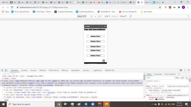
This is the page running the free GP theme:
https://badrsolutions.com/IGCSE/page-with-generateblocks/
I can change the theme to others if needed.
-
This reply was modified 4 years, 6 months ago by
Ok I think this became apparent trough an action from my side, I set the bottom margin of the Headline in the 3rd column of the first row to zero, this didn’t affect the layout in desktop, but it only affects it in mobile.
-
This reply was modified 4 years, 6 months ago by
FYI, the reason it worked with Kadence is because it just blatantly overrode the setting I made in the Block Builder by assigning it’s margins on every
hxelement globally:.single-content h1, .single-content h2, .single-content h3, .single-content h4, .single-content h5, .single-content h6 { margin: 1.5em 0 .5em; }By this it balanced them all out … a little cheaky though.
-
This reply was modified 4 years, 6 months ago by
Aha, so it would be better to remove the margin from those headings and depend on the vertical gap option to handle the gaps.
Aha, so it would be better to remove the margin from those headings and depend on the vertical gap option to handle the gaps.
In essence maybe, but it might only apply to last block in each grid-item (column), since margin is also used for the spacing between elements inside of a grid-item like in this use-case:

As for mobile then it is messy when you see it like this, but there might be use-case where you want it to space apart, even on mobile, like images with box-shadows for example, or images that cross element boundaries by way of floating or positioning.

What I actually found missing right now, trying to correct my mistake, is a ‘reset’ option for margins for example.
Just as a heads up, are you aware of the vendor differences in the use of flexbox? Maybe important to consider?
Quote from css-tricks.com
Prefixing Flexbox
Flexbox requires some vendor prefixing to support the most browsers possible. It doesn’t just include prepending properties with the vendor prefix, but there are actually entirely different property and value names. This is because the Flexbox spec has changed over time, creating an “old”, “tweener”, and “new” versions.Perhaps the best way to handle this is to write in the new (and final) syntax and run your CSS through Autoprefixer, which handles the fallbacks very well.
Alternatively, here’s a Sass @mixin to help with some of the prefixing, which also gives you an idea of what kind of things need to be done:
@mixin flexbox() { display: -webkit-box; display: -moz-box; display: -ms-flexbox; display: -webkit-flex; display: flex; } @mixin flex($values) { -webkit-box-flex: $values; -moz-box-flex: $values; -webkit-flex: $values; -ms-flex: $values; flex: $values; } @mixin order($val) { -webkit-box-ordinal-group: $val; -moz-box-ordinal-group: $val; -ms-flex-order: $val; -webkit-order: $val; order: $val; } .wrapper { @include flexbox(); } .item { @include flex(1 200px); @include order(2); }Not sure I’m fully understanding the margin issue. For uniform spacing between grids, you should use the gap options – they’re built specifically for this purpose and work all the way down to mobile as you would expect. If you need margin on mobile, you shouldn’t have any issues adding it to the mobile block, however it will be in addition to the mobile vertical gap.
Yes, aware of vendor prefixes. We’ll actually be removing most of ours in the next version, as it’s time to end support for IE10 and below.
-
This reply was modified 4 years, 6 months ago by
- The topic ‘Space between different rows’ is closed to new replies.