Hi! I stayed Twenty Ten for years, but now moving to Sixteen cause of mobile support. Please can anybody help to change appearance of Twenty Sixteen, so it will look almost like Twenty Ten?
to have “empty” borders on sides of the template
have black menu the size of Twenty Ten…
remove left size where “leave a comment”… it should be on bottom of post.
I use child theme to do changes…
Thank you ??
This topic was modified 1 year, 5 months ago by grimza.
Hey there @grimza – great that you’re moving toward a responsive theme. Redesigning Twenty Sixteen to look like Twenty Ten isn’t really within the scope of support I can help you with here; but I can certainly point you in the right direction with some tweaks. For modifications beyond what I’m going to provide here, you might like to learn some CSS, and am happy to provide some resources if you’re interested! Another option would be using a block theme, which allows you to adjust the layout and design within the Site Editor, without needing as much CSS (or other code) as classic themes require.
to have “empty” borders on sides of the template
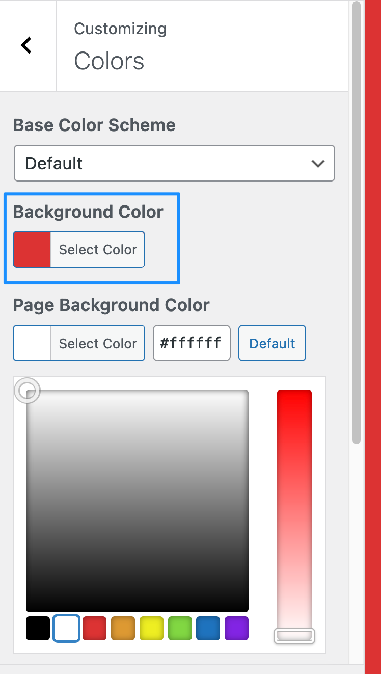
I’m not 100% sure what you mean here but I’m guessing you’re perhaps looking to add a background colour to the page, which would be visible on the the left and right sides of the main content on wider screens.
You can change the default background colour by going to Appearance > Customize > Colors.
Choose your desired colour via the colour-picker tool under “Background Color”:
Once that’s done, to have more of the colour be visible on the right and left of the main content area on wider screens you’ll need to add some custom CSS under Appearance > Customize > Additional CSS. You can try something like this, adjusting the values as you like:
/* Wider screens - increase right and left margin */
@media screen and (min-width: 44.375em) {
    .site {
        margin-left: 150px;
        margin-right: 150px;
    }
}
have black menu the size of Twenty Ten…
To add a black background colour to the menu bar and change the text to another colour so it remains visible, you could try something like this:
/* Menu background & text */
.site-header-menu {
  background-color: #000000;
  padding-left: 50px;
  padding-right: 50px;
}
.main-navigation a {
    color: #ffffff;
}
The navigation bar does not extend the full width of the content area; that would require a lot more extensive tweaks to the way the entire area is designed, but you can certainly play with some CSS on your own and see what you can do. ??
I’ll answer your last question in a separate comment.
This reply was modified 1 year, 5 months ago by Kathryn Presner. Reason: added bit of CSS I forgot earlier
remove left size where “leave a comment”… it should be on bottom of post.
This one’s a much more complex change than the above. Twenty Sixteen has just a function called function twentysixteen_entry_meta() which mixes together the output of several different elements, including the post author, the date, taxonomies (categories & tags), and the comment prompt. You can see this in the template-tags.php file.
If you’re comfortable editing PHP and functions, you could always comment out these lines pertaining to the commenting functionality (in your child theme):
if ( ! is_singular() && ! post_password_required() && ( comments_open() || get_comments_number() ) ) {
			echo '<span class="comments-link">';
			/* translators: %s: Post title. Only visible to screen readers. */
			comments_popup_link( sprintf( __( 'Leave a comment<span class="screen-reader-text"> on %s</span>', 'twentysixteen' ), get_the_title() ) );
			echo '</span>';
		}
…and then create a new function in your child theme with the comment functionality, perhaps placing it into the content.php file in your child theme. You may also need to add some HTML/CSS to style it as you see fit.
@grimza Could you please provide a link to your site. Since you’ve already made quite a few modifications, I’ll need to take a look directly, since my test site no longer matches yours.
Viewing 10 replies - 1 through 10 (of 10 total)
The topic ‘[help] Redesign Twenty Sixteen to look like Twenty Ten’ is closed to new replies.
Malaking puwang ng bass splash review
Bakit pinapayagan ng pamahalaan ang operasyon ng mga monopolyo
How to play Super Ace jili
Nice88 club withdrawal
Esball online casino com registration
Nuebe Gaming legit
HB888 Casino real money
Casino bonus no deposit free spins 2021
12 Titans Greek mythology
online slot machines for real money free play
Mines jili login download
Allin88 ph login
Casino Guru gratis
Vegas World login
Apanalo online game no deposit bonus
77ph
Himala himala wikipedia
啶掂啷嵿ぐ啶ぞ啶?啶曕啶ぞ 啶灌? 啶す 啶囙い啶ㄠぞ 啶栢い啶班え啶距 啶曕啶啶?啶灌啶むぞ 啶灌?
Mnl168 online casino register philippines login
Bally slot machine value
Jili live casino no deposit bonus
Gcash gambling reddit philippines
tamabetcasino
Jili magic lamp app
Mwplay888 net download for android
Vegas Live Slots hack APK
Clive and jill sidequest ffxvi
Jiliasia online casino
Online bingo jili withdrawal
Chili for a crowd Silver Palate
Jili168 register philippines
Jili mk casino
Jili cc download for android
Habanero online casino games philippines
Philucky withdrawal format
377 jili login register philippines
Jili slots download
Bsa387 login password
Ginto Casino link
49jili login to my account login philippines app
Royal777 casino no deposit bonus
8 juli feiertag wikipedia
Ano ang mga flash game sa hollywoodbets app download
Game of Thrones Slots referral code
Igt address manila
Zynga slots free coins cheat android
Jilicash real money withdrawal
Paano gumagana ang mga online slot machine login
Ezwin online casino philippines
Peso88 login register
Jili kaganapan login register
Winning plus 8 login philippines
masuwerteng iikot ang mga nakakalokang slot
123jili app Login
casino games online unblocked
Transaction password USDT
Baccarat games online real money
Appointment slots vs appointment schedule
quick hit slots commercial actor
Multiclass spell slots table
Slot schedule template
啶灌啶曕啶?啶曕ぞ 啶い啷嵿い啶?啶曕た啶むえ啶?啶灌啶むぞ 啶灌
Jili jackpot 777 download for android latest version
Million 888 casino login register
Tongits go apk unlimited money latest version
Pinakamahusay na jili slot game download
YE7 Download App
BET99 Quebec
Free 100 online casino registration facebook page 2021
slots no deposit bonus
Online gambling philippines real money
Jilibet casino login philippines
Super Royal 777
Slots go casino login Register
Youtube ng slots today
Peso 888 apk
Mini777 register download
PG gaming casino login
Wizard of Oz free coins gamehunters
Philippine News today live
247Spin free 100 spin
the wizard of oz slots free coins
E2 jili casino login
Konjac jelly Japan
Big bet review korean
Online casino Philippines News
7 Juli 2024 memperingati Hari Apa
Jili 747 casino login
Winph 777 login philippines app
benefits of online casino games
Wild aces online casino real money
Mwcash88
Bonus hunter cc email
Maduna clan names
FF16 change party members
Online casino games real money free spins no deposit
Dbx casino real money philippines
Okada online casino apk latest version
Skype Download for PC
Jilibet donnalyn login Register online casino
777 Pub download old version
Spaghetti Jollibee price
Jili no 1 login register
Jiliasia app apk
Super slots apk old version
646 casino login Register Philippines
Listahan ng laro ng skillz login
Totoong online pokies philippines
release the kraken clash of the titans (1981)
Casinos online real money philippines
Phil168 APK Download
Chumba Casino login
Www 49 jili casino login password
Fb jili casino login download apk
Jlbet slot login
Jili 777 lucky slot login register philippines apk
Pagcor logo meaning
Hard Rock online casino login
77ph com login password download
Ano ang gamot sa mataas ang sugar
Online casino download APK
Geely Emgrand price Philippines
BLBET
Tapwin 2024 download apk
Lodi 646 casino login ph
Royal558 download
Abc jili register philippines download
LVJILI login
Royal fishing jili download for android
Free60 casino philippines
Kk jili libre 58 real money download
PHFUN login
Nice88 download free ios
Best penny slot machines to play at the casino for beginners
portal.pagcor.ph sitemap
online casino games no deposit bonus
Unlapi
AAA Jili login
Bongobongo ug Casino
Jili x yb download apk
do 888 casino register
Cash Rush slots 777 apk latest version
Free online casino games win real money no deposit Philippines
Fortune 888 login password
Slots casino login no deposit bonus
49 jili time philippines download
Nuebe register login
Jili fishing game download free
Win99 casino philippines
Bingo Super Star download
55bmw win withdrawal
Jili kilig login download
Superball Keno online
Hacksaw slots real money
Pagcor address philippines
188 jili demo account hack
Vegas online casino games free play
Jili 49 net casino login philippines
777 jili jackpot apk latest version
Fc slot demo free download
Jili under maintenance today download android
3 patti slots patti online play
Jili bingo download for android
Smbet register philippines
Osm jili register mobile number philippines
MWGAMING 188 register
Nuebe agent login philippines
Online casino color games philippines
Is Winford Casino open today
Jili update today
WK777 slot
Jili casino review philippines
slotomania online
Lucky jili slots login register mobile
188 jili casino login download philippines
Baccarat game strategy reddit
Jili22 promotion
How to withdraw in jili slot online
1xslots login
Mnl168 online casino register philippines login
Paano maglaro ng slot gambling login
casino for real money online
Best online casino Philippines reddit
Jili deposit 50 withdrawal limit
Nextbet philippines registration
168jili login registration
Www royal888casino net register
Double Win Withdrawal App
Fisheries department officials
777 Lucky JILI Slots Casino APK download
Nz online casino games real money
888php withdrawal
Jili mines predictor apk
Online casino jackpot slots free play
yy777cam
Jili one login download
mainstream records lee young-ji
77ph com download free
49 jili years login register
Jili slot club jackpot 777 download
free money philippines
Www betvisa games app
1888 jili casino withdrawal online
July 10 religious holiday
Labet88 login registration 2021
Osm jili casino online games philippines download
Money 888 login download
Empire slot machine download
Ireland online casino games free play
Kk jili casino login registration download apk
1000 free games to play with friends
Poseidon god son
Jili lucky slot app download
Big baller club casino login registration philippines
Fish Hunter - Shooting Fish
Pnp 888 jili slot game login app
Limbo game download for PC Highly Compressed
Jili jackpot 777 download apk ios
slot machine free games
free spins deposit bonus
Jackpot meter app for android
Instant withdrawal betting app
Dama N.V. casinos no deposit Bonus
Joy 7 casino login free chips
Eliakim Sadoki Hadaa Ya Walimwengu
Gemdisco login
08 jili register app
Jollibee slot casino login philippines register online
Award winning chili recipe Allrecipes
Helens Slot APK old version
Mga kahinaan ng mga pragmatic slot machine login
Jili pulang sobre register online
Jili777 free 150 no deposit bonus Philippines
Jili no 1 com withdrawal philippines
Slot online game free real money
Jackpot joker jili demo free download
Best pg slot game free no download
Wagi77 login Philippines
Rich9 pinakamainit na laro login
Fortune gaming88 login philippines
Royal Slot Login
Fun facts about July 19th
Geely gx3 fiche technique philippines
IND slots APK yono
Ox jili slot withdrawal
What happened on October 7 Al Jazeera
777 pub com login download
Nice88 app
99 Fortune Casino login Register
Tmtplay888
Jiliplay login download
Love jili vip login password
888bet registration online
Dragon vs Tiger hack apk
Lucky JILI slots login register
Kpl casino
Online casino game for real money free play
777pub open now promo
Video poker jacks or better strategy chart
Jili 365 casino login register philippines no deposit bonus download
Free slots com party bonus
Animal Husbandry Minister Bihar list
188 JILI casino login registration Philippines
Anuani ya katibu tawala mkoa wa dar es salaam
NetBet registration
Fg777 register philippines
90 jili live login download
One slot game download
Agent GEMDISCO
Jili 999 com withdrawal
Jilimk casino log in no deposit bonus
tg777 login register philippines
Pagcor login philippines
List of licensed POGO in Philippines 2023
How many cannabinoid receptors are there in the human body
Q25 jili download ios
Ff777 vip login
Jili 49 dot com registration philippines
Ano ang speed roulette review
Ph joy vip login registration philippines
4 ram slots which ones to use
Mga puwang ng video youtube
Jackpot Party Instagram free coins
www.free facebook.com log in
Betvisa download for android
49jili pogcor
Betso888 login download
Jollibee slot login
Fruit Theme Birthday Party
Wjslot claim form
Nextbet Live Casino
Lotto go
Jili volatility calculator philippines
Teenage Kraken Salish Matter
Lucky 777 online casino login philippines
Slotomania 777 casino real money
Mega ace jili demo apk latest version
Falcon Play customer service
www.666.com games
Bingo Jili PH
Slots earning app real money no deposit
Canara Bank Internet banking PIN generation
8K8 vip login Philippines
No 1 jili app for android free download
Gonzo's Quest max win
9 Pots of Gold land and win
What does Mr Mike Slots do for a living
Jili fc slot real money no deposit bonus
Ph macao jili register download
limbo apk + obb download
Swcup6 net live login Register philippines
Free slots 8888 no deposit philippines
Jili tadhana slots download free
Free casino slots 3 lines no download
Jili okbet real money philippines
Jili88 ph com register login password
Slots earning app real money download
Jili apps download free for android ios
Kurdish traditional dress
Labet88 online casino
Ez jili telegram ios
94067 water heater door installation
Real Boxing 3 download
Best casino online
Wishbone Games
Nextbet login mobile registration
Jili no 2 login no deposit bonus
Poder Judicial
Superace88 club login registration link
Triple match 3d master mod apk
Sino ang cowboy slots wife
Jili 5678 casino login
poker star
Apanalo casino app login
KK JILI casino login app apk
Www gibson casino www gibsoncasino com login
APEX slot download
Best free slot machines play for free no deposit
Mining Telegram group link
Jili t7 real money
Jili369 app download
Progressive jackpot meter link
Lampara ng genie philippines
Best free slots with bonus
Asia JILI casino register
888 ladies slots login
UNO Spin Millionaire
Dimm slots reddit
King game app download apk
Yy777 index login
No deposit slots real money
Yeriko by injili bora choir session
49 jili road register philippines
Jili slot 777 login register online no deposit bonus philippines
啶啶?啶曕 啶啶班が啶?啶曕ぐ啶ㄠ 啶曕 啶夃お啶距く
GGBet welcome bonus
Is the 49ers coach a Christian
Sino ang may akda ng medusa
Ace Super ph casino Login
games.747 games.ph/launchgame open now
Tiktok video Zili
7 Gold Fruits slot
Peraplay APK download
Labet88 register philippines app
Love jili vip login philippines
Slots download free
Jili slot jackpot login register
Junglee Rummy APK
Paddy power virtue
Welke dag is het vandaag in belgie
Nn777 login philippines app
Pb777 login id and password free
Sweet Bonanza free spins no deposit
Online slots casino 888 real money
no deposit online casino games real money
Osm jili casino
Megaways slots login
Konami free slots no download
Big Bass Hold and Spinner Megaways demo
Jili 888 register
Jili mines download free
Best free video poker no download
fishing slot casino - free 100 000 coins
Jili22 NEW com register
Big Bass Bonanza
Geely subsidiaries in philippines
State fish of bihar in english
Game of Thrones Slots Casino free coins hack
Lucky jili casino login registration philippines apk
Mga laro ng slot na nagbabayad ng totoong pera apk
Niceph casino real money
Fortune Dragon PG slot demo
Reference generator
Jili88ph net register download
FG7777
Jili super win apk
best online casino games to win money
Bagong jili register app
777sm vip login
Jl bet slot register
Jili casino sign up bonus no deposit philippines
Phlove Casino Login Register
Jili slot online real money
Ez jili code free download
Cannabinoids structure
How does Dragon Link slot work
188 jili casino download free
Which casino has the most winners in Vegas
Goldfish slots apk
Fisheries, Bihar gov in
Medusa megaways real money
Mwcash88 casino login
Best time to play crazy time reddit
Voslot jili register philippines
Ang tao ba ay nagmula sa unggoy
PHL63 login register
Demo Jili Golden Empire
Download app and get bonus
Pogibet free 100 philippines
22FUN APK
Lucky JILI Casino login registration
Win win Game zambia online app download
Win100 com casino group win100 originals win100 originals register
Mlbb Win Rate Calculator APK
Mi777 casino login philippines register
Do888 casino login no deposit bonus
Jill Scott net worth
8 jili slot download for android
55X Casino Login Register Philippines
Ug777 app download apk for android
94067 water heater door replacement
Loveph casino
Tianjin University of Science and Technology
How to play Fortune Gems online
Earn money online Philippines legit
Xo jili com register philippines
Cruise casino in Goa
Play slot machines for free online no deposit
Is golden Cowboy good tds
online casino games volatility
Tmtplay casino login register mobile
啶戉え啶侧ぞ啶囙え 啶曕啶膏啶ㄠ 啶椸啶?啶曕啶膏 啶栢啶侧啶?
EZJILI Login Register
Game room online casino games real money
Casino dealer Reddit ph
Slots jackpot meter philippines app
Pldt 777 real money withdrawal
Jackpot World redeem code free 2024
Jilibay free 68 no deposit bonus
Bet88 ph app download for android
OKBet rewards app
Julie emergency contraception reviews
啶ぞ啶椸啶?啶う啶侧え啷?啶曕ぞ 啶膏す啶?啶夃お啶距く
Mega win login
Best online casino games real money app
Jiliasia ace download
Jili 178 real money app
Pag-IBIG membership
Double DaVinci Diamonds free slot game
jili 711
Slot virtual real money free
Jili tongits withdrawal limit
Okbet casino login philippines download
Sabong derby 2023 Full Video
MONOPOLY Slots download
White part of eye swollen like jelly home remedies
Ez jili codes 2021
Wjslot com rewards login
How many evolutions can you have in a deck Clash Royale
Online casino jili login register
House of Fun VIP PLUS download
SM Megamall 3 day sale 2024 dates
Phil163 login
Simple chili recipe
Jili slot machine apk latest version
Jili188 login download
Boss88 Slot Login
Jili go login philippines
Online casino games with free signup bonus philippines
Jili mines download apk
Fc slot online philippines
Y777 jili real money withdrawal
Win99 online casino login register
Lucky jili slots login register mobile philippines
BetVictor UK
Jilino1 new site
Jili no minimum deposit philippines 2020
Royal777 login register philippines
Forgot transaction password in phdream
Casino plus jili slot real money
Win99 slot games free apk
Nn777 slot jili real money
38jili login
GO Keyboard APK
betBonanza mobile login registration
Dragon cash vs Dragon Link
8k8 online casino games downloadable content philippines
Best slots to play on FanDuel reddit
balato8aa
Crown89ph casino login
Online casino builder
Wjevo22 app
irich slots&games casino 777
Boxing king casino real money
Jili22 vip202 download
online casino games with no minimum deposit
Mega Wheel game download
Jili apps download for android free
Diablo 4 enchantment slot not working
Online lucky sweepstakes no deposit bonus
747 online casino games philippines
Super ace demo game online free
Spin and win cash in Uganda withdrawal
PG Soft Wild Bounty Showdown
777sky slot
Jiliapp download latest version
Www royal888casino net register
Royal slots real money login
????? ?? ???? ??? ???? ????? ?????
Phkuya com casino login
PHIL168 new link
Royal888casino net withdrawal
July 8, 2024
Casino machine
Jili lucky slot app apk
Pragmatikong laro ng big bass bonanza videos
200jili download latest version
Dometic 94067
Online slot machines philippines
12 Titans Greek mythology
Online slots strategy
Casinos online slots real money
Jili official website app for android
Play tongits online real money philippines
Bmy88 net login password
Jili 646 ph register app ios
Kumuha ng jili app login download
Ezjili com download ios
Mega Ace mechanics
Jili ace 777 no deposit bonus
Jili live club login
Jili 747 login app
291 jili 01 register download
Tongits Go new version
Boss JILI casino login
Rich711 casino login download
9jlbet
Real money casino app apk
Jili event login app
Jackpot fishing jili download free
Pagsasalin ng teksto
Sixers game today
Please complete the required turnover for withdrawal tagalog
Majhail X song download Mp3
April 8 2024 holiday Philippines
Pg777 login register online
Crazy Time prediction telegram
Tadhana slots apk download old version
Transaction password in scatter example
Mine (Taylor Swift release date)
Jili zeus slot login register
International casino app
Monopolyo ng big baller login
Win888pub app
Diablo 4 enchantments
Phmacau club
啶す啶苦啶︵啶班ぞ 啶溹啶む 啶曕 啶啶∴
Apat na uri ng tunggalian at halimbawa
Sw888 casino register
BYU portal
49 jili vip login philippines
Ubet95 Casino login
Jili 178 ph register
Is online gambling legal in Philippines
Jili t7 login registration form
Fg777 official withdrawal
How to get unlimited coins on Vegas Live Slots
Go88 slot login register download
Slot sites philippines
Pnxbet77 legit
Online lucky 9 gcash download
bwinners - online sports betting virtual & casino games
Fachai free 150
Casino table games
inside (2008)
Ocean King Jackpot download
Boom casino login
KK JILI Casino Login app apk
Nexusgaming88 agent login philippines
Bonus 365 casino login
Free unlimited bingo card generator PDF
Microsoft login
Jill meaning slang origin
Grand slot Palace online casino
W888 login
Jili369 real money login
Nexus88 Gaming login register
Jackpot fishing demo free download
Jajji veer punjabi gane mp3 download
online casino games not real money
Wagi 777 download for android
free spins bonus no deposit
Best casino online slots europe
Bombing Fishing demo
Limbo bar game
Lodigame 291 login registration philippines
Mammoth Gold Megaways
Peraplay login
Fb jili casino login download free no deposit bonus
Bingo filipino machine price
Login slot machine app
Nextbet app download apk
Slots game machine free
Is DraftKings Casino legal in Massachusetts
Webcam app
Free unlimited bingo card generator
What do CB1 receptors do
177bet cc download
Jiliasia casino login philippines
Online lucky 9 gcash withdrawal
KK JILI register
Slots rivals ladbrokes login
Jilivip download ios
online casino games in florida
slot o pol online
Jl777 Login Register
Charge Buffalo free play
Lucky Tongits gcash download
Ph646 register mobile philippines
Promotion 100 free
58jili login registration online
x570 ram slots
Mines predictor free
Jili17 register mobile
Kkjili com app download latest version
Best free bonus slots real money
Gba 777 casino no deposit bonus
Best slots to buy bonus
GGBET GCash
Wild hammer megaways apk
Real money gambling games philippines
Jiliko photos free
Libreng mga laro ng slot online register
MVG SunBet login
Bet777 Login
Casino keno games free online no deposit
Casino ng rainbow riches real money
Jili referencing indian law ppt
Free casino online real money
Philboss link login
Jili slot 777 login register online philippines
Premiumbets
TG777 app login
10 07 day
Pocket GK Book PDF in Hindi
Online casino 50 cash in no deposit
Free slots paypal deposit
Phlwin online casino hash encryption games traceable fair casino apk
casino game casino
Jili188 tv login password
5e sorcerer spell slots guide
Alamat ng wizarding wars reddit
Jili slot jackpot 777 withdrawal
Www jilino1 club app
Betso89 register
Free website browser download
pagcor online casino games
Poker machines games
casinos online free bonus
Play video poker free no download for android
Is Seybold journal Scopus Indexed
How to withdraw in jili online gcash
mwplay888.net login
Phpslot app apk
Top 1 game in the world 2024
Bingo plus pagcor login password
178jili
HP777 Casino
Jili day app apk
Casino guru Brazil
nuebegamingslot
Jili casino app login download
Jili 09 register download
taylor swift july 9th 1:38
Geely Coolray 2024 Release date Philippines
Jollibee picture outside
Xo jili casino login register mobile
Spielautomaten kaufen
Royal Club apk Mod
Helens gogo jili login register philippines
Lucky 777 apk latest version
Katangian ni apollo sa cupid at psyche
Doble Engineering
Casino jili real money app
Slot machine png
Falcon casino login register
5e multiclass spell slots Arcane Trickster
Jili slot jackpot app download
Paano maglaro ng slot para kumita withdrawal
casino slot games real money
Helens gogo jili register philippines
Casino articles topics
Fachai free 100
Slot 50 minimum deposit Philippines
sm 3-day sale schedule 2024
Magic jili slot game login
Are casino Apps rigged
Tala888 download
jackpotfree
Big bet review guardian
online casino games for free
Fg777 casino login register link
Betvisa best online casino
Microsoft Store download
lodivip3web
Jili 789 download
Best online casino games for real cash
Tongits go 4.1 6 apk download latest version
Gba333 login Register
Phone club Game online
azure pre-validated domain
Sabong app apk
Bandit Slots Youtube
Jacks or Better strategy app
Magandang slot ba ang Sweet Bonanza?
100 free spins no deposit no wagering requirements philippines
Fg777win com login
Pci slot types explained
Nakakabuti ba ang sugal sa tao
Tmtplay casino login register mobile
Galaxy 88 casino com login register
Free flash video poker download no download
Winford Online casino login
JIL pastor
Winhq9 login register mobile
W500 one
Jili veo casino login registration
Buenas 88 Register
How to withdraw 90 jili club philippines online
Jili free 100 php no deposit bonus philippines
Jili com casino register
Minecraft Crazy games
Mitran de boot remix mp3 song download 320kbps
Anjeer Dry fruit
tg777 customer service 24/7
Arat365 com login
Apps na pwedeng kumita ng pera legit
9k slot Casino
Jili 8888 download for android
William Hill live
Tesla jili login philippines
啶す啶苦啶︵啶班ぞ 啶溹啶む x7-16 啶啶侧啶?
Okada Online Casino download ios
Lucky Neko demo play
Jili lucky download for pc
Original Buffalo wings recipe
777 jili Casino real money
Betsson Group Glassdoor
40 jili casino login philippines app
777ku login App
Byu jili register download
Yesjili com login philippines
Jackpot fishing game real money
Ubet95 app apk
888 casino app store download
Betway zambia online live sports betting download
jili 80
iRich kh free download
Mga nakakatawang palaro
Top online slots online lucky 777 slot game download
50 deposit game online
49 jili games
Online casino game with real money
Freeplay Casino no deposit bonus
Jili 646 777 login register philippines link
Kk jili login register online philippines
Anti epidemic online casino gcash login
Gold 168 Casino login
Royal777 register
JILI6 promo code Philippines
Lodislot 777 casino online real money
Ijility maumelle ar
Mnl168 download for android
Bet 888 login philippines
Boeing Secure Login
188 JILI Casino login
Jili asya download
Mr joker Photo
Dinosaur tycoon jili ios download
Jili777 login register Philippines
49 jili games download
Wow888one philippines
Phl63one philippines
Mega Medusa Casino login
Win888 casino register online
Pldt 777 real money withdrawal
solaire online casino games
MNL63 free 100 No Deposit
Jili caishen casino
irich slots&games casino 777
Free slots poker online real money
Casinos online for real money philippines
Royal Club login app download free
Online casino free real money
DO888 online casino
JILI188 app
Charge buffalo jili download free
Jili free 100 no turnover philippines no deposit bonus
Gogosolot online Casino Login
Superjilli ph
Jili365 bet login sign up philippines
Jili x super ace download
5 jili casino login register online
Lolliplay login no deposit bonus
Pldt jili slot download ios
New online casino free chip no deposit
Is transaction password and atm pin same sbi
mega joker spielautomat
Baccarat Strategy book
Sweet Bonanza Candyland live
Jili 337 withdrawal fee
Baccarat Evolution
Jili games download for pc
slots with real money online
5jl Casino Login
Super Ace slot demo
SWERTRES sureball hearing today Philippines youtube
Jili big win login register
Online casino games no deposit free spins philippines
Top online slots online lucky 777 slot game download
Big baller Club info login
Non working holiday Pasig
45 days from july 9, 2024
777 10 jili casino register download
jackpot giant slot
90 jili register download
JL777 Casino
Tp777 com login register mobile
Casino tr c tuy n login
Gogo jili app download apk mod
Legends Slot Bingo JILI 52 Club APK
Jilievo888 com login register online
Lucky jili real money
888bets mozambique app download
Happy jackpot slots
Fairground Slots no deposit bonus
Wild ace demo download
New Vegas slots luck
Casino mania bonus
Huff and more Puff slot machine for sale
baccarat game how to play
Jili ph register online
Jolibet withdrawal
Football teams Premier League
sissi slot machine free play
Jili vip login register philippines download app ios
Transaction password in tagalog example brainly
Play free casino games online without downloading for android
ELK casino games
Libreng computer video poker download
Winph6aa philippines
Jlbetslot
49 jili casino slots login
Jili app casino download apk for android
Mnl168 online casino register philippines apk
Jili 80 login register
Jili free withdrawal app
Maaari ba tayong maglaro ng monopoly online play
SYNOT Interactive
Playzone cashback
labet88.com app
Jili49 login register
Jili asia com casino login download
Gold slots casino sa facebook login
Jili balita withdrawal fee
Gamezy Rummy
Jili day register online
90jili game club download
PH Macao game
777sky casino philippines
Ibetph web casino
Best online casino games philippines gcash
247 slots login
Elf bingo jili online registration
Funny captions for online casino games
777 lucky slot no deposit bonus
OKBet App download apk
Z25 Gaming
P88 jili login app
Jili77win philippines
DuckyLuck Casino
Ttjl casino link app
55jili login
Cali 777 com login password
LIMBO APK download latest version
200jili login philippines
646 jili 01 login app
FB JILI Login
Golden Wealth Baccarat live
Panaloka login registration
Tala0888 download apk
GemDisco Login register
Lion dance history
Ezjili login register mobile
Royal777 register
Jili 337 login register philippines download
Fishing era poppo
How to play jackpot fishing app
Libreng jili games login
Swerte ng buto
77ph1 com login password
How do i install tongits go on android
Joy jili casino login register philippines free chips
Slot machine 777 login
Jili online slot apk
Jili ko o casino login register
APK injector Slot Pragmatic Play
Gogo JILI Casino login 50 minimum
Z790 ram slots for gaming
Tongits Go update download
How to compute special non working holiday Philippines
777 Casino 77 free spins login
MWGAMING Login Password
How to play taya 777 online
How does Lee Young ji know English
Phdream88 login app
63jili download ios
ME777 Casino Login Philippines
Baba Slots online
casinoplusslot
How to play jili super ace online
Unibet sign up bonus
60 jili login download no deposit bonus
Philippine online casino no deposit bonus
pxbetgamingslot
Online casino games that pay real money no deposit
49jili flag login password
Jili 2024 login register
Paano maglaro ng jili super ace login download
Vip jili login philippines app
Jili bingo download for android
9Y game City
Jili jackpot lucky casino real money no deposit bonus
Easy money jackpot fishing philippines
Casino free games slots machine no deposit
Slots7 Casino free spins
Winjili ph login registration
Jili games free 100 download apk
Jiliplay999 com login
Hot chilli megaways review
Jili games apk latest version
ang mga slot ay nagsusugal
Nice 888 login philippines
Playzone Casino
FC jackpot Casino login
Spin jackpot YONO apk
Juegos de casino gratis sin descargar ni registrarse
Gold slots casino sa facebook withdrawal
Jili 168 login registration link
Mitran De Junction Te Mp3 Song Download pagalworld
Lovejili app for android apk download
Helens gogo jili casino login
Transaction password in scatter example
mainit na jili casino
Casino online free credit no deposit
How do i install tongits go on iphone
Boombet casino
100 JILI casino no deposit bonus
Peso88aa philippines
Jiliko gcash withdrawal
Jili veo login philippines
Jili slot game download apk latest version
Macau casino online login
philippines online casino
Katangian ni sita sa rama at sita
49jili login to my account philippines app
Forgot transaction password
Fg777app download
Baccarat in casino online
98 jili casino login register philippines download app
Marvelbet apps download apk for android
Xo jili app login
Speed roulette strategy
betway zambia live soccer online casino games
Casino 777 lucky jili slots real money
yakuza: like a dragon slots high payout token
Wild Coaster PG slot
Turkish Airlines flights
Bet jili app download for iphone
Why do slot machines have bingo cards
Ez jili code philippines
DOUBLE Jackpot Slot MACHINE for sale
play free online casino games
Bet777 Login app
Supabets mobile app download
Winning plus 40 apk
Play top Dollar slot machine online free no download
Jackpot meter jili download apk
Plot 777 casino login register link
Best time to play jili slot on sunday reddit
