• Hello, viewing the page on mobile, the featured image has been shrunk to fit within margins. However, if scroll down you see the same image used inside the post is too wide. Both the left side of the image and the caption below it go way beyond the left margin.
    Any tips in what might wrong would be greatly appreciated.

    The page I need help with: [log in to see the link]

Viewing 3 replies - 1 through 3 (of 3 total)
  • Hi @polaatx!

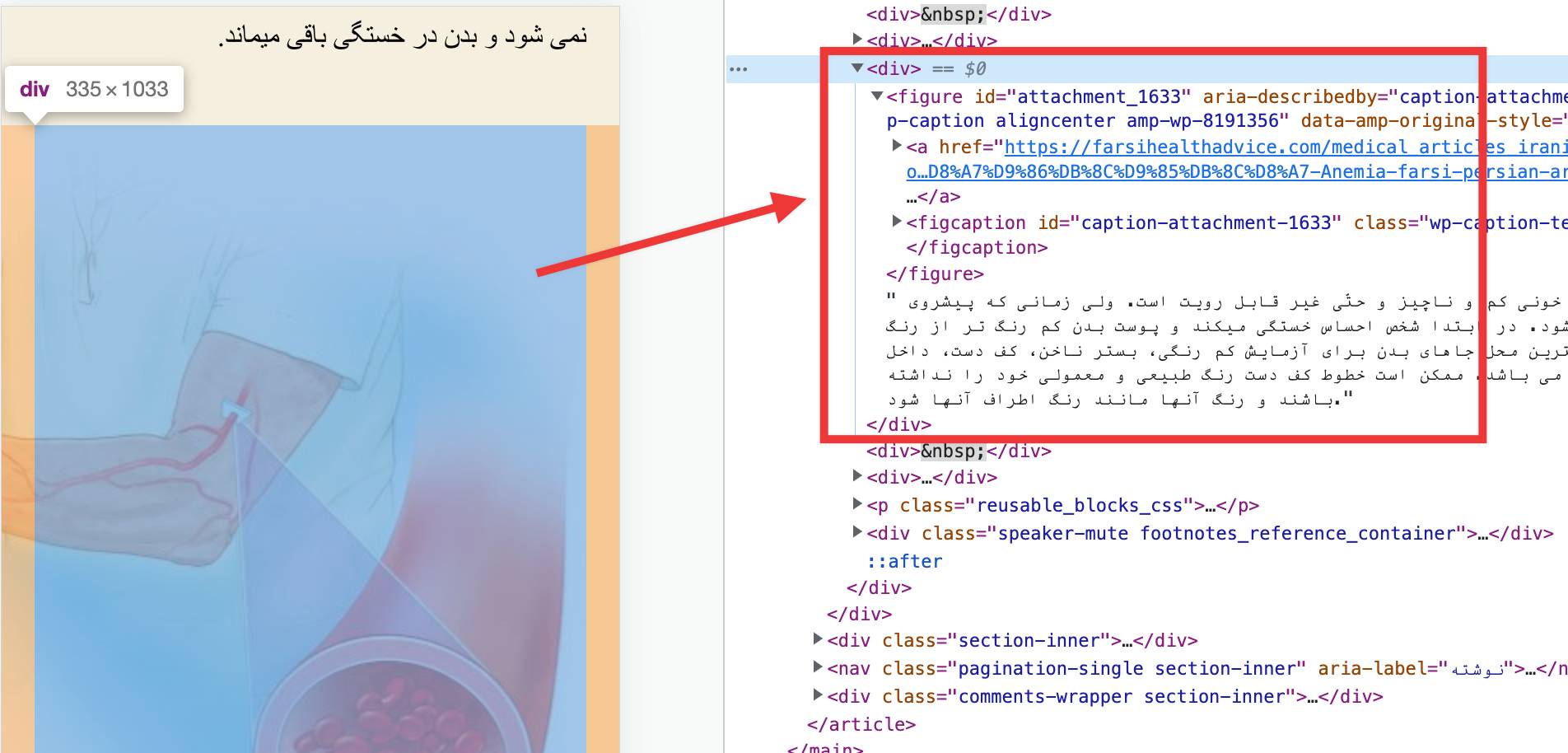
    I am looking at your image (the one inside the content, with the overflowing caption) and I see that it is wrapped inside a div, as seen in the screenshot below:

    Screen Shot on 2022 08 29 at 18 08 20

    In principle, that div should not be there if you add the image using the block editor. Could it be the case that you copy/pasted the image from somewhere else?

    Could you please try removing that image block and adding it again to see if the overflow persists and/or if the div goes away?

    Thread Starter Alex T.

    (@polaatx)

    Hi @mrfoxtalbot thanks for your reply.
    I didn’t use the block editor. I use the Classic editor.
    I saw the div you mentioned and I deleted in the Text view. It’s not there anymore.
    But the image is still not shrinking for mobile.

    The code in text view is specifying the width:

    [caption id="attachment_1633" align="aligncenter" width="608"]<a href="https://farsihealthadvice.com/medical_articles_iranians_persians/wp-content/uploads/2022/08/??-????-??????-Anemia-farsi-persian-article-about.jpg"><img src="https://farsihealthadvice.com/medical_articles_iranians_persians/wp-content/uploads/2022/08/??-????-??????-Anemia-farsi-persian-article-about.jpg" alt="?? ???? ?????? (Anemia)" width="608" height="690" /></a> ??????? ???? ???? (????? ????) ?? ????? ???? ?????? ? ?? ??? ?????.????? ?? ??? ???? ?? ???? ???? ????? ??????? ???? ???? ?? ????? ??? ?? ??????? ??? ???? ????????? (hemoglobin) ???? ???? ????? ?? ?? ???? ???? ???. ??????? ?????? ??????? ???? ? ?? ??? ?? ??????? ???? ???????.[/caption]

    Both in the caption tag and image tag as width=”608″.

    Could that be causing the overflowing?

    Thank you for your reply @polaatx and for providing more details.

    This overflow on mobile is due to the fact that you are setting a “fixed” width for the image and it ends up being wider than the screen itself on small devices.

    This can be worked around by setting a max-width value with some custom CSS, have you ever added custom CSS before?

    You will want to add the code below in your “Additional CSS” tab (at My Site > Appearance > Customize https://wordpress.com/customize), in a new line, under any existing code, and make sure you click on “Save Changes” to save it:

    #site-content .entry-content figure {
      max-width:100%;
    }

    The code will not affect the width of the image on desktop, but it should prevent the overflow on smaller devices.

    Let me know if that helps!

Viewing 3 replies - 1 through 3 (of 3 total)
  • The topic ‘Images are not shrunk in mobile view’ is closed to new replies.