Language Switcher Block position and styling
-
I added a Language Switcher Block to my header. The Block works, but I encounter two problems that I can’t solve.
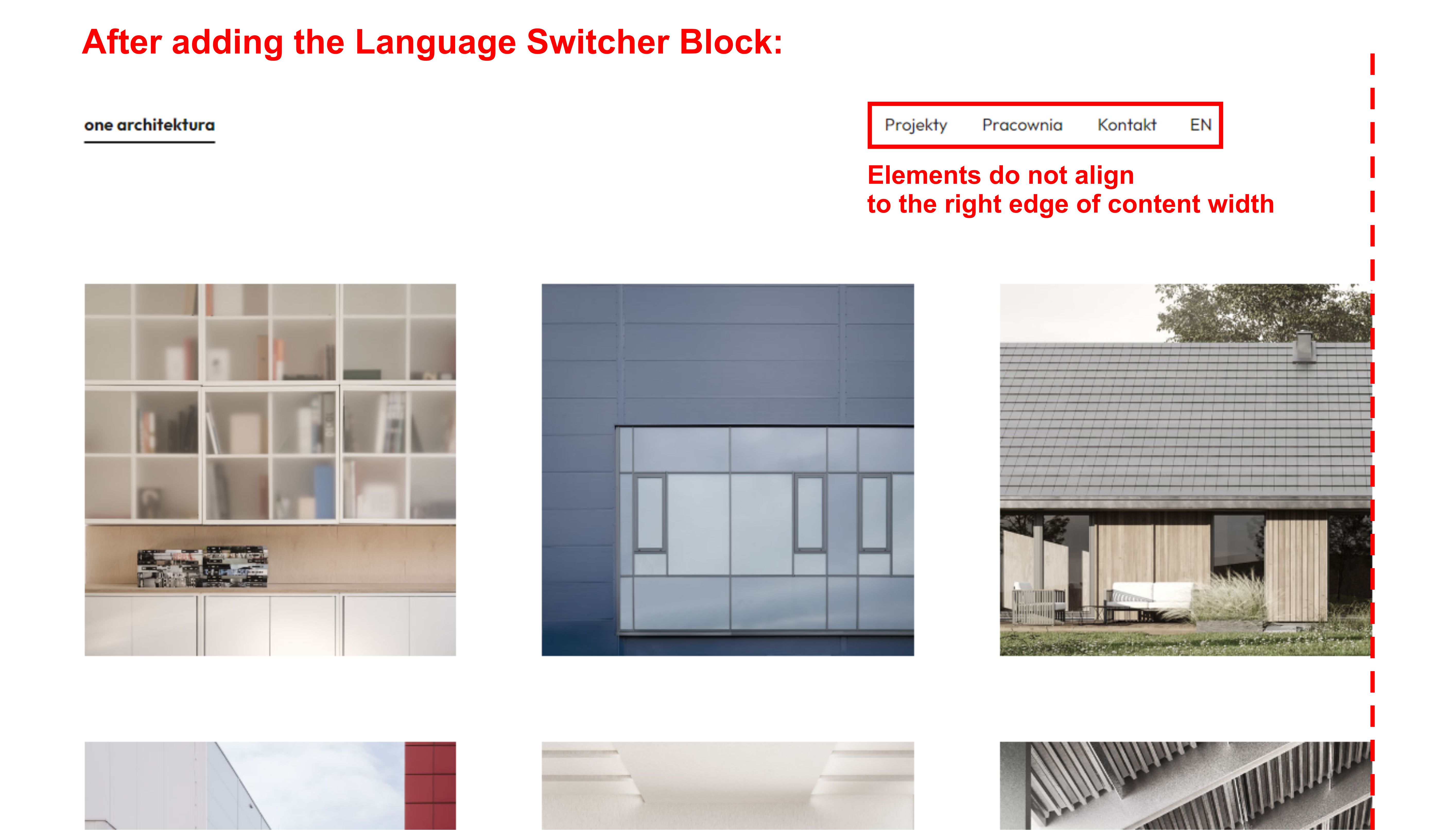
- Position – the Language Switcher does not align to content width.
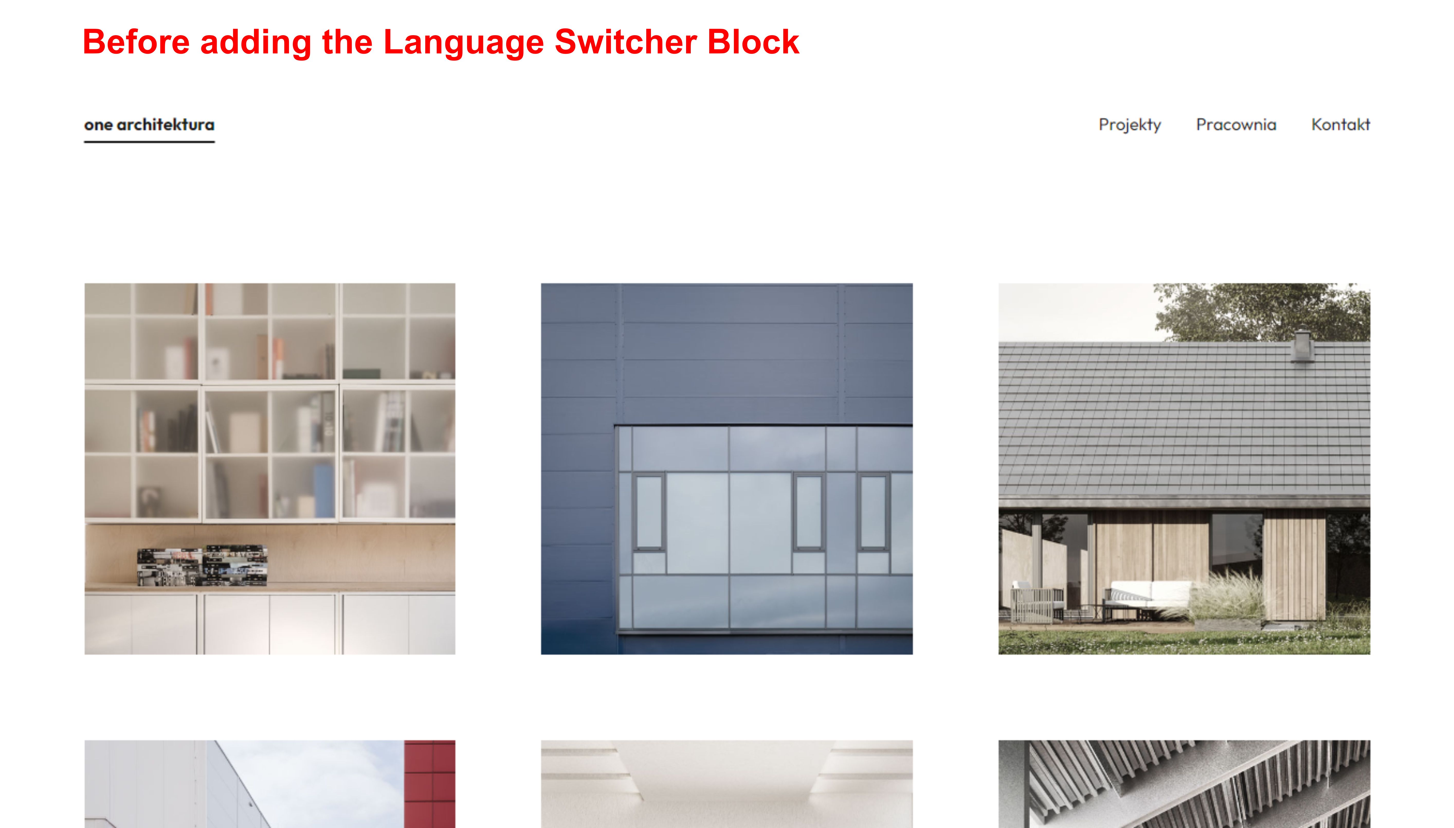
Before adding the Language Switcher, my header composed of Site Title and Navigation worked correctly and filled the set content width.
After adding the Language Switcher, the elements of the Navigation move away from the right side.
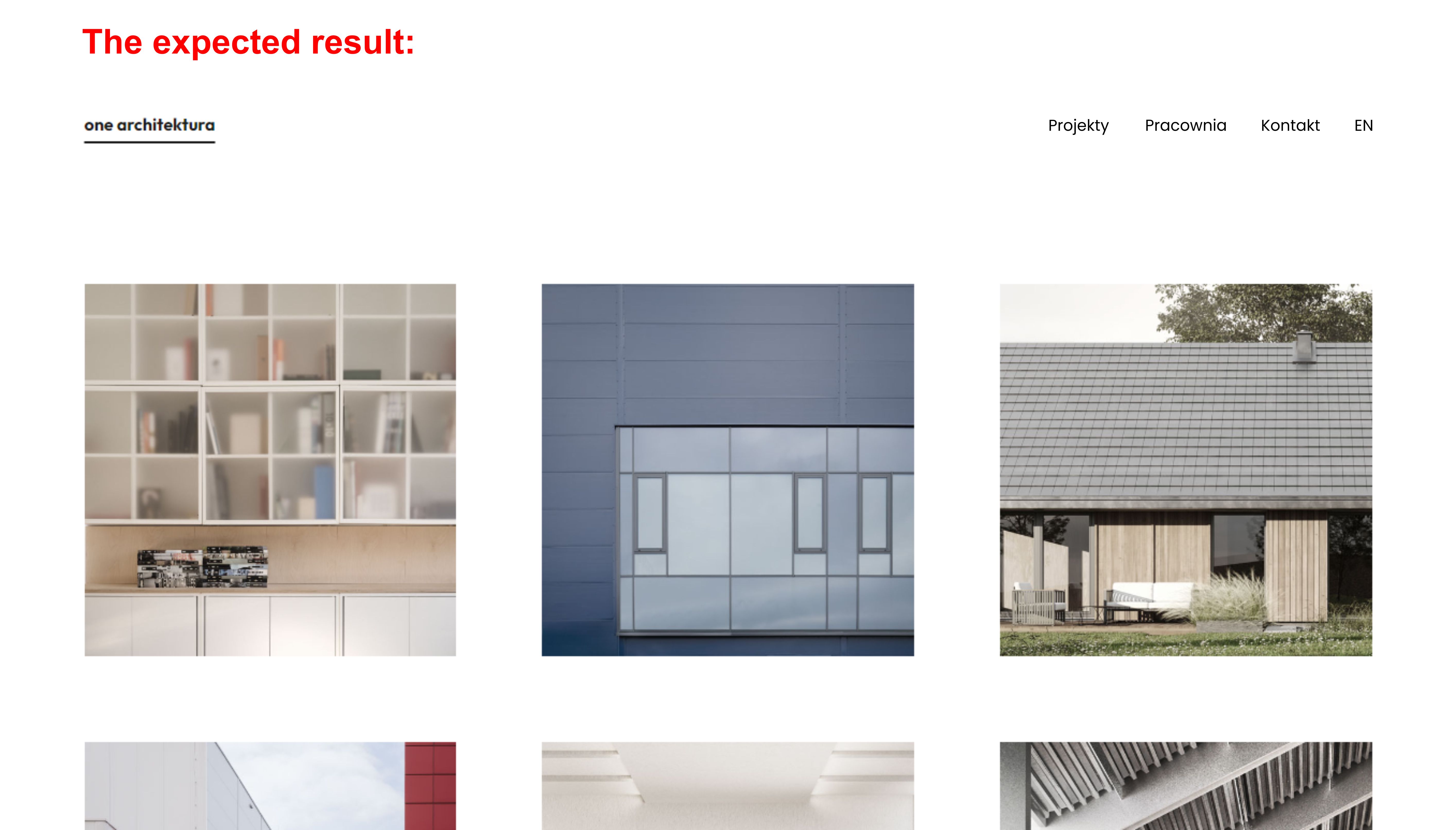
How to align the Language Switcher to the right side? - Styling customization – I want the Language Switcher to look and behave like the page links in the Navigation. Therefore, I have two questions:
How to disable the effect of switcher text moving slightly down while hovering?
Switcher text is not vertically aligned with baselines of Links in Navigation (it’s slightly lower). Can this be fixed?
So far, I have added the below properties to Additional CSS:
.trp-language-switcher > div{
border: 0 !important;
}

.trp-language-switcher a:hover {
text-decoration: underline;
text-decoration-thickness: 2px;
text-underline-offset: 10px;
background-color: transparent !important;
}
I will be grateful for help on how to solve my problems.
All the best,
KacperThe page I need help with: [log in to see the link]
- Position – the Language Switcher does not align to content width.
Viewing 6 replies - 1 through 6 (of 6 total)
Viewing 6 replies - 1 through 6 (of 6 total)
- You must be logged in to reply to this topic.


