• Hello,

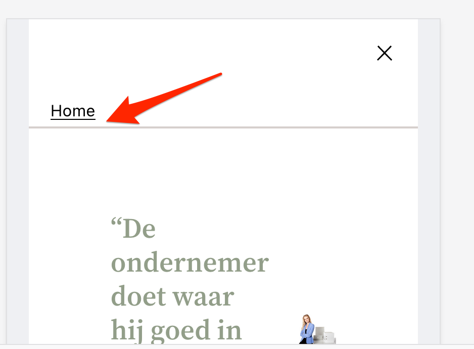
    We recently changed our websites theme to 2022 after we found out the designer of the site would require money to keep the premium theme up to date. I rebuilt the website in 2022. The only problem is that when on mobile the burgermenu doesnt properly extend.

    I suspect used mostly groups and rows to make it because the header seemed difficult to work with and made the width of the page different.

    While I could technically try to mess around in the theme files, I’d prefer a solution that uses only the editor(beta) so that it remains update friendly.

    Thanks in advance for any help.

    King regards,
    Teun

    The page I need help with: [log in to see the link]

Viewing 3 replies - 1 through 3 (of 3 total)
  • Moderator Kathryn Presner

    (@zoonini)

    Heya @tmdro – I see what you mean – the bottom of the mobile menu is cut off:

    Since this issue doesn’t occur with the default Header template part, rather than trying to reverse-engineer the modifications you’ve already made, I’d probably suggest you undo your edits to the Header template part. It would be best practice to do this on a development or staging copy of the site first, so you can work out the issue while your live site remains unaffected.

    You can quickly undo changes to a template or template part by clicking the “clear customizations” option:

    (As a heads-up, there is no revision history for templates/template parts, so you won’t be able to get your customizations back.)

    If the problem goes away after undoing your template-part changes, then you could work on making the header modifications you want – without negatively affecting the hamburger menu:

    I suspect used mostly groups and rows to make it because the header seemed difficult to work with and made the width of the page different.

    If you need help with this part of the process, I’d be glad to take a look.

    Thread Starter tmdro

    (@tmdro)

    Thank you!
    I created a new empty header and dragged the row with the site logo and nav into it. It works now. Is there a way for me to edit the header layout, or do I have to add blocks into it and then edit those?

    Also, in order to change the text or images, I use the editor(beta), and changes made through the pages menu don’t work. Do you know why that is?

    Kind regards,
    Teun

    Moderator Kathryn Presner

    (@zoonini)

    I created a new empty header and dragged the row with the site logo and nav into it. It works now.

    Great!

    Is there a way for me to edit the header layout, or do I have to add blocks into it and then edit those?

    You can both edit the layout of the existing blocks, and you can also add new blocks and edit those.

    If you need help doing something specific, let me know.

    Also, in order to change the text or images, I use the editor(beta), and changes made through the pages menu don’t work. Do you know why that is?

    There could be a couple of things happening, but the first thing I’d suggest checking is to make sure you have a Post Content block in your Page template. If you removed that block, content added under Pages won’t be displayed.

    The only text and images you should be adding in your templates is stuff you want to appear on every page, such as in a footer, header, or sidebar. Content that’s going to be different from page to page should be added under Pages – not in the Site Editor’s templates.

Viewing 3 replies - 1 through 3 (of 3 total)
  • The topic ‘Mobile menu not extending properly’ is closed to new replies.