• Resolved chriscaldwell11

    (@chriscaldwell11)


    Hello,

    I can’t seem to adjust h1 to an appropriate size for mobile phone viewing.

    So far I tried adding the following to the additional css classes in the advanced section of the template Page (No Separators) There was no change though:

    @media only screen and (max-width: 600px) { h1 { font: 20px; }

    Thank you so much.

    The page I need help with: [log in to see the link]

Viewing 5 replies - 1 through 5 (of 5 total)
  • I can’t seem to adjust h1 to an appropriate size for mobile phone viewing.

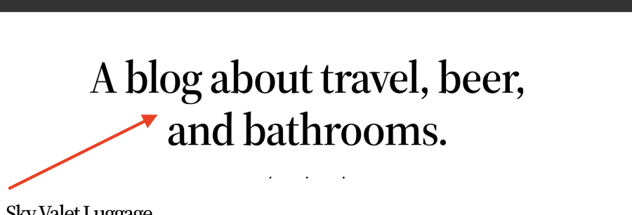
    Hi @chriscaldwell11 it would depend on what you want to change exactly, for example, if you want to reduce the font size for the post title shown below.

    Screenshot 2023 05 24 at 03 50 45

    You can use the CSS below, adjust the size to your preference.

    @media only screen and (max-width: 600px) {
    .wp-block-post-title {
        font-size: 20px;
    }}
    Thread Starter chriscaldwell11

    (@chriscaldwell11)

    Thank you very much for the response. I put the css you suggested in the Additional CSS Classes field in the Advanced Section styles area of the template Page (No Separators) There was no change though. Is this where I should put this?

    Thanks again!

    Hi @chriscaldwell11 I am sorry I missed that, you have to add the CSS to the Additional CSS section.

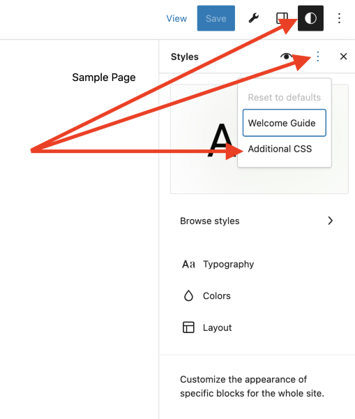
    To access the additional CSS section open Global Styles in Appearance > Editor then click on 3-Dots that appear on the top-right. You will then see the option to access the Additional CSS section for your site.

    Screenshot 2023 04 25 at 11 21 24
    Thread Starter chriscaldwell11

    (@chriscaldwell11)

    Great. That worked beautifully. Thank you so much!!

    Hi @chriscaldwell11 thank you for the update, I am glad it is working as expected. I will make this issue as resolved.

Viewing 5 replies - 1 through 5 (of 5 total)
  • The topic ‘Mobile view h1 size too large’ is closed to new replies.