Page cuts off with lower aspect ratio
-
I really like this theme, although one really annoying issue is that the page cuts off if the aspect ratio is too low. E.g. for mobile/tablet users, or even if you don’t have the website in full-screen mode on Desktop.
-
Hi @icedqueen0001,
Thank you for using Hestia theme and for your feedback.
May you please share more details about the issue that you’re facing and how we can replicate it? Also, a screenshot of the problem would be very helpful to understanding it better.
Thanks!Hey Vytis,
Feel free to check it out for yourself ??
Note that the site is NSFW – https://eeveebot.xyz
If you try and open it on e.g. a mobile with a smaller aspect ratio the page just cuts off.
(It shouldn’t do that :D)
Kind regards,
IcedQueenHi @icedqueen0001,
Thank you for sharing the URL. The reason why this image cuts off on smaller screen sizes, is because it’s a background image. Here is an article that explains in detail why background images behave like that in general – https://docs.themeisle.com/article/1232-why-background-images-arent-responsive. It’s not an aspect related to the Hestia theme.
The solution is to add the image in content instead of the background one, and it will be automatically adjusted for all screen sizes.
Regards,
StefanHey Stefan,
What do you mean by adding the image in content instead of the background one?
If I look at Appearance settings > Background Image, there is no image there.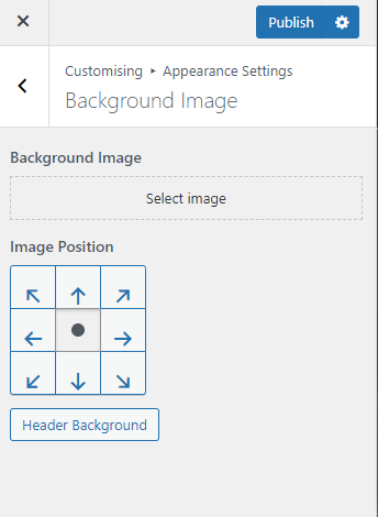
I added the background through Header Options > Header Settings.
Hi @icedqueen0001!
It’s possible to add an Image block in the editor, set it to full width, and it will be automatically resized on smaller screens, as it is not an actual background image. This can be done by clicking on the Edit Page button and then adding the Image block – screenshot.
Have a nice day!
Hey @luciamarinescu ,
I just tried to remove every image there is and even that didn’t fix it.
So I doubt it has something to do with that.Can this issue please be looked into ??
Hi @icedqueen0001!
As mentioned before by my colleagues, this is not an issue. It is the default behavior of any cover/background image on smaller screens. This isn’t related to the theme. The big title section is designed to be a full-width section and as a result, the background image covers the entire section, from top to bottom. This is the reason why the image can’t look exactly the same on every device. A mobile device doesn’t have the physical possibility to display the entire picture, while at the same time keeping the aspect ratio and all its properties. This is why on mobile devices the image is cropped and some parts of it may not be visible.
The only workaround for this behaviour would be not to display the big title section, and instead add an Image block in the editor which would be automatically resized on smaller screens.
For any other issues or questions regarding the theme, please open a ticket on this page.
Have a nice day!
Hey @luciamarinescu
I just tried to completely disable the big title section and that didn’t fix it.Hi @icedqueen0001,
I’m sorry for the delay here. I set two images on my testing instance, one as the background of the Big Title Section, and one as an image in content in the About section. You can see them on this page.
If you resize the browser or view this page on a mobile device, you can see only the second image is resized as expected.
This is because the first image is a background in HTML(https://vertis.d.pr/i/Xhn6jY), while the second image is an image in content added with the default image block available in the WordPress editor(https://vertis.d.pr/i/MpttTs). This behavior of images is related to the browser rather than the Hestia theme. You can add the image as the second one in my testing instance, and it will resize correctly.
I hope this will help.
Hey @stefancotitosu and thank you for the explanation ??
Although like I said, even with NO images at all, it still cuts off ??Hi @icedqueen0001,
I’m not saying to remove the other images on the page to fix this one, but to remove this one from the Big Title section and add it in a different section. What do you mean by it still cuts off even with no image, what is it that is cut off, can you share a screenshot, please?
Regards,
StefanI’m not sure that I focus on the correct issue here. Is it the problem with this image, the first section on the page(https://vertis.d.pr/i/OP4y9m), or about this section with the Team Members(https://vertis.d.pr/i/UVSduE)?
Hey again @stefancotitosu
I am pretty positive that I spotted the issue and it was definitely on my end.
I had this css:
.row {
margin-left: -200px;
margin-right: -200px;
}
Which was to create more space on each line.
I feel really dumb right now and I’m so sorry for bothering ??</img>Hi @icedqueen0001,
I’m glad you found the problem and the theme works as expected now.
Feel free to open a new topic on the forum whenever you have questions about it.
Have a great day ahead!
- The topic ‘Page cuts off with lower aspect ratio’ is closed to new replies.
