• Resolved hebhansen

    (@hebhansen)


    Hey TT3

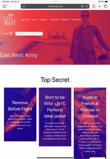
    It appears my styles are fine on computer and on Mobile, but on middle size Tablets:
    – Block spacing is gone
    – Links are blue (90ies site) and not Olive Green

    Is this correct and is it a bug? or do I seriously have to independently style for all clients individually?

    The page I need help with: [log in to see the link]

Viewing 6 replies - 1 through 6 (of 6 total)
  • Moderator Kathryn Presner

    (@zoonini)

    Hi @hebhansen – I spot-checked your site on an iPad but I’m not sure where to look to find the issue.

    Could you please provide:

    – a link to a specific problematic page or post where the issue is present
    – a link to a screenshot showing the problem on your tablet
    – name of the type of tablet you’re using (i.e. iPad Air 4th generation)
    – browser & version
    – dimensions of browser window

    I’ll be glad to do some more testing once I have that info. Thanks!

    Thread Starter hebhansen

    (@hebhansen)

    Hey @zoonini

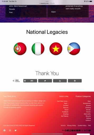
    Here is what I see compared to what you see and on my other clients, where iPad is the flawed one. I have restarted, deleted ram and restarted iPad over and over as well as clearing cache maybe 200 times since:

    Header:
    iPad Air 2nd gen
    iMac 27″ 2017
    iPhone Xs

    Front:
    iPad Air 2nd Gen

    iMac 27 2017
    iPhone Xs

    Query:
    iPad Air 2nd Gen

    iMac 27 2017
    iPhone Xs

    Footer:
    iPad Air 2nd Gen

    iMac 27 2017
    iPhone Xs

    Note all other browsing displays correct on my iPad.

    Specs:

    iPad Air 2nd Gen:
    iOS 12.5.6 Latest supported
    Browser Safari – Collapses, No Block Space, Wrong font color for links
    Browser Chrome – Collapses, No Block Space, Wrong font color for links

    iMac 27:
    2017 Retina 5k
    OSx Monterey 12.6
    Browser Chrome – Looks perfect
    Browser Safari – Looks Perfect

    iPhone Xs:
    iOS 16.1.1
    Browser Safari – Looks perfect
    Browser Chrome – Looks Perfect

    Please report back what your findings are. Since I have the bad view I can test corrections for you. Provided that the sw has no other alpha and beta applied. This transfer onto TT3 has been a bit extensive … Part learning Full Site Edit, but also all kinds of other stuff that went wrong not related to TT3.

    Looking forward to hear from you, as this is quite concerning to me obviously…

    Thx for your support

    Thread Starter hebhansen

    (@hebhansen)

    Off topic: How can I center header and footer on mobile? As you can see in screens it lokks a bit off on iPhone

    Moderator Kathryn Presner

    (@zoonini)

    Hi @hebhansen

    How can I center header and footer on mobile? As you can see in screens it lokks a bit off on iPhone

    Could you please start a new thread for this one? There’s already a lot going on here and it’ll be better if you could break out your new questions into a new forum post. Thanks!

    I’ll have a look at your screenshots and reply in a bit.

    Moderator Kathryn Presner

    (@zoonini)

    Thanks for all the screenshots and device/browser details, it’s very helpful.

    iPad Air 2nd Gen:
    iOS 12.5.6 Latest supported
    Browser Safari – Collapses, No Block Space, Wrong font color for links
    Browser Chrome – Collapses, No Block Space, Wrong font color for links

    I checked your site on my tablet but don’t see any display issues there, everything looks fine on my end. My specs:

    iPad Air (4th generation)
    iOS 16.1.1
    Safari 16.1.1
    Chrome 108.0.5359.52

    Here are a few screenshots from my iPad Air:

    DB5AE97E E3E1 4BAC 8A0B 392F0B6E6BE2 1 102 o

    DAAE34BD 24BC 4F84 8E56 A6A1903AF73B 1 102 o

    I suspect it’s your browser version that may not support some of the the Site Editor’s CSS output.

    Just as one example, versions of Safari prior to 14.1 don’t support flexbox gap, which is used in Site Editing to create spacing between blocks. So that could explain why you’re seeing certain blocks collapsed against each other, as you’re only running Safari 12.5.6 (the Safari version is the same as the iOS version).

    https://caniuse.com/flexbox-gap

    Thread Starter hebhansen

    (@hebhansen)

    Thx Kathryn

    That’s probaly it. If it’s not supported, it’s now. That said, it appears that nav menu doesn’t get much styling, so it looks extensive.

    I’ll close this for now

Viewing 6 replies - 1 through 6 (of 6 total)
  • The topic ‘Styling not applied for Tablets’ is closed to new replies.