Hi @makway and @s7ranger, here’s an extract of the header menus documentation page.
Let me know if you are still having problems after assigning a menu for mobile devices as described below.
When visiting your website using a smartphone or a tablet (with a width less than 720px), the menus are revealed when clicking on the hamburger button(s) :

To choose which header menu you want to be displayed as mobile menu follow these steps:
- From the Customizer navigate through <em style=”background-color: initial;”>Header Design -> <i style=”font-weight: bold;”>Header Menus : mobile settings, scroll behavior</i>
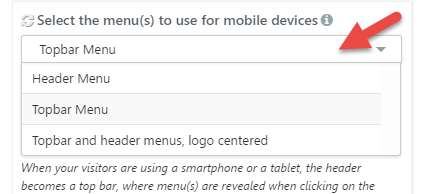
- Expand the dropdown list against the option Select the menu(s) to use for mobile devices :
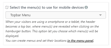
- Select the header menu location(s) you want to be displayed as mobile menu(s) :
- Header Menu: the menu assigned to the Header location will be displayed as mobile menu in one bar on top
- Topbar Menu: the menu assigned to the Topbar location will be displayed as mobile menu in one bar on top (default)
- Topbar and header menus, logo centered: both the menus assigned to, respectively, Topbar and Header menu locations will be displayed as two separated mobile menus with the title/logo centered
