• Resolved G

    (@gjhepworth)


    I have several pages but not posts. I have created a static page website using the default Twenty Fourteen theme. On each page I have chosen to use a Featured Image (the same image on each page). When the website is displayed, the front page shows the image spaced down quite a bit (with blank lines between the menu bar and the image) but other (non-front) pages show the image hard up against the menu bar as I would have expected. What is making the alignment different on the front page? How do I get around this issue? Thanks

Viewing 15 replies - 1 through 15 (of 27 total)
  • Hi there, if you could provide a link to your site it will be easier to help. Thanks!

    Thread Starter G

    (@gjhepworth)

    I need to tweak the site slightly first though to remove a few business names as this is a new site. I will post a link shortly. Thanks for your help.

    Make a child theme and add this to the CSS:

    .content-area, .content-sidebar {
    	padding-top: 0;
    }
    Thread Starter G

    (@gjhepworth)

    Hi Kathryn,

    Here’s the promised link. You will see that the pages ‘FRENCH COURSES’ and ‘SPANISH COURSES’ show the image hard up against the menubar but the ‘ABOUT US’ page shows the image lower down.

    The First Page setting is ‘ABOUT US’ and there is no post page.

    https://www.graphiq-design.com

    Many thanks

    Thanks for the link.

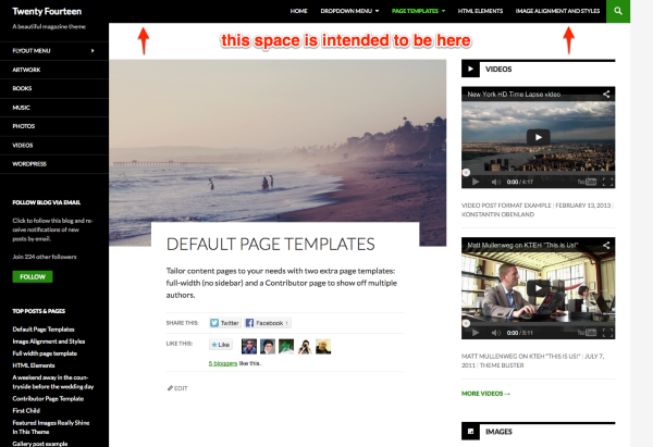
    If you have a look at any page on the demo site on www.ads-software.com or WordPress.com, you’ll see that the space above the page/post content is actually what’s intended. Screenshot:

    Default Page Templates Twenty Fourteen

    So the question is actually why there is no space above the featured image on your pages, such as this one:

    https://www.graphiq-design.com/?page_id=129

    Have you made any CSS or theme-file modifications or is this a default install of Twenty Fourteen? If you have, could you please try reverting back to a default installation?

    If that doesn’t change anything, could you please try temporarily deactivating all plugins you’re running? If the space appears, then turn them back on one-by-one to find the conflict.

    Let me know how it goes.

    Thread Starter G

    (@gjhepworth)

    Thanks for the information. I note your comment about the spacing and looked at the image you made reference to. However, I also observed on the HOME page of https://twentyfourteendemo.wordpress.com that some images there were hard-up against the menubar.

    Anyway, the point is that the spacing is different on one page to that on another, which is not the desired result! I don’t mind which it is so long as it’s consistent.

    I have since created a completely new installation and have tested the Twenty Fourteen theme with a simple two page static site. The problem exists here too.

    The problem only happens when a Featured Image is present on the pages. Without a Featured Image all the pages have the same spacing.

    Within the Reading Settings, changing the ‘Front page’ changes the behaviour so that the page selected shows the spacing, while all the other pages do not.

    I have disabled all add-ons but the problem still exists!

    Thanks again for your help.

    Thread Starter G

    (@gjhepworth)

    Please have a look at this too, which also shows the image under the menubar without any spacing…

    https://twentyfourteendemo.wordpress.com/default-page-templates/full-width-page-template

    Hi there, thanks for the additional information, most helpful.

    I spoke with one of the Twenty Fourteen developers and it looks like the missing gap on pages with a featured image using the full-width template – like the page you pointed out in the demo – is actually a bug in the theme. Those pages should have the gap as well, to be consistent with the rest of the theme.

    I filed a core bug ticket here:
    https://core.trac.www.ads-software.com/ticket/26694

    Anyway, the point is that the spacing is different on one page to that on another, which is not the desired result! I don’t mind which it is so long as it’s consistent.

    I think it would make sense at this point – since it looks like this will at some point be changed in the theme – is to apply the gap to the specific type of page which is missing it.

    Could you try adding this bit of custom CSS:

    .page-template-page-templatesfull-width-php .post-thumbnail {
        margin-top: 72px;
    }

    An easy way to add custom CSS like this is to install the Jetpack plugin and activate the Custom CSS module. You could also install a standalone custom CSS plugin, or create a child theme.

    Going one of these routes will mean your CSS won’t be overwritten when you update the theme – though hopefully this particular issue will be fixed in the next version of Twenty Fourteen and you’ll no longer need the custom CSS. ??

    Let me know if you have any questions or need further help with anything.
    It looks like the theme designers actually meant there to be no gap on full-width featured-image pages when a static page is set as the homepage, and I see you’ve come up with your own workaround to remove the gap as well.

    If you still need any help, just let me know.

    I have the same problem as G. When I look at G’s site now is see that G solved the problem. How did you solve it G?

    hanskeer – could you please start a new thread, provide a link to your site, and let us know whether you want the gap or not? Thanks.

    Hi Kathryn, Thnx for your reaction. My site is yllw.be and I don’t want the gap on the static startpage. Do I still need to start a new thread or is it OK now?

    Thread Starter G

    (@gjhepworth)

    Hi Hanskeer,

    I followed Kathryn’s link (in her earlier posting) and came across the following link, which gives details of the solution. I then applied this to my system as an interim bugfix.

    https://core.trac.www.ads-software.com/attachment/ticket/26694/26694.diff

    Hope this helps,
    G

    Thread Starter G

    (@gjhepworth)

    Hi Kathryn,

    I meant to thank you for your help…

    “Thanks”!

    G

    Thanks – I had a few issues like this with spacing but resolved most. Thanks for the direction of where to look to fix!

    [Link removed]

Viewing 15 replies - 1 through 15 (of 27 total)
  • The topic ‘Twenty Fourteen – featured image spacing on frontpage’ is closed to new replies.