• Can anyone enlighten me on the followings or throw out clues how I can do the following

    I am not an experienced coder – so thanks for bearing with me if the questions are facile.

    1/ Change and reduce the reduce the font size for Contact on that page (page title). The block lists H1 – H6 – and selecting any of these makes no difference. H1-H6 appears in many locations in the file structure. If these are CSS – which is the relevant location

    2/ Reduce the space between the header menus and the contact – and the white space below the ‘Contact’ page title and the line beneath it (border between it and the page content).

    3/ remove the border line under contact – or change it to white, so it does not show

    4/reduce the padding on the footer – so it climbs up closer to the page content.

    I expect these are all CSS attributes but am confused by WP and dont know how to find identify any of the names of these CSS – or even which files within the site structure contain CSS relevant to those parts of the page.

    thanks

    The page I need help with: [log in to see the link]

Viewing 5 replies - 1 through 5 (of 5 total)
  • Looks like you’re using ‘Twenty Twenty-two’ and not ‘Twenty Twenty-three’. You might want to post your question here instead: https://www.ads-software.com/support/theme/twentytwentytwo/

    Thread Starter Philip Chudy

    (@philipchudy)

    thank you Mike – so I am

    I am going to see if I can achieve a better result with 2023 and it that fails I will do as you suggest

    Sure, let us know how that goes.

    Thread Starter Philip Chudy

    (@philipchudy)

    Ok – so 2023 offers much more native control over the things I was struggling with, with 2022. So some of the titles and spacing are as I would like them now.

    But I still have no handle onto how to customize a 3 further things for now.

    1/Post title (as per ‘First Test Post’) is still gigantic on https://peachesincrime.com/2023/02/08/first-test-post/
    Meanwhile using editor I was able to resize its equivalent down, on ‘pages’ such as https://peachesincrime.com/

    2/The test gallery https://peachesincrime.com/2023/02/08/first-test-post/ and the text columns on https://peachesincrime.com/about/ seem to be defined by the theme rather than gallery plugin or my code – and the width is considerably narrower than width possible on a desktop computer. It is also considerably narrower than the width which the theme permits for the header and menu area above. What defines that column width? Can I modify something so it uses a % of available width real-estate. I would like to pretty much fill the page with scalable imagery, text or more gallery columns when available (even borderless).

    Undoubtedly my approach is na?ve – but appreciate any suggestions or cautions.

    3/ my inserted code in the animated HTML waterpark image at the bottom (which as far as I remember has no justify code in it) justifies to the left on the published page even though it does center itself on the page with ‘Align None’ when editing. Not sure if this might be controlled in some way in the theme or however. I have a number of such animations I would like to feature

    thanks

    • This reply was modified 1 year, 9 months ago by Philip Chudy.

    1/Post title (as per ‘First Test Post’) is still gigantic on?https://peachesincrime.com/2023/02/08/first-test-post/

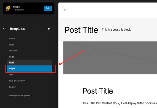
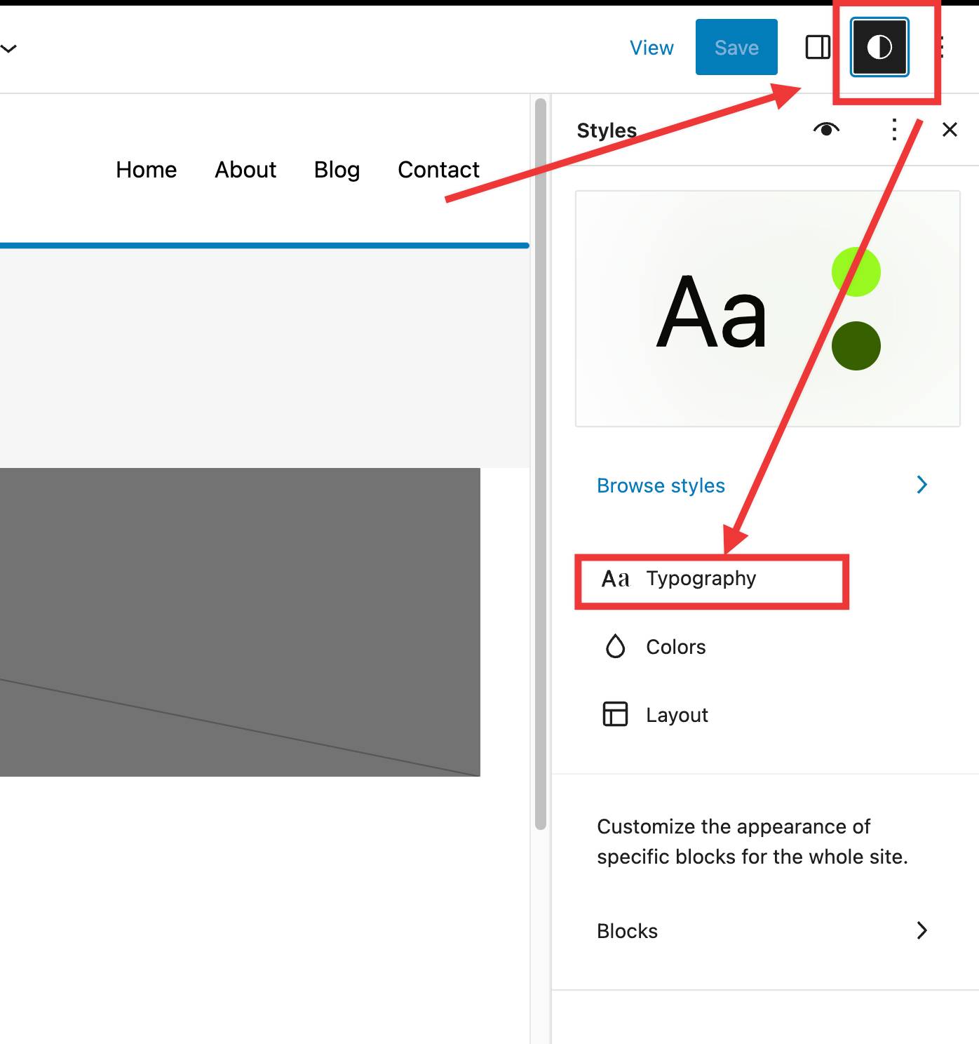
    You should be able to adjust the size on single posts either by editing the single template or by modifying the size of H1s via global styles. Did you try this?

    Screen Shot
    Screen Shot on 2023 02 16 at 16 39 11

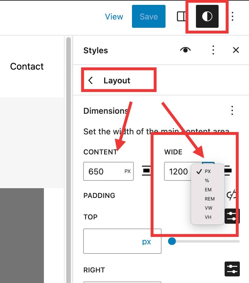
    What defines that column width? Can I modify something so it uses a % of available width real-estate.?

    You can adjust the general width under Styles > Layout as seen below. Please note that you can select VW (viewport width) to specify what percentage of the available space you want the main or wide setting to be

    Screen Shot on 2023 02 16 at 16 42 05

    my inserted code in the animated HTML waterpark image at the bottom (which as far as I remember has no justify code in it) justifies to the left on the published page even though it does center itself on the page with ‘Align None’ when editing. Not sure if this might be controlled in some way in the theme or however.?

    This might not work with the specific custom HTML code you are using, but you can try to add that Code Block to a group, and then align the block itself. Let me know if that helps. If not, we can look for other options.

Viewing 5 replies - 1 through 5 (of 5 total)
  • The topic ‘Twenty Twenty Three – adjusting header and page title spacing’ is closed to new replies.