dcoleonline
Forum Replies Created
-
I’m glad I could help with the earlier changes.
it’s not possible to close the submenu (feels natural to touch the top menu item again to close the submenu). Is this possible to add?
Hmm, so with this, I’d recommend looking for a theme that has this built in and then copying the code responsible for that behavior into a Child Theme for your site. It will likely require some JavaScript code to make it work the way you have in mind.
Making a child theme means your changes won’t be overwritten when you update the theme. If you’re new to child themes, these resources will help you with the process:
https://codex.www.ads-software.com/Child_Themes
https://www.smashingmagazine.com/2016/01/create-customize-wordpress-child-theme/
Keeping your theme up-to-date is strongly recommended to ensure you get bug fixes, security updates, and updates to keep the theme compatible with WordPress core.
Hi Lorena,
You can use this as an example:
@media (max-width: 767px) {
    .site-branding {
        background: url(https://s.w.org/about/images/desktops/wp-dkblue-blue-1440x900.png) center center;
    }
}
This tells the site to use a specified background at the mobile widths.
You can put a link to your own image in place of the one I have there. Just make sure to keep it inside the parenthesis.When you add the code, remember to not edit the theme files directly, otherwise your changes will be overwritten every time the theme is updated. Instead, use the CSS editor included in the Customizer as of WordPress 4.7. under Appearance > Customize > Additional CSS in your dashboard.
Hi there,
When on mobile, the menu functions very different: suddenly all the items (including the child menu items) show up, taking up all the screen estate!
The reason that happens is because this code is applying to your site at all browser widths:
.panel#menu-toggle-nav {
  display: block;
}
Since it isn’t inside of a media query to limit its behavior to desktop views, the menu items also appear by default on the mobile/tablet views.
how i would like it to function: On mobile, only the top level menu items are visible by default…It would be even nicer if there is a (downwards facing) triangle to indicate there is a submenu underneath the top level (that changes to an upward facing triangle when opened). And if the color of the child menu items could be blue(ish) like on PC mouse-over
Sure, add this to your existing CSS (don’t remove the code above):
/*Limit changes to tablet and mobile widths*/

@media screen and (max-width: 48.81em) {
    /*Show only top level menu items, and set blue background on sub-menus*/

    .main-navigation ul ul {
        display: none;
        background-color: #7cbbbb;
    }
    /*Show down arrow for items with sub-menus*/

    .menu-item-has-children > a:before {
        font-family: 'Genericons';
        content: '\f502';
        display: block;
        float: left;
        width: 20px;
        height: 20px;
    }
    /*Show up arrow next to sub menu when it is open*/

    .menu-item-has-children > a:hover:before {
        content: '\f500';
    }
}
When you add the code, remember to not edit the theme files directly, otherwise your changes will be overwritten every time the theme is updated. Instead, use the CSS editor included in the Customizer as of WordPress 4.7. under Appearance > Customize > Additional CSS in your dashboard.
Also, if you’d like to change the arrows, you can find other icons listed in the hexa > genericons > genericons.css file of your theme’s folder. If you go to GitHub (here) and download the source file zip of Genericons 3.0.3, you’ll find an example.html file there which will give you a visual preview of the different icon types available for use in Hexa.
Forum: Themes and Templates
In reply to: [Confit] width menu columWhen you use that code, don’t edit the theme files directly, otherwise your changes will be overwritten every time the theme is updated.
An easy way to add custom CSS is to use the CSS editor included in the Customizer as of WordPress 4.7. Head to Appearance > Customize > Additional CSS to add your custom CSS.
Forum: Themes and Templates
In reply to: [Confit] width menu columYou can use this CSS to widen the vertical sidebar:
@media screen and (min-width: 964px) {

/*Widen the sidebar areas*/
    #masthead, #secondary, #page:before {
        width: 400px;
    }
/*Move the main content area to the right*/
    #main {
        margin-left: 20rem;
    }
/*Move the footer to the right*/
    .site-footer {
        margin-left: 47%;
    }
}
The change is limited to browser widths of 964 pixels or more. It doesn’t change the overall width of the site from what Confit already declares. This means that the content area will be narrower so that everything still fits on the page with the wider sidebar, but feel free to further customize it to your liking.
Forum: Themes and Templates
In reply to: [Cubic] Post image scaling and alignment.Hi Marcin,
I would like to ask if there is a way to align the main post image to the text area below it. i.e. to make the image have the same width as the “entry-content” section.
You can do that by adding this CSS:
.single .entry-thumbnail {
    width: 624px;
    margin: 0 auto;
}
When you use it, don’t edit the theme files directly, otherwise your changes will be overwritten every time the theme is updated.
An easy way to add custom CSS is to use the CSS editor included in the Customizer as of WordPress 4.7. Head to Appearance > Customize > Additional CSS to add your custom CSS.
Is there a way to stop the image from cropping?
For this, are you wanting to stop the cropping only on the single post view? (example)
Forum: Themes and Templates
In reply to: [Confit] adding top bar in Confit themeMaking these changes would require some code changes in a child theme, so you’ll need to be comfortable editing theme files to accomplish this.
Making a child theme prevents your changes from being overwritten when you update the theme. If you’re new to child themes, here are some resources to help:
https://codex.www.ads-software.com/Child_Themes
?https://www.smashingmagazine.com/2016/01/create-customize-wordpress-child-theme/
Once you have your child theme created, you’ll want to put a copy of Confit’s header.php file into your child theme’s folder. This way, you can add some HTML to this file, and it will appear on every view of the site, because the header is loaded on all views.
You’ll probably want to add an HTML div tag into the header.php file that will be used as the top bar. Then you’ll want to add CSS into the child theme’s style.css file in to adjust the appearance of that div.
You’ll likely need to use some CSS media queries to make it work well on tablets and phones. Here are a few resources on using those:
https://www.w3schools.com/css/css_rwd_mediaqueries.asp
https://developer.mozilla.org/en-US/docs/Web/CSS/Media_Queries/Using_media_queries
If you get stuck, feel free to share the code you have, and I’ll take a look.
Hi there,
Here’s a quick link to the most current version of the front-page.php file so we have a common starting point as a reference.
You can see the code there, and also use the Original Format download link at the bottom of the page to download the actual php file later if needed.
For this template, the order that the items are displayed on the page begins at line 89.
You’ll want to swap the order of the news (starting at line 94) and front page (starting at line 98) sections in your child theme’s file.
So instead of what is in the original file from lines 94 to 100, use this:
  if ( 1 != $front_page ) :
    get_template_part( 'content', 'front-page' );
  endif;

  if ( 1 != $front_news ) :
    get_template_part( 'content', 'front-news' );
  endif;
Making those changes should allow your child theme to show sections in the order you prefer.
Here’s what it looked like (small/zoomed out screenshot) on my test site once I made the same changes.
Forum: Themes and Templates
In reply to: [Sela] Featured ImageHi @kmbrlygrn22,
It looks like your image for this post is large enough. When I view the original media file, it’s 1024 x 576 which is larger than the minimum requirement for featured post images.
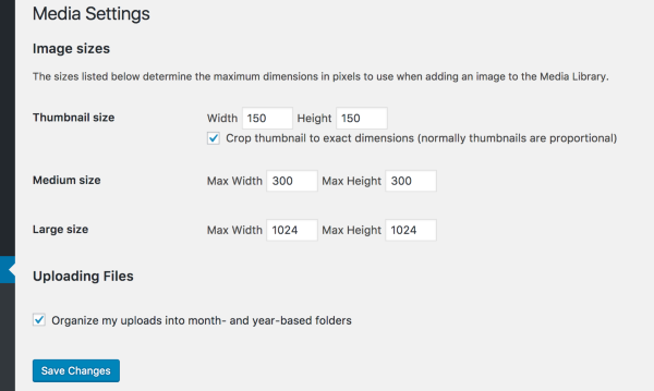
I’d also recommend regenerating the featured images as gary-barrett mentioned earlier. If that doesn’t work, could you double check your Settings > Media area to ensure that your largest size is at least 820px? (Set it to 1180px or more if you might want to use the large featured image on the front page later.)
Here is what the default settings look like:

If the largest setting you have is smaller than the 820 minimum, increase the size there, then regenerate the thumbnails again.
Forum: Themes and Templates
In reply to: [Hexa] Translation of standard wordpress elements doesn’t workHi there,
I’m not sure why the translations aren’t downloading. They didn’t download for me either. However, you can still manually add the translations file and it should work.
To do that, first visit the translation site for Hexa’s Dutch language here:
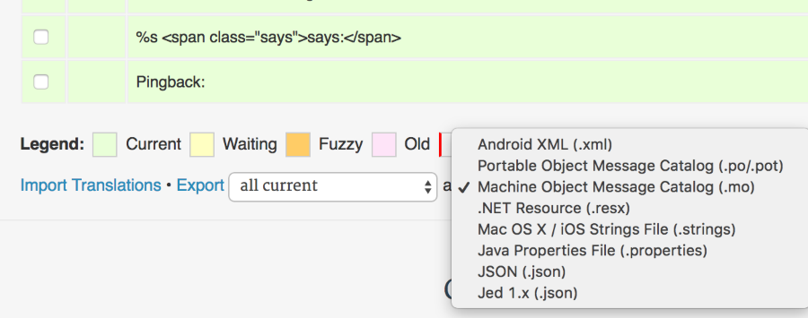
https://translate.wordpress.com/projects/wpcom/themes/hexa/nl/default/At the bottom, look for the option to export the .mo file:

Leave the left option as all current. Once you select the .mo file option from the list, click the Export link.
Find the file on your computer and rename it from wpcom-themes-hexa-nl.mo to hexa-nl_NL.mo.
The file needs to be uploaded into your WordPress directory here:
/wp-content/languages/themes
Once the hexa-nl_NL.mo file is in that folder, make sure that your site’s language settings look like this:
(Note that this theme is not 100% translated. If you’d like to help finish the translations, you can find information on that here and here.)
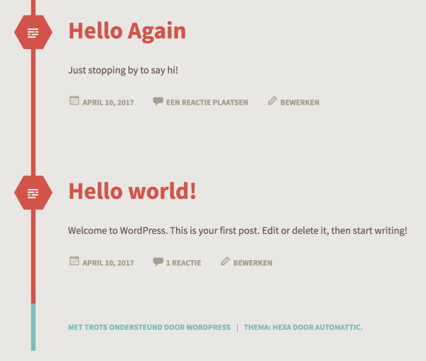
When you view your site, you should see the new translated strings. Here’s what it looks like on my demo site:
When it comes to actually uploading the language file, one way to do that is by using an FTP client. You’ll need to contact your web host to request FTP access if you don’t already have it.
The other way to upload the file is through a plugin that allows you to upload files.
Either way, it’s recommended that you make a backup of your sites files and database anytime you’re making changes like this. That way if anything goes wrong, you can restore your site from a backup.
You can find backup plugins to make this process easier here:
https://www.ads-software.com/plugins/search/backup/Let me know if this works for you.
Forum: Themes and Templates
In reply to: [Argent] Disabling commentsOk great. They both essentially let you change the settings for an individual post or page. Glad to hear that you were able to sort it out!
Forum: Themes and Templates
In reply to: [Affinity] Seo title not workingHi @giuliacotta,
I’d definitely recommend trying @gary-barrett’s recommendation there.
Also, as this doesn’t seem to be theme related, if you need help with the plugin itself, you can post over in the Yoast SEO forum for support.
Forum: Themes and Templates
In reply to: [Dyad] Grid in mobile versionHi there,
Could you send over a link to your site?
Also, are you using Dyad or the new Dyad 2 theme?
Forum: Themes and Templates
In reply to: [Ixion] How to edit font size, color, etc., in headingHi genebrodejr,
I am using the plugin Easy Google Fonts to change my site fonts. When I changed the H1-H6 heading fonts I found that my header did not change.
If Easy Google Fonts isn’t working as expected, I’d recommend making a post over in that plugin’s support forum to see if the folks there have any tips on getting it to work on your site.
I did test it with Ixion on a fresh install, and it worked, but there might be something on your site causing a conflict with that particular plugin. If you make a post in the plugin’s forum, either its developers or another user might be able to assist you with troubleshooting.
Forum: Themes and Templates
In reply to: [Confit] adding top bar in Confit themeHi there,
Could you send over a link to your site?

