kacperludwiczak
Forum Replies Created
-
Forum: Developing with WordPress
In reply to: Sync nested patternsI’ve started a new feature request: #64698
Hello @alexcozmoslabs,
I’m using the new version of WordPress with Block theme, so the traditional menu interface is no longer accessible under Appearance > Menus.
When I try to enable Language Switcher in “Menu item” the message is displayed: “Your theme does not support navigation menus or widgets.”When I add the Switcher on the left side of the menu the issue remains the same.
All the best,
KacperThank for response.
I’m not using the menu Language Switcher block – I didn’t even have the option to add this block to the menu.
I added the Language Switcher block next to my menu, grouping it with menu in a Row block.
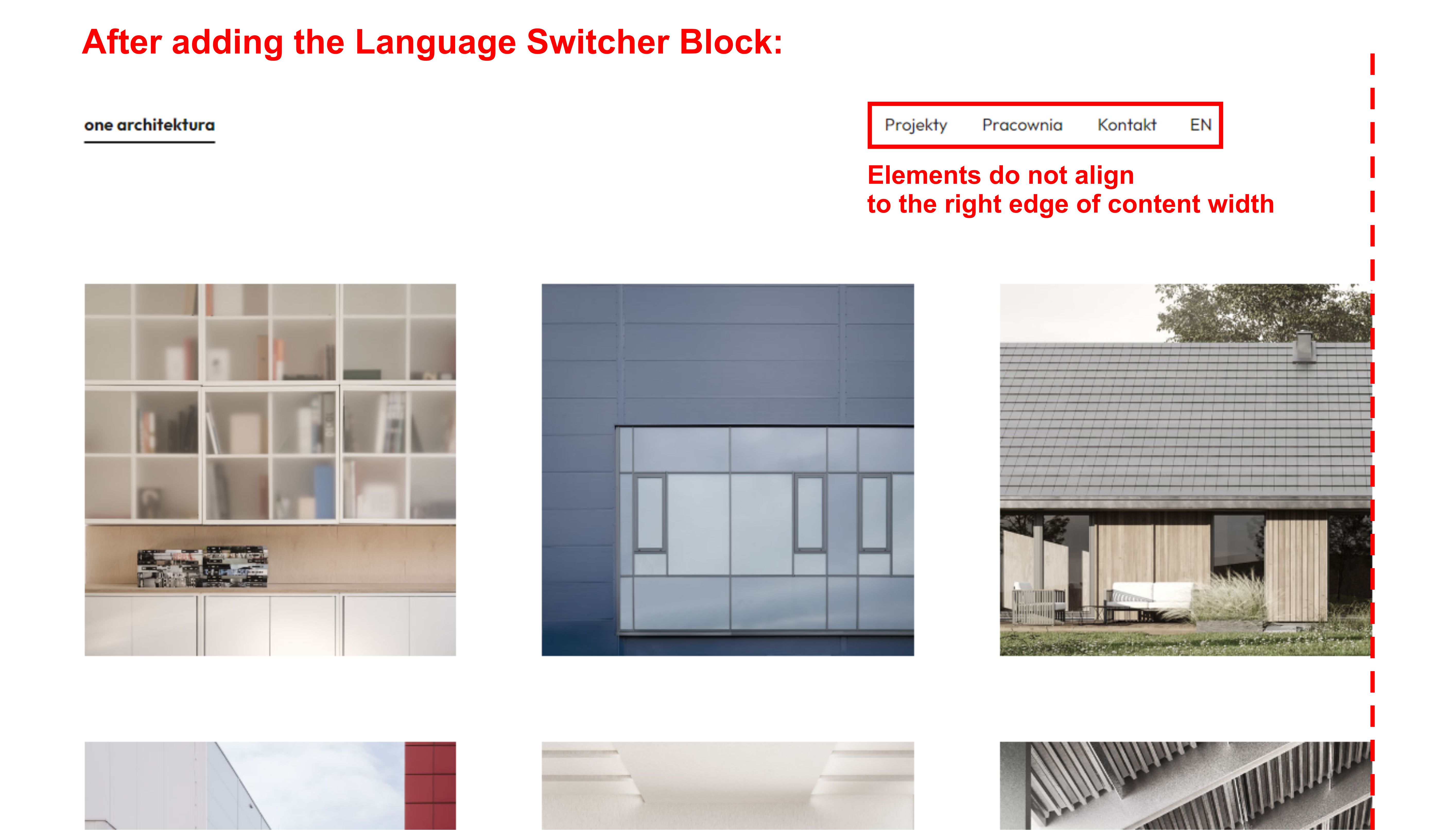
I also checked how the Language Switcher block behaves when you simply add it somewhere on the page and the same thing always happens – remains a distance away from the right edge of the Content Width.
Doesn’t this indicate that the issue is related to the plugin?
All the best,
KacperHello!
I managed to solve second problem (switcher text moving slightly down while hovering) by adding to Additional CSS padding property.
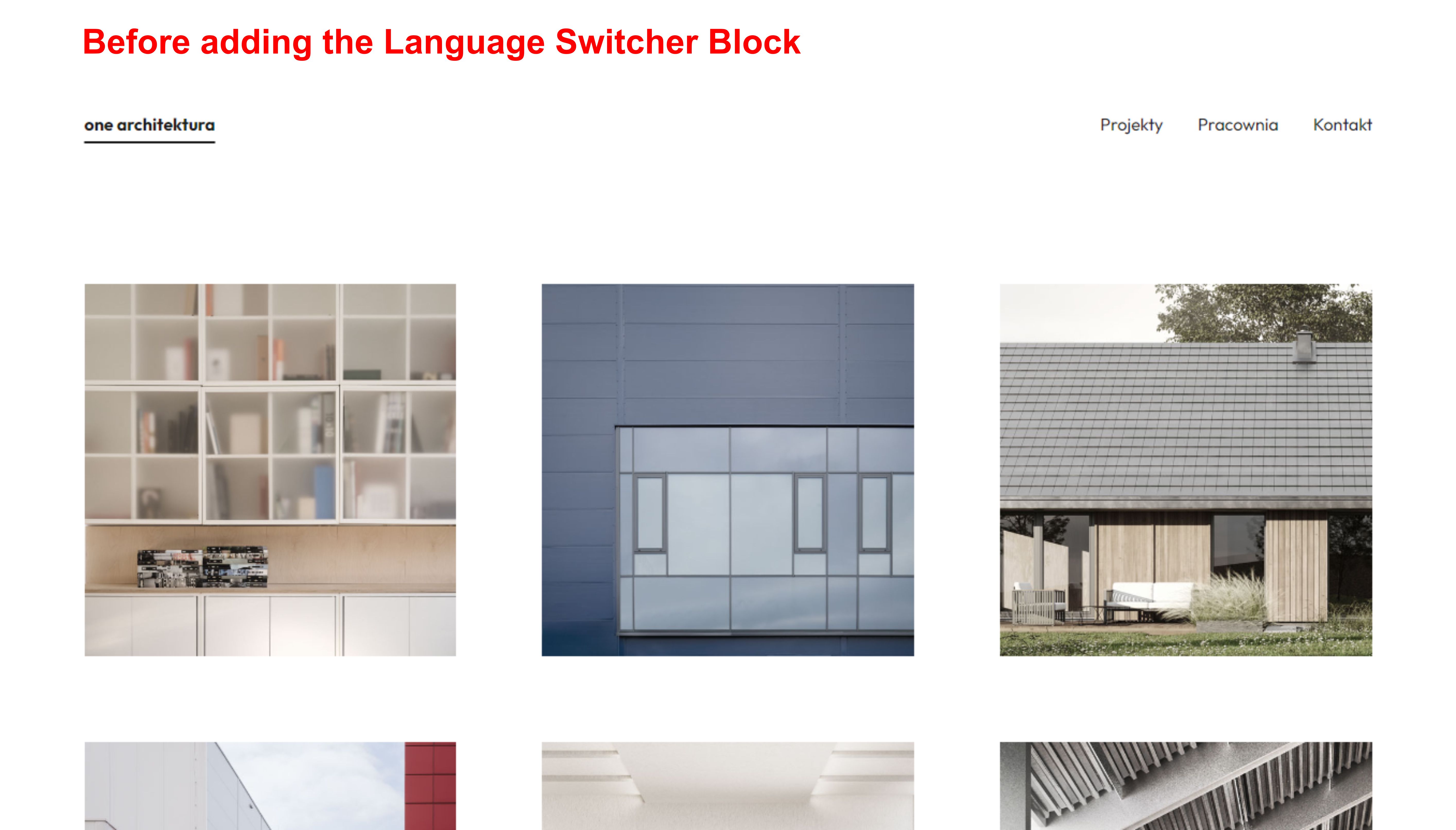
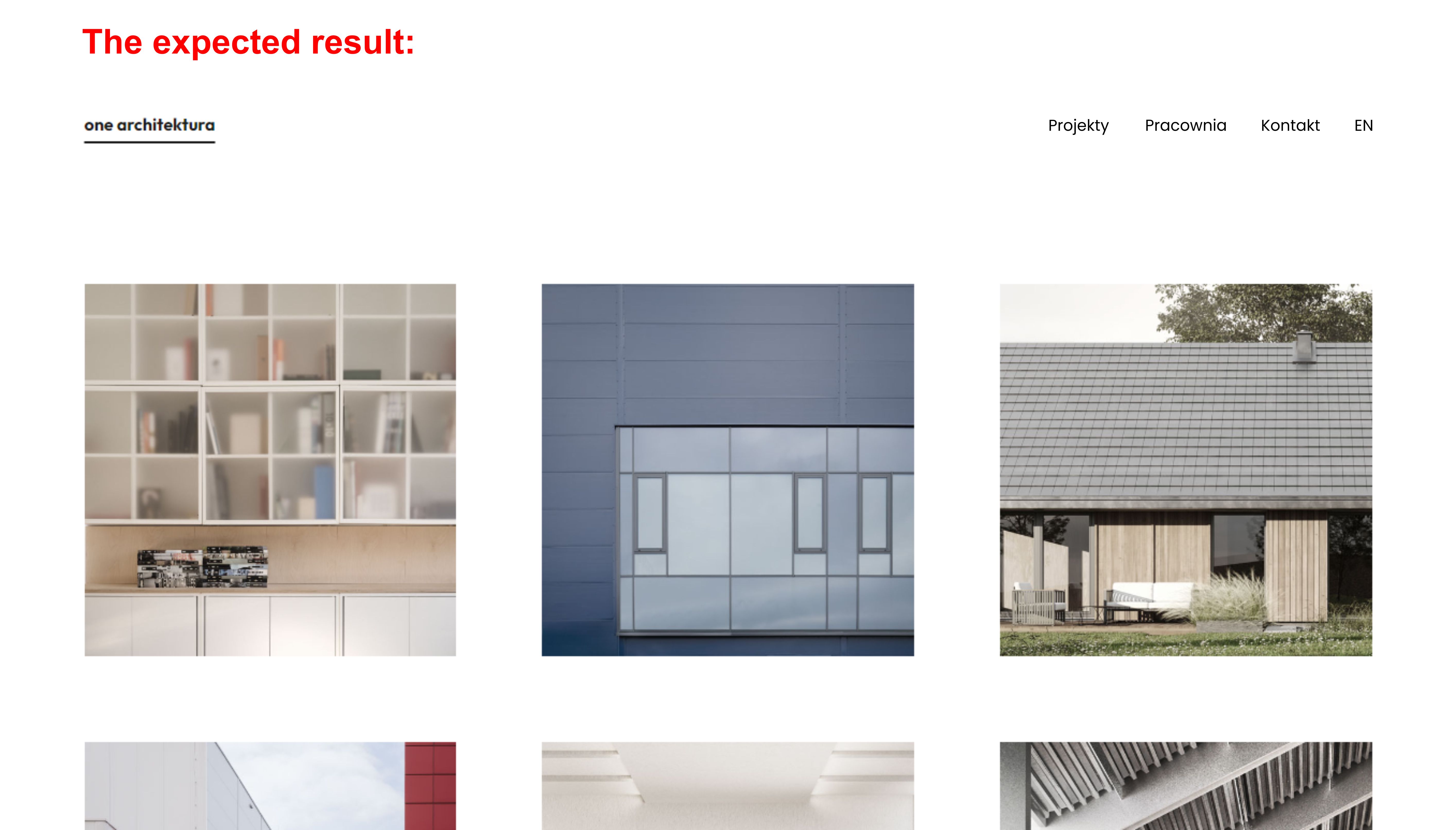
Now my customized code looks like this:.trp-language-switcher > div{ border: 0 !important; padding: 2px !important; } .trp-language-switcher a:hover { text-decoration: underline; text-decoration-thickness: 2px; text-underline-offset: 10px; background-color: transparent !important; }However, I still have a problem with the correct position of the Block in relation to the page layout.
Below are screenshots to illustrate the situation I am struggling with:


Does anyone have an idea how to solve this problem?
All the best,
KacperForum: Developing with WordPress
In reply to: Image Gallery Block overlay fade on hoverMy experience with plugins is that they rarely deliver exactly what is needed, and when they do, it comes with a lot of unnecessary extras. That is a bit of a problem for a purist like me. ??
Anyway, I found a plugin that should be useful for now, but at the same time I will start learning how to create my own custom block.
Thank you for all your tips.Forum: Developing with WordPress
In reply to: Image Gallery Block overlay fade on hoverHi, @bcworkz. Thank you for reply!
Following your advice, I experimented with different CSS rules and I’m getting closer to the expected result.
Although I wasn’t able to achieve the effect for the Image Blocks inside the Image Gallery Block, but working around it, I created a grid of Column Blocks and embedded Image Blocks (with Additional CSS class) in each column. It seems to work correctly, but I would like to ask whether this solution carries any risk of potential errors?
The code I used:.hover-img { display: inline-block; max-width: 100%; min-width: auto; overflow: hidden; position: relative; text-align: center; } .hover-img::before, .hover-img::after { position: absolute; top: 0; bottom: 0; left: 0; right: 0; background-color: rgba(255, 255, 255, 0.4); content: ''; transition: 0.4s ease; opacity: 0; z-index: 1; } .hover-img figcaption { position: absolute; top: 0; bottom: 0; left: 0; right: 0; align-items: center; display: flex; justify-content: center; opacity: 0; z-index: 2; line-height: 1.5rem; font-size: 1rem; font-family: sans-serif; } .hover-img:hover::before, .hover-img:hover::after { opacity: 1; } .hover-img:hover figcaption { opacity: 1; }This solution leaves me with one problem that I cannot overcome.
Before any change, each Image Block is linked to a subpage.
These links stop working after adding an Additional CSS Class to Images and pasting the above code in Additional CSS. I still can add links to Image figcaptions, but they are limited by the area of the text box.
Illustrating the case:


As you can see I aim to make the link available when you hover the mouse over the image, without having to point at the figcaption.
Can I add a link to an image in the hover status with Additional CSS?
Or, can I somehow increase the box around the text that would still act as a link?
All the best, Kacper@mrfoxtalbot, I posted a video in the GitHub conversation.
Hello, @mrfoxtalbot. Thanks for your reply.
I confirm that the situation is different in the case of Paragraph block. I observed that when placing a Paragraph block inside a Cover block, the width of the other blocks contained in the Cover block shrinks to the extent of the text in the Paragraph block – e.g. If the text in a Paragraph fills the entire width of a Cover block, the remaining blocks width do not shrink when repositioned.Thanks to you I know that the problem lies deeper and is not due to my ignorance. I will keep an eye on this thread until the problem is resolved.
Hi guys,
I am still struggling with this issue. Any of you have an idea how to avoid this blocks width shrinking after setting the Cover block content position on Top Center?